Everything in UI Design & Figma, page 13

Focal Point: You Can't Emphasize Everything
A focal point guides the user's eye by making one element dominant. To make something stand out, other elements must fade into the background. Use it to draw attention to a call-to-action or headline. The footgun is trying to emphasize everything at once.
Figma's Auto Layout Grid
Figma's Auto Layout Grid arranges items in a true 2D grid of rows and columns. Use it for complex, responsive layouts like dashboards or bento boxes. The footgun is expecting items to auto-wrap; it's a structured grid, not a flowing container.
White Space: Designing with Nothing
White space isn't just empty background; it's an active tool for grouping related elements and separating unrelated ones. Use it to improve readability and create focus. The footgun is seeing it as leftover space to be filled, which creates visual clutter.
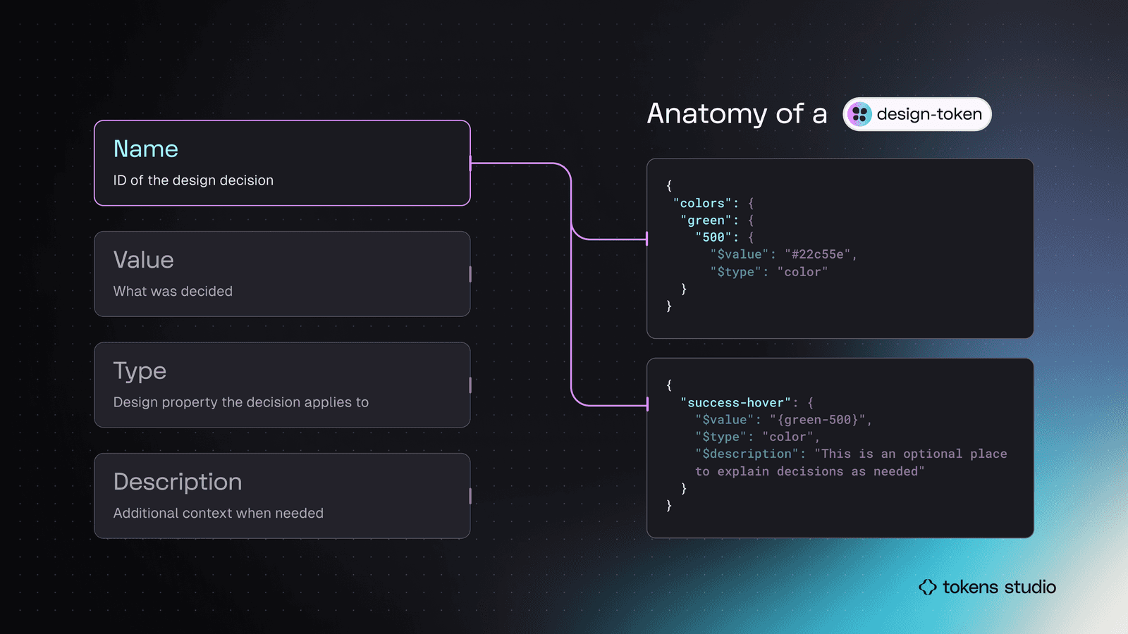
Semantic Naming for Design Tokens
Don't name a token by its value (blue-500); name it by its job (color.action.primary). This decouples design intent from implementation, making systems scalable. It's key for theming and avoiding "lie" variables when designs change.

Kerning, Tracking, and Leading: Spacing in Typography
Kerning adjusts space between two letters, tracking adjusts space across a whole word, and leading controls vertical line spacing. These are used in UI and branding to improve readability. The footgun is confusing kerning (pairs) with tracking (groups).
.png&w=1600&q=75)
Icon System Design: Build Once, Use Everywhere
Treat icons as reusable building blocks, not one-off graphics. A systematic setup in Figma ensures consistency and speeds up your entire design process. The footgun is skipping standardization, which creates tedious overrides and visual debt later on.

SVG: Code-Based, Infinitely Scalable Graphics
Think of SVG as HTML for graphics. It's an XML file with drawing instructions, not pixels, so images scale perfectly. It's ideal for logos and icons on responsive sites. The footgun: SVGs can contain JavaScript, posing a security risk (XSS) if not sanitized.
WCAG Color Contrast: A Readability Score, Not an Opinion
WCAG color contrast is a mathematical ratio ensuring text is readable for people with vision impairments. Use it for all text and UI elements. The footgun is only testing on a good monitor or forgetting that large text has a lower 3:1 requirement.
Color Schemes: The Logic of Color Harmony
A color scheme is a logical combination of colors to achieve a goal, not just a random palette. It's used in UI design for brand consistency, in data viz to encode information, and in safety systems for high visibility.

Rule of Thirds: Guide the Eye, Don't Just Center
Don't center your subject; place key elements along the lines or intersections of a 3x3 grid. This creates a more dynamic, visually interesting composition in photos and UI layouts. The footgun is treating it as a rigid law; sometimes centering is better.
RGB vs. HSL: Two Ways to Tell a Computer 'Color'
RGB tells a computer how to mix light (Red, Green, Blue), while HSL describes color how humans perceive it (Hue, Saturation, Lightness). Use RGB for brand colors and HSL for intuitive variations. The footgun is creating low-contrast UIs that are unreadable.
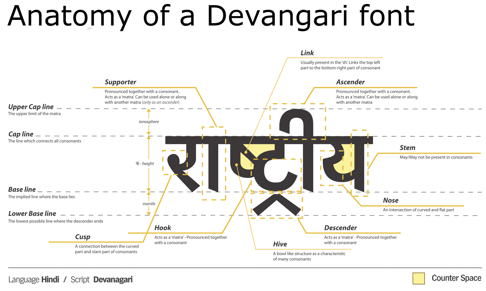
Anatomy of a Typeface: Why Letters Lie to Your Eyes
Typeface anatomy is a system of optical illusions. Letters are drawn with inconsistent dimensions to appear uniform. This is why a circle must be taller than a square to look the same size. The footgun is trusting bounding boxes over your eyes for alignment.
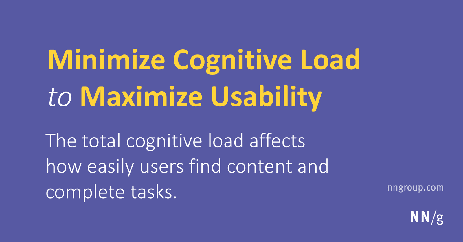
Cognitive Load: Don't Make Users Think (Too Hard)
Think of a user's brain like a computer with limited RAM; cognitive load is the processing power your UI demands. High load from cluttered interfaces slows users down, causing them to miss details or abandon tasks.
"Miller's Law" is Ambiguous and Often Misused
"Miller's Law" isn't one rule, but a name for four distinct, unrelated principles. This ambiguity causes confusion in fields like psychology and computer science.
Hick's Law: More Choices, Slower Decisions
Hick's Law states that decision time increases logarithmically with the number of choices. It's why complex menus slow users down, forcing them into analysis paralysis.

Fitts's Law: Bigger, Closer Targets Are Faster to Hit
Fitts's Law predicts that the time to hit a target depends on its distance and size. This is why mobile buttons are large and context menus appear at your cursor. The footgun is making everything huge, which sacrifices information density and visual hierarchy.

Jakob's Law: Don't Reinvent the UI Wheel
Users spend most of their time on other sites, so they expect yours to work like everything else they already know. Leverage familiar patterns for navigation, icons, and workflows.
Affordances Are Actions, Signifiers Are Clues
An affordance is what's possible (a door can be pushed), while a signifier is the clue telling you how (the flat plate). In UI, a button's styling is a signifier for its click affordance. The footgun is saying 'affordance' when you mean 'signifier'.
UI Typography for Readability
Good typography isn't about fancy fonts; it's about making content effortless to read by controlling size, spacing, and alignment. It's crucial for body copy, headings, and labels. The footgun is using justified text or lines over 90 characters long.
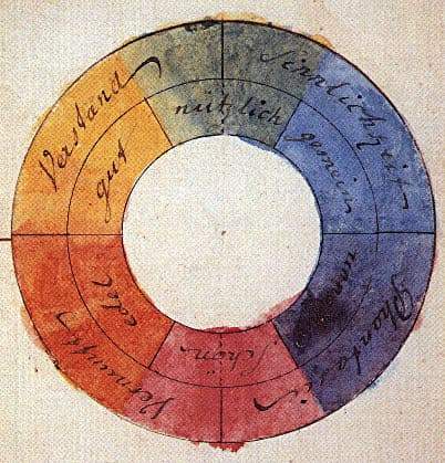
Color Theory: Harmony, Contrast, and Meaning in UI
Color theory is a system for using contrast, harmony, and symbolism to guide user experience. It's applied in UI to create visual hierarchy, evoke brand emotions, and ensure readability.
We are hiring for this. Every open role lists the topics its interview covers, so you can prepare for the real thing rather than guessing.
See open roles