All bites
The whole library, newest first. Filter by what you are here for, or pick a topic if you already know.
8667 bites
Page 353
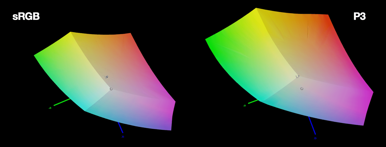
LCH Color: More Vivid, Predictable UI Colors
LCH is a color space that aligns with human perception. It fixes HSL's broken lightness and unlocks 50% more vivid colors on modern screens. The footgun: LCH hue angles don't match HSL's; 0° is magenta, not red, so you can't just swap them.
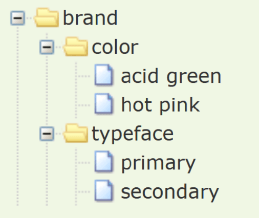
Token Tiers: From Raw Values to Component Properties
Token tiers layer your design system from abstract to concrete: raw values become semantic names, which then style components. This lets you change a core color and see it update everywhere.

CSS clamp(): Fluid Sizing Without Media Queries
CSS clamp() sets guardrails for a value, letting it scale fluidly but never going outside a min/max bound. It's ideal for responsive typography, allowing font-size to grow with the viewport. The footgun: the preferred value is ignored at extreme screen sizes.

Vertical Rhythm: A Formula for Consistent Spacing
Vertical rhythm is a system for consistent spacing derived from your body text's line height. Use this calculated unit between all elements—paragraphs, lists, and after headings—to create harmony.
WCAG Color Contrast: The 4.5:1 Rule for Readability
WCAG contrast ratios ensure text is readable for people with low vision by measuring relative luminance, not just color. Standard text needs a 4.5:1 ratio against its background.

Spacing Scales: Using Multiples for Consistent UI
A spacing scale builds consistent UI layouts from a limited set of values, usually multiples of a base unit like 8px. It's used for everything from button padding to page gaps. The footgun is using arbitrary pixel values, which breaks the system's rhythm.

Typographic Scale: A System for Consistent Text
A typographic scale is a predefined set of font sizes and line heights that creates visual harmony. Design systems use it for consistent, readable text across devices. The footgun is adding one-off font sizes, which breaks the system's rhythm and consistency.
System of Systems: Managing Design Systems at Scale
A "system of systems" isn't one giant design system, but a fleet of interconnected ones. It's how large organizations manage multiple brands or products without total fragmentation.

Measuring Design System Health and ROI
A design system isn't a one-off project; it's a product that decays without measurement. Track metrics like component adoption and design-to-code parity to prove its value and guide maintenance.

Theming: One Design System, Many Visual Styles
Theming lets one component library wear many visual styles, like skins on a character. You can support multiple brands or dark/light modes by swapping design tokens instead of rebuilding components.
Design Systems: Your UI's Single Source of Truth
A design system is the single source of truth for UI, giving designers and developers a shared toolkit of reusable components and standards. It ensures consistency and efficiency across projects.
Design Systems: From UI Kits to Business Infrastructure
A design system is business infrastructure, not just a UI kit. It translates brand consistency into measurable ROI by reducing costs and accelerating delivery.

Atomic Design: Building UIs Like Chemistry
Atomic Design is like chemistry for UIs: you build complex screens from simple, indivisible 'atoms' like buttons and inputs. It's used to create consistent design systems. The footgun is treating it as a rigid, linear process instead of a mental model.
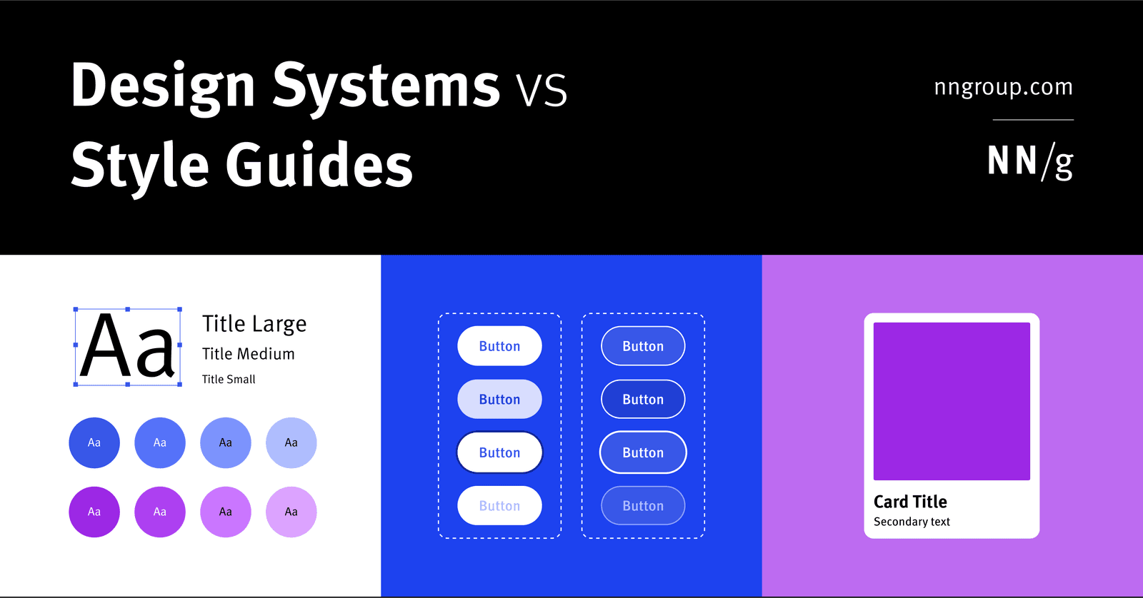
Design System: The Whole vs. Its Parts
A design system is the parent; style guides and component libraries are its children. It's the full toolkit for building consistent products at scale, containing rules, patterns, and ready-to-use code.
A Design System is a Shared Toolbox, Not Just a Sticker Sheet
A design system is a shared toolbox of reusable UI components and rules, not just a style guide. It ensures consistency and speed when multiple teams build products at scale.
Single Source of Truth (SSOT): One Place for All UI
A Single Source of Truth (SSOT) is the "don't repeat yourself" principle for UI. Define a component or style once in a central design system, and reference it everywhere. This prevents UI drift across teams.
Caching: Write-Through for Safety, Write-Back for Speed
Write-through caching writes to the database immediately for data safety, while write-back delays writes for speed. Use write-through for critical data and write-back for high-volume updates.

Phantom Reads: When New Rows Appear Mid-Transaction
A phantom read occurs when a transaction repeats a query and finds new rows that match its search criteria, inserted by another committed transaction. It's common in reporting jobs that need a stable set of data.
Watermarks: Defining 'Done' in Event Streams
A watermark tells a stream processor when a time window is 'complete' for unordered events. It's a timestamped signal declaring 'no more data is expected before this point,' allowing aggregations to be finalized. The key footgun is balancing lateness vs.

Multi-Region Databases: Resilience, Latency, and Compliance
A multi-region database is a strategy for resilience, low latency, and data compliance. It's used to survive region outages, keep data in-country, and serve reads close to users. The footgun is managing low-level replica placement directly, which is complex.