All bites
The whole library, newest first. Filter by what you are here for, or pick a topic if you already know.
8667 bites
Page 352
Writing Accessibility Docs for Your Components
Accessibility docs are the user manual for your component's a11y features. They guide consumers on correct usage, like required ARIA attributes or keyboard behavior.
Design System Changelogs: For Humans, Not Machines
A design system changelog translates code changes into human-readable impact. It's a curated notice for consumers—not a raw git log. It's essential for communicating new components, token updates, and breaking changes so teams can adopt updates safely.
Design System Onboarding: The Welcome Mat
Design system onboarding is a welcome mat, not a full manual. It orients new users by explaining the system's purpose and scope, then routes designers to interactive guides and engineers to implementation docs. The footgun is information overload.
The Slot Pattern: Making UI Components Composable
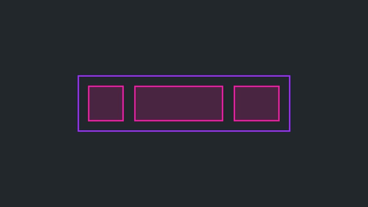
The Slot Pattern makes components flexible by defining areas for custom content, like a picture frame for your UI. It's used in Cards or Modals to allow varied content in a consistent frame. The footgun is that too much flexibility can break consistency.

Wizard/Stepper Pattern: Guide Users Through Complex Tasks
A wizard or stepper pattern is like a recipe for a complex task, breaking a long process into numbered, manageable steps. It's ideal for multi-stage forms like onboarding or checkout flows.
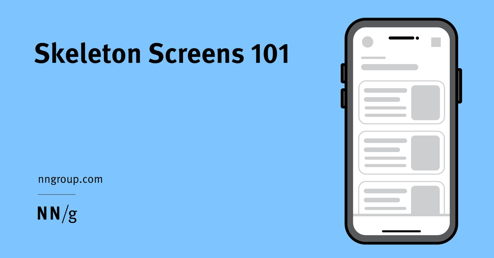
Skeleton Screens: Faster by Faking It
Skeleton screens create the illusion of speed by showing a wireframe-like preview of a page while content loads. They're used for full-page loads to set expectations about the layout. The footgun is showing just the app frame, which gives no structure.
Master-Detail: Show a List, Focus on One
The master-detail pattern splits your UI into a list of items (master) and a view for the selected one (detail). It's used in email clients and file explorers to manage information density. The footgun is a master list so sparse it forces users to click.
Header Components: An Exception to Reusability
Treat your site header as a unique beast, not a reusable component. Its complexity—managing branding, responsive navigation, and sticky positioning—makes abstraction brittle. The footgun is reusing the entire header instead of just its internal components.
Modal Dialogs: The Focus Trap Pattern
A modal dialog is a "focus trap" that overlays the UI, forcing a user to complete a task. It's used for critical confirmations or focused inputs, like a date picker. The main footgun is failing to trap keyboard focus, letting users tab into the inert.
Footer Layout Patterns
A footer is a safety net for users who reach the bottom of a page without finding what they need. Use a "Big" footer for complex sites, "Medium" for standard ones, and "Slim" for simple pages.
ESM vs. CJS: Navigating JavaScript's Module Divide
JavaScript has two module systems: modern, static ESM (import) and legacy, dynamic CJS (require). When publishing a library, you must support both. The footgun is shipping only ESM, as it breaks downstream projects that still use require().
Tree Shaking: Shipping Only the Code You Use
Tree shaking is a build-time optimization that eliminates unused code. For component libraries, it means importing a Button won't bundle the unused DataGrid. The main footgun is side effects: code that modifies global state can't be safely removed.
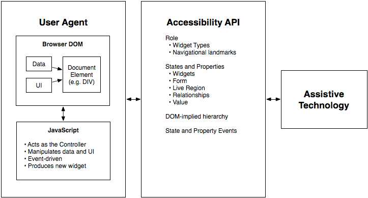
WAI-ARIA: A Script for Custom UI Accessibility
WAI-ARIA gives custom UI a voice for assistive tech. It's the script telling a screen reader what a <div> acting as a button is and if it's "pressed." Use it for custom widgets when native HTML can't.
Semantic Versioning: A Contract for Your Code's Evolution
Semantic Versioning is a contract for your code. The MAJOR.MINOR.PATCH format signals if an update is a breaking change, a new feature, or a bug fix. It's vital for managing dependencies safely. The footgun: SemVer is meaningless without a defined public API.

Style Encapsulation with Shadow DOM
Shadow DOM creates a private DOM tree for a component, acting like a one-way mirror for CSS. This prevents style collisions in complex UIs, ensuring a button's CSS doesn't break a header.
Component-Driven Development: Build UIs Bottom-Up
Component-Driven Development (CDD) builds UIs bottom-up, like assembling a car from its engine and wheels. It's used to manage complex UIs by creating small, independent components first. The footgun is building components too coupled to app-specific logic.

Controlled vs. Uncontrolled Components
A controlled component is a puppet; its parent pulls the strings via props. An uncontrolled one manages its own state. This pattern is key for coordinating siblings, like ensuring only one panel in an accordion is open.
Component Composition: Treat a Group Like an Individual
Component composition treats a group of objects the same as a single one. This allows building complex UIs by nesting simple components, like putting a Button inside a Form. The footgun is creating monolithic components instead of small, reusable ones.
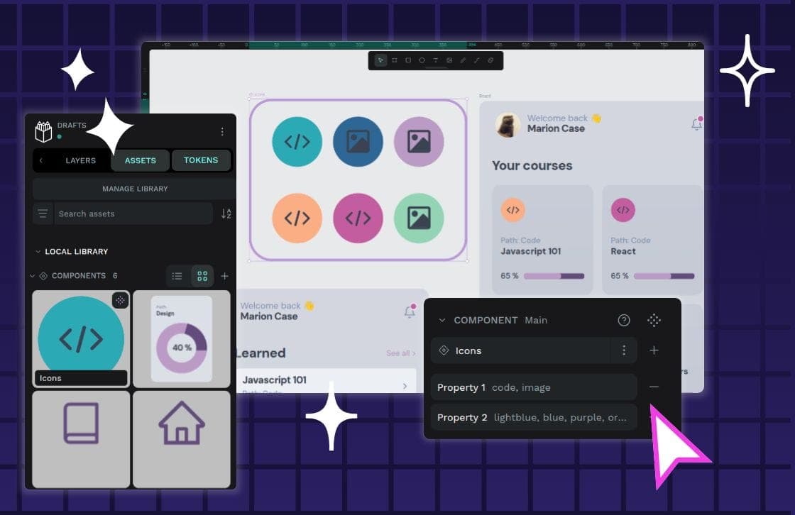
Component Variants: One Component, Many Forms
Component variants are like Lego bricks for your UI: one block can build many things. Instead of creating a unique component for every button state or size, you define properties to manage its variations.
Automated Token Pipelines: A Single Source of Truth
Automated token pipelines turn design decisions into code, using a standard format to sync styles from design tools to production. This is critical for multi-platform systems, preventing drift.