Intermediate everything in AI & ML, page 25
Support Vector Machine: Finding the Widest Street
A Support Vector Machine (SVM) finds the widest possible "street" to separate data classes. It's used for classification tasks like text analysis. The footgun is forgetting the "kernel trick," which lets SVMs solve non-linear problems, not just draw lines.
Cross-Validation: Don't Test on Your Training Data
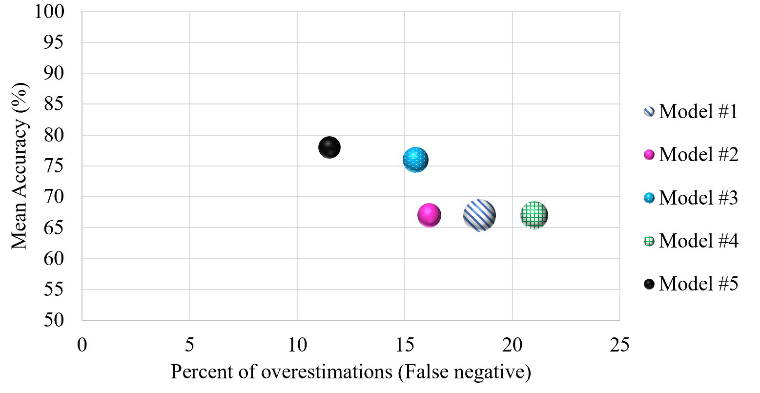
Cross-validation stops a model from 'cheating' by testing it on unseen data. It repeatedly splits your dataset into training and testing portions to simulate real-world performance.

Q-Q Plot: Visually Test if Data Fits a Distribution
A Q-Q plot visually checks if your data fits a theoretical distribution (like normal). If the points form a straight line, it's a match. Use it to validate model assumptions.

Kernel Density Estimation: Beyond the Histogram
A KDE plot is a smoothed histogram, revealing a variable's distribution by summing 'bumps' over each data point instead of using rigid bins. It's great for data exploration, but the 'smoothness' (bandwidth) choice can drastically alter the plot's story.
Violin Plots: Box Plots with a Sense of Shape
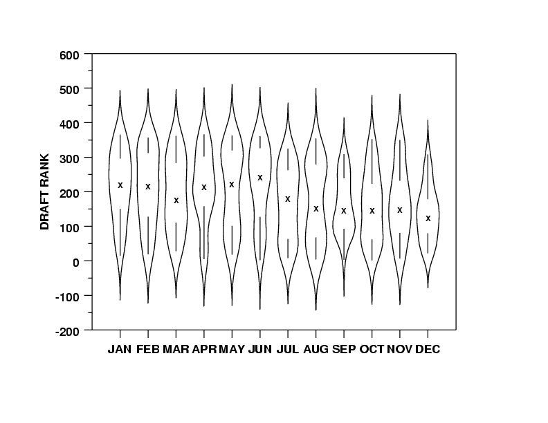
A violin plot is a box plot that also shows the data's shape. It reveals multi-modal distributions or skews that a simple box plot would hide. Use it to compare distributions across categories, like server response times.
Pair Plot: See All Your Data's Relationships at Once
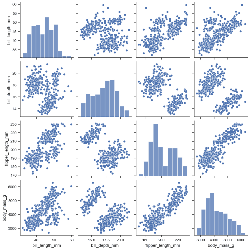
A pair plot is a matrix of charts showing every pairwise relationship in a dataset. Use it in exploratory data analysis to spot correlations and distributions at a glance. The footgun: it becomes unreadably large and slow with more than ~10 variables.
Heatmap: Visualizing Magnitude with Color
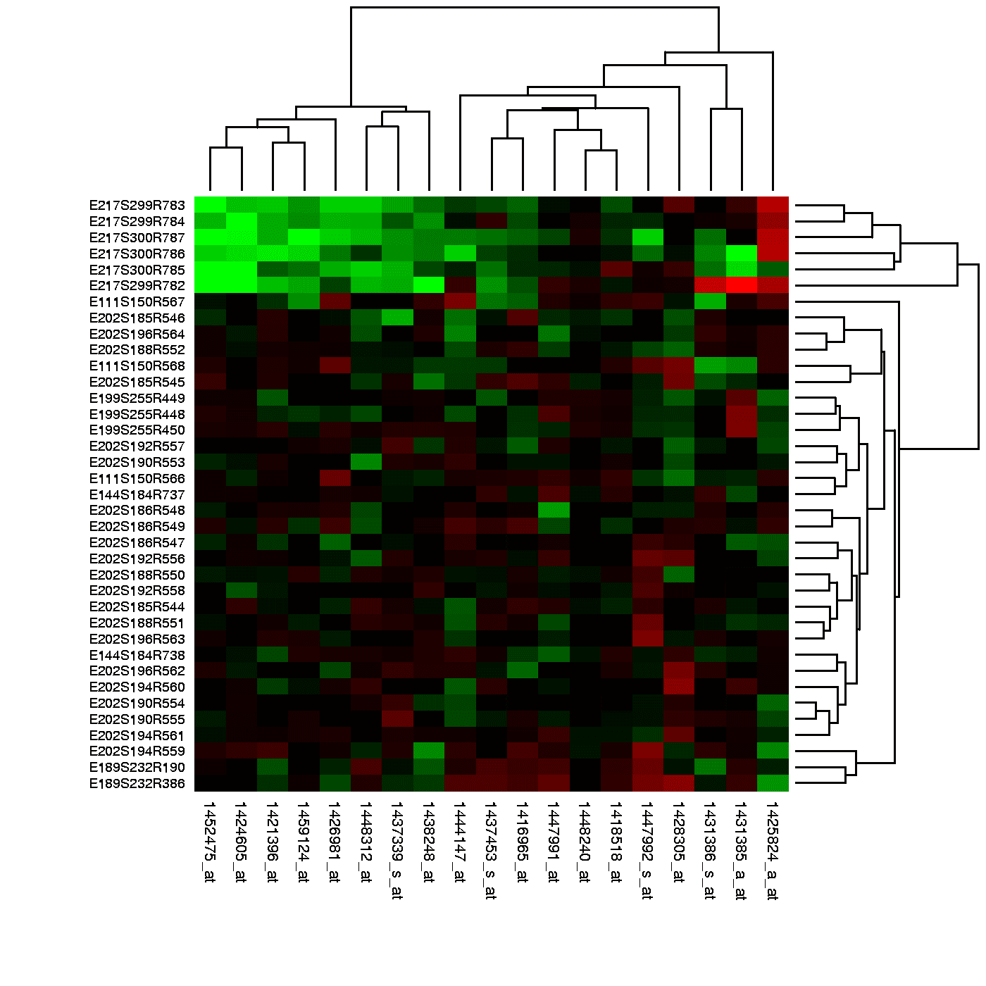
A heatmap is like coloring in a spreadsheet, using color to show the magnitude of values in a 2D grid. It's used to spot user engagement hotspots on a webpage, analyze financial data, or visualize gene expression.
Data Quality Management: Is Your Data Fit for Use?
Data quality management ensures data is "fit for purpose." It's vital when training ML models or creating financial reports, as outcomes depend on data reliability. The footgun is treating quality as a one-time project, not a continuous process.

Label Encoding: Turning Categories into Numbers
Label Encoding turns text categories into numbers, like assigning bib numbers to runners. It's essential for algorithms that need numerical input, but its biggest footgun is creating a fake order (e.g., 2 > 1) that can mislead linear models and neural…
Regular Expressions for Data Cleaning
Regex is a mini-language for describing text patterns, letting you find and fix messy data at scale. It's used to standardize phone numbers or extract zip codes from addresses. The footgun: complex regex is often unreadable and a maintenance nightmare.
Binning: Grouping Continuous Data into Buckets
Binning is like rounding, but for ranges. It groups continuous data into discrete 'buckets' to reduce noise. This turns messy user ages (21, 22.5) into clean categories (20-29) for analysis. The footgun: poor bin sizes can hide or create false trends.
Querying NoSQL: It Depends on the Data Model
Querying NoSQL isn't one-size-fits-all; the method depends on the data model (key-value, document, graph). This is used for large, unstructured datasets like social feeds. The footgun is assuming SQL works everywhere; many require a model-specific API.
robots.txt: The Web's 'Keep Off The Grass' Sign
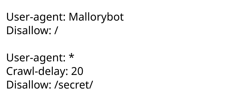
robots.txt is a public file suggesting which parts of a site web crawlers shouldn't visit, like admin areas. The footgun: it's a polite request, not a security wall. Malicious bots will ignore it, so never use it to hide sensitive data.
Webhooks: Don't Call Us, We'll Call You
A webhook is an automated HTTP callback from a service to your app when an event happens. Instead of polling for updates, the service calls you. This is how Stripe signals a payment or GitHub a commit.
GraphQL Queries: Ask for Exactly What You Need
GraphQL lets clients ask for exactly the data they need in a single call, like a flexible SQL query for your API. It avoids the over-fetching of fixed REST endpoints, making apps faster. The footgun: complex client queries can overload your server.
HTML Parsing: Turning Web Pages into Data
Think of HTML parsing as X-ray vision for web pages, revealing the underlying data structure. It's used for web scraping and automated testing. The main footgun is using regex; a real parser is robust against markup changes.
API Authentication: Who Goes There?
API authentication is the bouncer at your application's door, checking IDs to prove who is making a request. It's used to protect any networked service, from weather data to banking.
dplyr: A Grammar for Data Manipulation
dplyr offers a consistent grammar for data manipulation, letting you chain simple verbs to perform complex transformations. It's essential for cleaning, summarizing, and reshaping data frames in R.
ggplot2: Building Graphics with a Grammar
ggplot2 treats plots like sentences. You declare components—data, aesthetics (x/y axes, color), and geoms (points, bars)—and it assembles the visual. It's essential for data exploration in R, letting you iterate by swapping layers.
Tidy Data: One Variable, One Column
Tidy data is a standard for structuring datasets: each column is a variable, each row an observation. This format simplifies analysis, as tools can expect a consistent input shape.
We are hiring for this. Every open role lists the topics its interview covers, so you can prepare for the real thing rather than guessing.
See open roles