Easy concepts in Analytics & Metrics

Key Performance Indicators (KPIs)
A KPI isn't just any metric; it's a measurable value showing how effectively you're achieving a key business objective. It's used to track things like website uptime or customer acquisition cost.
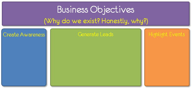
Analytics Measurement Plan: From Why to What
An analytics measurement plan forces you to define success before you look at data. It connects high-level business objectives to specific user actions and sets clear targets.
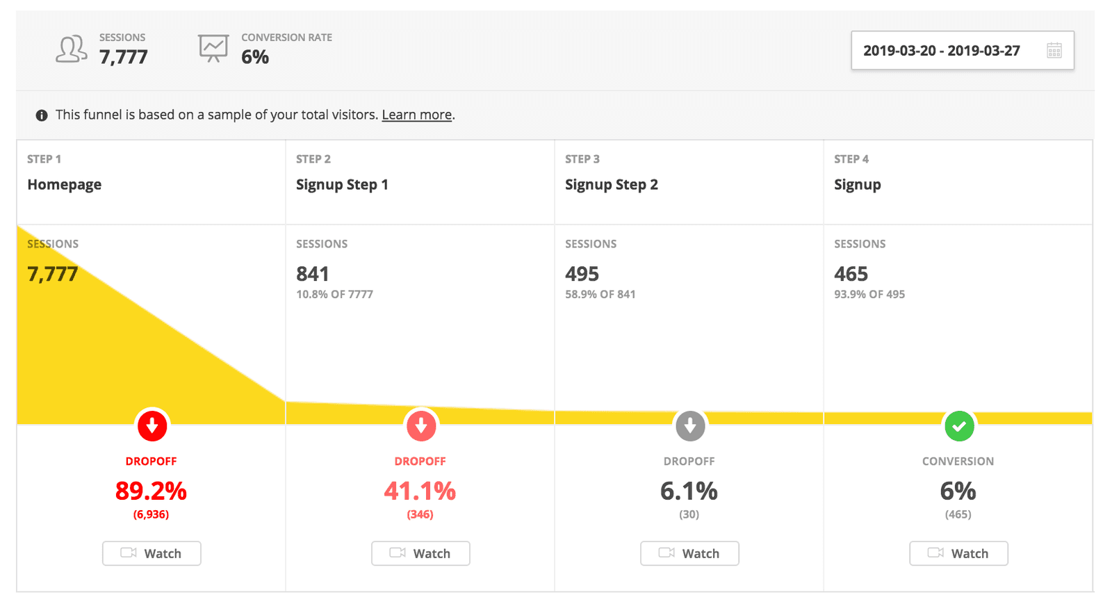
Funnel Analysis: Pinpointing Where Users Drop Off
Funnel analysis treats a user journey like a real-world funnel, showing exactly where people 'leak' out before reaching a goal. It's key for optimizing e-commerce checkouts or app sign-ups. The footgun is only looking at the final conversion rate.
Leading vs. Lagging Indicators: Looking Forward vs. Backward
Leading indicators predict the future; lagging indicators confirm the past. This distinction is key for analyzing business cycles or system health. The main footgun is relying only on lagging data, forcing you to react to problems that have already occurred.

Event Tracking: Measuring What Users Do
Event tracking turns user actions like clicks and purchases into analyzable data. Analytics platforms use this data to report on engagement and conversions. The biggest footgun is inconsistent naming, which pollutes your data and breaks reports.
UTM Parameters: Know Exactly Where Your Traffic Comes From
UTM parameters are like labels on your website visitors, telling you which marketing campaign brought them. They're added to URLs in ads or emails to measure channel effectiveness. The footgun is inconsistent naming, which splits data and ruins analysis.
Tag Management Systems: Control Your Analytics Snippets
A Tag Management System (TMS) is a single container for all the analytics and marketing scripts you'd otherwise hardcode. Instead of asking engineers to add new scripts, you add them via a web UI.
Analytics Consent Management: Respecting User Choices
Consent management is the system that asks users for tracking permission and technically enforces their choice. It's legally required for sites using Google Analytics or Ads.

ETL: The Assembly Line for Your Data
ETL (Extract, Transform, Load) is an assembly line for data, moving it from various sources into a single destination for analysis. It's used to populate data warehouses by combining data from databases, logs, and APIs into a unified view.
ELT: Load Raw Data First, Transform It Later
ELT pipelines load raw data directly into a data lake *before* any transformation. This speeds up ingestion and lets you figure out the data's structure later.

Data Warehouse: The Single Source of Truth for Analytics
A data warehouse is a central database optimized for analytics, not transactions. It integrates historical data from disparate sources like sales and marketing to create a single source of truth for business intelligence.
Online Analytical Processing (OLAP)
OLAP databases are built to quickly answer complex, multi-dimensional questions, unlike transactional (OLTP) databases that handle individual records. They power business intelligence tools for sales and marketing analysis.
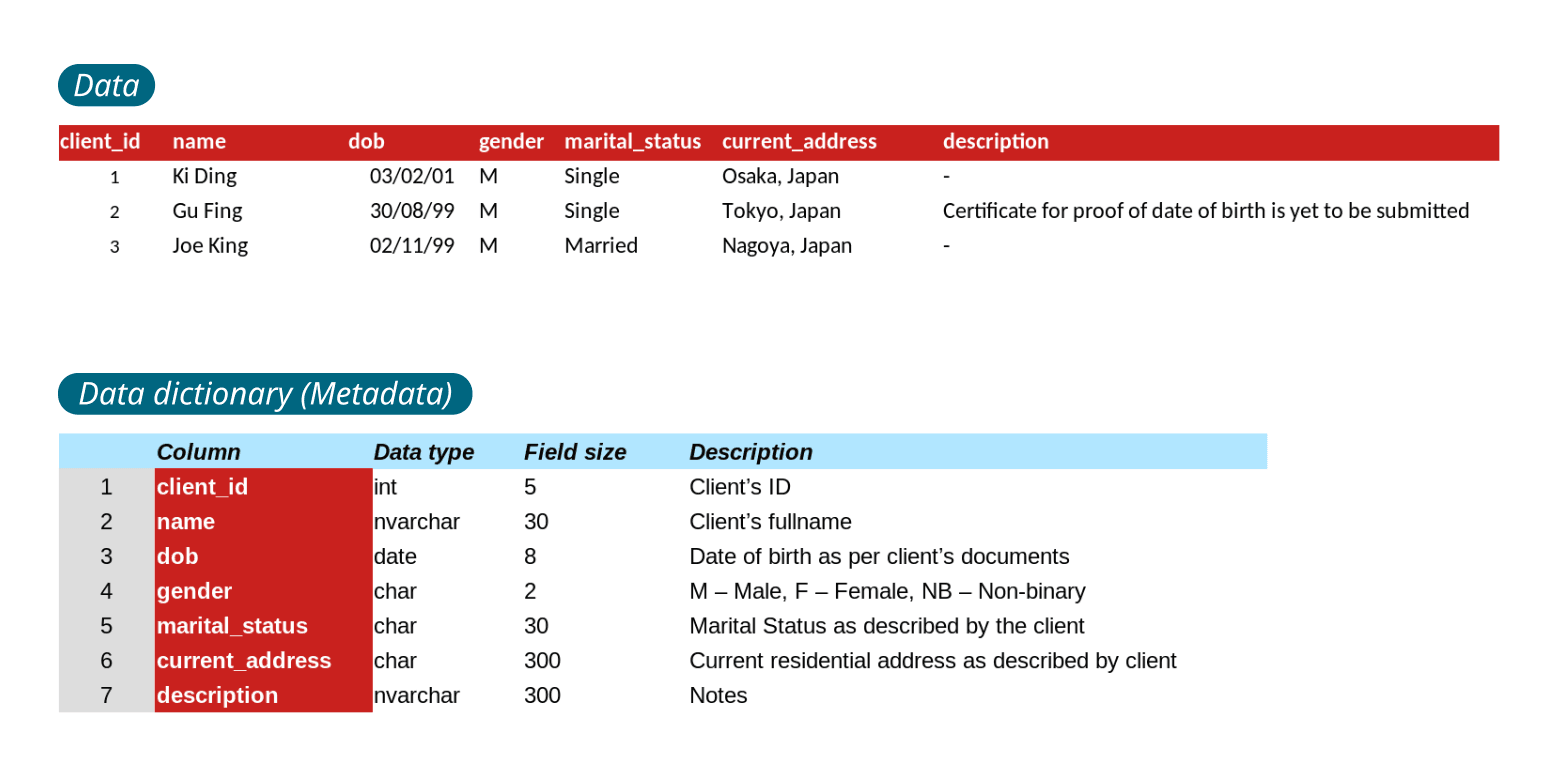
Data Dictionary: The 'About' Page for Your Data
A data dictionary is the instruction manual for your database, defining what each piece of data means and how it's formatted. It's used by engineers to understand a schema or by analytics tools to interpret columns. The biggest footgun is letting it go stale.
PII: Data That Identifies a Real Person
PII is any data that can identify a real person. Email addresses, IP addresses, and device IDs all count, so analytics systems must mask or hash them before storage. A leaked salt can still expose a hashed email, so do not assume hashing removes PII.
Data Cleansing: Fixing Your Data Before It Fails You
Data cleansing is quality control for your dataset, finding and fixing errors before they skew your analysis. It's a crucial first step in any data pipeline, from training an ML model to generating business reports. The footgun is assuming data is clean.
Data Validation: Garbage In, Garbage Out
Data validation is the bouncer for your app, checking data at the door to ensure it's correct and useful. It's used on user forms, API requests, and file imports. The footgun is skipping it, which risks corrupted data, security holes, and future crashes.
Report Generation: Turning Raw Data into Human-Readable Documents
Report generators translate raw data into formatted documents for human eyes. They power business dashboards and sales summaries. The main footgun is forgetting the report is a stale snapshot, not the live data source itself.
Descriptive Statistics: What Your Data Looks Like
Descriptive statistics summarize the data you have, painting a picture of your sample without making guesses about the wider world. It's used for calculating things like average age or max response time.
Business Intelligence (BI) Tools: From Raw Data to Dashboards
BI tools turn raw company data into visual dashboards and reports. They let non-technical teams explore sales trends or user behavior from a data warehouse, but remember: a slick dashboard built on messy data is just a pretty lie.

Anscombe's Quartet: When Numbers Lie
Anscombe's Quartet shows how four datasets can share identical summary stats (mean, variance) but look completely different when plotted. It's a classic reminder to always visualize your data before trusting numerical summaries.
We are hiring for this. Every open role lists the topics its interview covers, so you can prepare for the real thing rather than guessing.
See open roles