Intermediate concepts in Analytics & Metrics, page 4
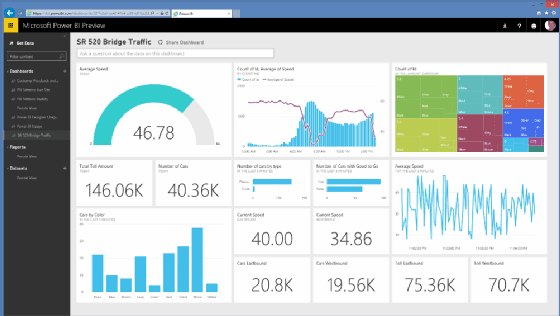
Self-Service Analytics: Let Teams Answer Their Own Data Questions
Self-service analytics gives business teams tools like Power BI to explore data and build reports without waiting for an analyst. This speeds up decision-making by giving teams direct data access.

Data Visualization: Telling a Story with Data
Data visualization turns raw numbers into graphics that reveal hidden patterns. It’s about designing visuals to help people quickly explore and interpret complex information, like using infographics to convey a concise message to the public.

Experimentation Culture: Data Over Opinions
An experimentation culture prioritizes data over intuition, treating business ideas as testable hypotheses. It's crucial in product development for A/B testing features and UI. The footgun is only testing minor tweaks instead of challenging core assumptions.

Vanity vs. Actionable Metrics: Measure What Matters
Actionable metrics are levers that change business outcomes; vanity metrics are scoreboard numbers that feel good but don't inform decisions. Use this distinction when setting KPIs to avoid the footgun of celebrating 'total downloads' over actual retained…

The North Star Metric: A Single Focus for Product Strategy
A North Star Metric is the one number that best captures the core value your product delivers to customers. It aligns entire teams on a single goal, simplifying prioritization and reducing wasted work. The footgun is mistaking revenue for a North Star.

AARRR Framework: Pirate Metrics for Growth
The AARRR framework models your business as a five-stage customer funnel: Acquisition, Activation, Retention, Referral, Revenue. It's used to pinpoint leaks in your growth engine. The footgun is tracking raw counts instead of conversion rates between stages.
The HEART Framework: Measuring User-Centric Success
The HEART framework measures user-centric success, not just clicks. It provides five categories (Happiness, Engagement, Adoption, Retention, Task Success) to track product health.
Marketing Attribution: Deciding Who Gets Credit for a Conversion
Attribution modeling decides which marketing touchpoint gets credit for a conversion. It's used to justify ad spend by assigning value to channels like email, social, or search. The biggest footgun is using a simple model that overvalues the final click.
Sessionization: Turning Raw Events into User Stories
Sessionization groups a user's raw clicks and page views into a single "visit." It's used to analyze conversion funnels and calculate metrics like time-on-site. The main footgun: your definition of a "session" is arbitrary and can skew results.
Tracking Schema: Your Analytics Naming Convention
A tracking schema is the shared dictionary for your analytics, defining how you name user actions (events) and their details (properties). It's crucial for ensuring one team tracks "Song Played" the same way as another.

Period-over-Period Analysis: Measuring Change Over Time
Period-over-Period analysis answers 'Are we getting better?' by comparing metrics from consecutive time blocks, like this month's sales vs. last month's. The footgun is ignoring seasonality, which can create false signals of growth or decline.

Multivariate Testing: Finding the Best Combination
Multivariate testing (MVT) finds the best *combination* of changes, not just the best single change. It tests multiple elements at once, like three headlines and two button colors, to see how they interact.
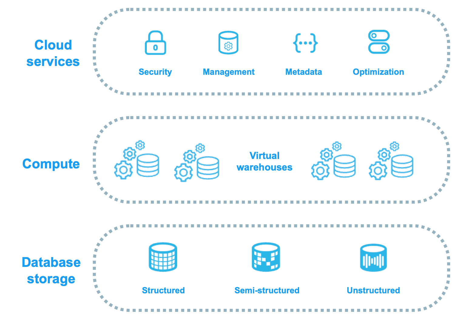
Snowflake: Decoupled Storage and Compute
Snowflake decouples storage from compute, acting like a shared-disk system for data management but a shared-nothing system for query performance. This lets you scale compute and storage independently, ideal for variable analytic workloads.
Data-as-a-Product: Treat Your Data Like Software
Data-as-a-Product (DaaP) treats internal datasets like software, with owners, versions, and SLAs. This provides reliable, self-service data for consumers like analysts or other apps.

Time to Value (TTV): From Signup to 'Aha!'
Time to Value (TTV) measures the time from a user's first touch to their first 'aha moment' of real value. It's crucial for optimizing onboarding and reducing churn. The main footgun is defining value from the company's view, not the customer's.

Analytics CoE: Centralizing Your Data Strategy
An Analytics Center of Excellence (CoE) is an internal data consulting group, centralizing experts to set standards and drive strategy. It helps large organizations standardize data quality and tooling. The footgun: becoming a bottleneck that slows teams down.

Data Dashboards: The Single-Page Business Story
A data dashboard is the executive summary for your metrics, telling a story on a single page with key visualizations. It consolidates data from multiple reports, providing a high-level view to monitor business performance.

Color Theory: Guiding the Eye in Data Visualization
Color in a chart is a cognitive shortcut, telling the viewer's brain what to notice and how to feel. Use it to highlight trends (green for growth) or group categories. The footgun is using too many colors, which creates noise and obscures insights.
GSM: Connect Your Goals to Real Metrics
The GSM framework turns fuzzy goals into concrete numbers by linking what you want (Goal), to observable behaviors (Signal), to a specific measurement (Metric). It's used to define KPIs for new features. The footgun is choosing easy-to-measure vanity metrics.
Pre-attentive Attributes: How Your Brain Sees Data First
Pre-attentive attributes are visual properties your brain processes instantly, before conscious thought. They're used in data visualization to make key information 'pop,' like using color to highlight an outlier.
We are hiring for this. Every open role lists the topics its interview covers, so you can prepare for the real thing rather than guessing.
See open roles