Easy everything in Analytics & Metrics, page 2
Outline an automated pipeline to load a daily CSV into a database
Event trigger on drop, schema validation, idempotent load, and observability.

Differences between ETL and ELT, and when to choose each
ETL transforms before loading for structured data; ELT loads raw first and transforms in the warehouse for scale.

How do you translate increase user engagement into a technical measurement plan?
Align with PM to define engagement, map touchpoints for events, pick a north star and guardrails, then draft technical schema.
MRR: The Subscription Heartbeat
MRR is the monthly pulse of a subscription business. SaaS teams use it to forecast growth and measure churn. Counting one-time fees or annual contracts without proration inflates the metric and misleads stakeholders.
PII: Data That Identifies a Real Person
PII is any data that can identify a real person. Email addresses, IP addresses, and device IDs all count, so analytics systems must mask or hash them before storage. A leaked salt can still expose a hashed email, so do not assume hashing removes PII.
Instrumenting a New User Interaction in a Mobile App
Tests your understanding of the end-to-end analytics pipeline. A good answer defines the event, instruments it on the client with an SDK, verifies it in a debug view, and confirms its arrival in the data warehouse after the ETL process.
How would you build a weekly active user dashboard?
This tests translating a business need into a technical spec. First, clarify the definition of "active." Then, identify the event data needed (user_id, timestamp). Finally, outline the ETL and BI tool steps. A red flag is not clarifying the metric first.

Track an 'Export to CSV' button's usage
This tests modeling a feature's full lifecycle (intent, success, failure) in analytics. Propose one custom event like export_interaction with a status parameter ('success', 'failure') fired on completion, not just on click.

Describe tracking a user event from frontend to BI tool
Tests your grasp of the modern data stack. A great answer outlines the five stages: frontend emission, ingestion, loading into a warehouse, transformation, and BI visualization. A red flag is describing only the frontend code and ignoring the data pipeline.
How would you capture UTM parameters for attribution?
This tests your grasp of the data lifecycle from capture to persistence. A good answer covers client-side parsing, cookie storage, and linking anonymous data to a user record upon sign-up. A red flag is forgetting to persist the data server-side.
Describe the client-side event for an 'Add to Cart' button
Tests your knowledge of standard analytics schemas (like GA4) and designing payloads for business analysis. A great answer names the 'add_to_cart' event, details the 'items' array with product data, and mentions user/session context.

How would you measure a sales forecast model's accuracy?
Tests if you can link statistical metrics to business outcomes. Define MAE (average error) and RMSE (penalizes large errors). Choose RMSE when large misses are costly (e.g., stock-outs), MAE otherwise. A red flag is reciting formulas without business context.
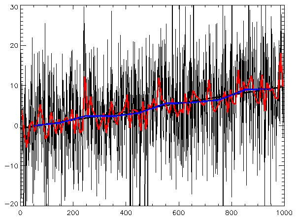
How would you analyze a time series of user sign-ups?
This tests your structured approach to decomposing time series data. A strong answer identifies trend (long-term growth), seasonality (weekly/yearly patterns), and irregular components like spikes or dips.
How would you A/B test a 'Buy Now' button color change?
Tests your grasp of the A/B testing lifecycle. A strong answer defines a clear hypothesis (e.g., 'a green button will increase clicks'), selects a primary metric (CTR), and considers guardrail metrics. A red flag is skipping the hypothesis and metrics.
What does a p-value of 0.03 mean in an A/B test?
This tests your grasp of statistical significance and ability to make a data-driven decision. A great answer defines p-value, compares it to alpha (0.03 < 0.05), and concludes to reject the null hypothesis. A red flag is misstating the p-value's definition.
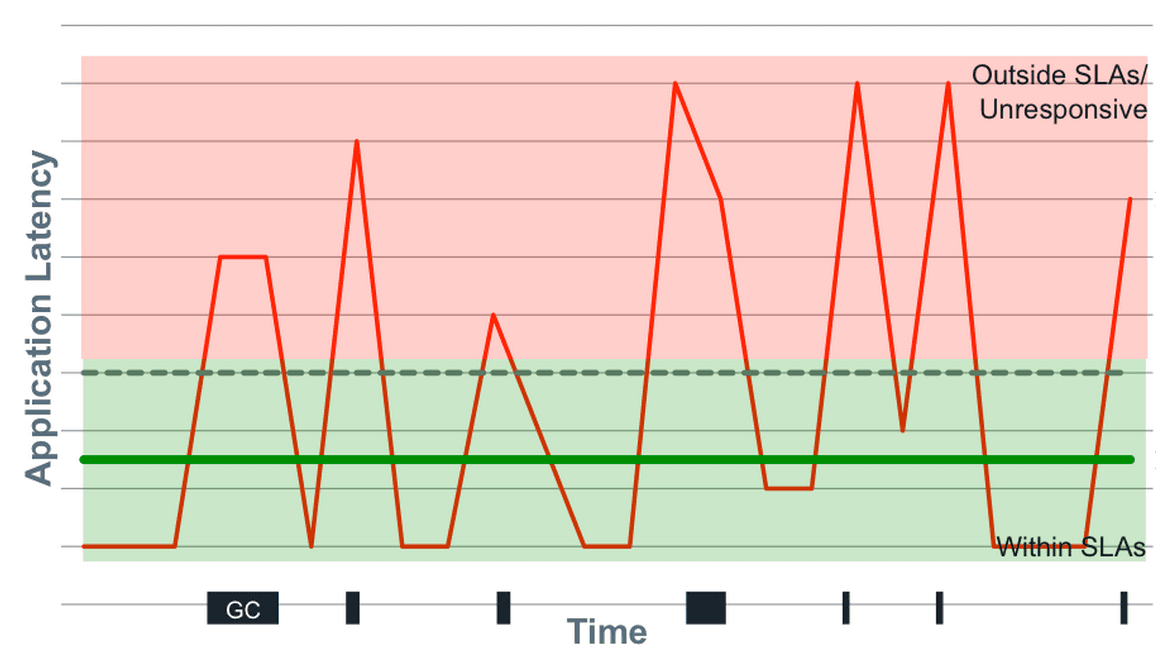
Mean vs. Median for API Response Times?
Tests your understanding of non-normal distributions like latency. Choose median as it's robust to outliers that skew the mean. Then, state that even median is insufficient; percentiles (p99, max) are crucial for capturing the full user experience.
Is Feature X Causal for 20% Higher Retention?
This tests your ability to separate correlation from causation. A great answer first identifies confounding variables (e.g., power users), then proposes an A/B test to isolate the feature's true effect, and finally suggests quasi-experiments if a test isn't…
DAU dropped 10%. How do you investigate?
Tests structured problem diagnosis. First, verify the data isn't corrupt. Then, segment the drop by user type (new vs. returning), platform (iOS/Android/Web), and geography to isolate the 'what' before hypothesizing the 'why'.
Bar Chart vs. Line Chart for Market Share Comparison?
This tests your grasp of visualization fundamentals for categorical vs. time-series data. A bar chart is correct for comparing discrete categories (companies) at one point in time. A line chart wrongly implies a trend. Red flag: justifying a line chart.

When is a pie chart an appropriate visualization?
Tests your grasp of data viz principles for part-to-whole data. A good answer defines this use case (e.g., market share), then lists pitfalls like too many slices or comparing multiple pies. A red flag is defending pie charts for complex data.
We are hiring for this. Every open role lists the topics its interview covers, so you can prepare for the real thing rather than guessing.
See open roles