Easy everything in Analytics & Metrics, page 5
Google BigQuery: A Serverless Data Warehouse
Think of BigQuery as a massive SQL database you don't have to manage. It's a serverless data warehouse for analyzing huge datasets, like terabytes of application logs. The footgun is treating it like a regular database for real-time transactions.
Jupyter Notebooks: Interactive Code Sandboxes
Jupyter Notebooks are digital lab notebooks for running code, seeing output, and writing notes in one place. Data scientists use them for exploration, visualization, and prototyping.
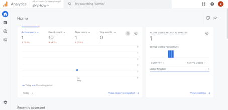
Google Analytics 4
Google Analytics is a service for tracking user activity across websites and mobile apps. It helps measure marketing performance by tracking traffic and user 'events'. The footgun is focusing on raw traffic instead of the events that signal valuable actions.

Customer Retention Rate: Your Leaky Bucket Metric
Customer Retention Rate measures how many customers you keep over a period, showing how "leaky" your business's bucket is. It's vital for subscription services and e-commerce to gauge loyalty and predict revenue. A high overall rate can hide dangerous churn.
Net Promoter Score (NPS): A Snapshot of Customer Loyalty
NPS distills customer loyalty into one number by asking, "How likely are you to recommend us?" It's a quick pulse check for product teams. The footgun is treating the score as a diagnosis; it tells you *what* customers feel, but not *why*.
Customer Acquisition Cost: What It Costs to Win a Customer
Customer Acquisition Cost (CAC) is the total price you pay in sales and marketing to get one new customer. Businesses use it to see if their model is viable by comparing it to customer lifetime value (LTV). The footgun is forgetting to include all costs.
Stationarity: A Time Series's Stable Personality
A time series is stationary if its statistical personality, like its average and spread, remains constant over time. Many forecasting models require this stability to work correctly.

Moving Average: Smoothing Out the Noise in Data
A moving average smooths out noisy data by replacing each point with the average of its neighbors, revealing the underlying trend. It's used to track stock prices or server metrics without overreacting to short spikes.
Twyman's Law: Interesting Data is Usually Wrong
Twyman's Law states that any data point that looks interesting is probably wrong. Before celebrating a sudden 10x spike in user engagement, first suspect a bug in your analytics pipeline or a bot attack.
Selection Bias: When Your Sample Skews Your Results
Selection bias occurs when your data sample isn't random, leading to flawed conclusions. This happens when surveying only volunteers or analyzing a non-representative group. The footgun is assuming your data reflects the whole population when it doesn't.

Law of Large Numbers: More Data, Truer Average
The more you repeat an experiment, the closer your average result gets to the true, underlying average. This is why A/B tests need sufficient traffic and casinos can reliably predict earnings. The footgun is mistaking it for the 'law of averages' fallacy.
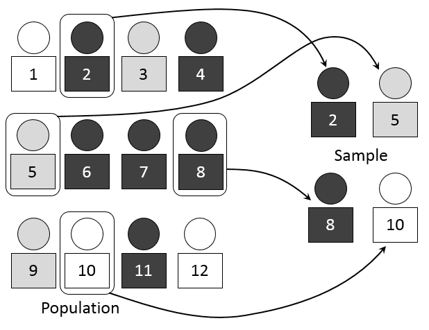
Sampling: Estimating the Whole from a Small Part
Sampling lets you understand a large group by studying a small, representative piece. Think of it like tasting a spoonful of soup to season the whole pot. It's used in A/B tests and polls, but the main footgun is a biased sample.

Probability Distribution: Mapping What's Possible
A probability distribution maps every possible outcome of a random event to its likelihood. It's used in A/B testing to model conversions or in monitoring to predict server load. The footgun is assuming every distribution is a bell curve; many are not.
Root Cause Analysis: Stop Fixing Symptoms, Find the Source
Root Cause Analysis digs past surface-level symptoms to find the true origin of a problem. It’s used to analyze IT outages, manufacturing defects, and even medical misdiagnoses.
Correlation Is Not Causation
Just because two metrics move together doesn't mean one causes the other. This is vital when analyzing user data, as a feature launch might correlate with higher signups when the real cause was a marketing campaign.
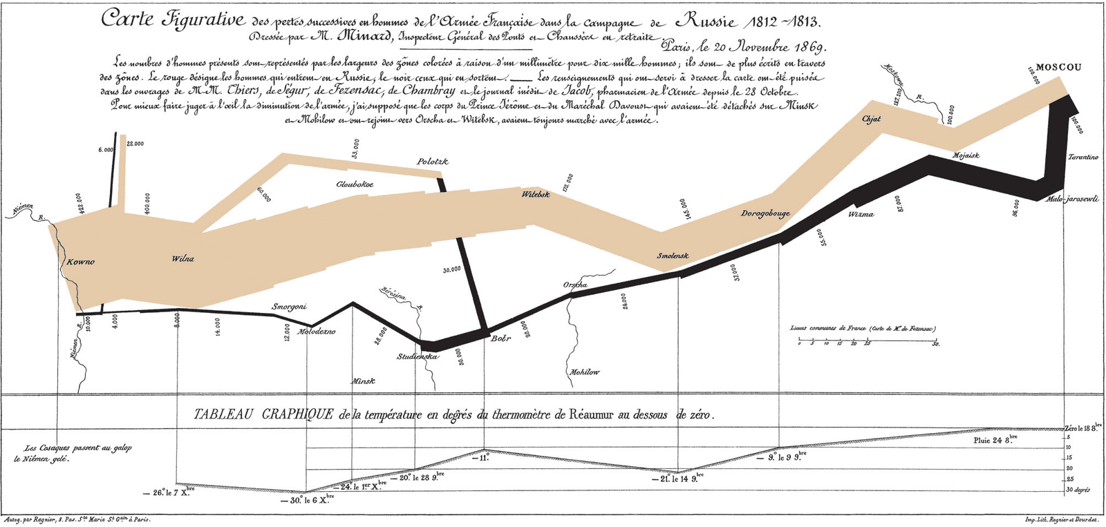
Exploratory Data Analysis (EDA): Look Before You Leap
Exploratory Data Analysis (EDA) is like being a detective with your data: you look for clues, patterns, and outliers before forming a theory. It's the first step in any data project, from building a model to creating a dashboard.
Gestalt Principles: How Brains Group Visuals
Gestalt principles explain why we see organized patterns, not random dots. Use them in data visualization to group related metrics with proximity or color, guiding users to see the intended story. Ignoring them creates confusing charts that obscure insights.

Chart Selection: Match Purpose, Not Looks
Start with the purpose, not the chart. The question you're asking—'how do these compare?' or 'what's the trend?'—determines the best visualization. A line chart shows trends; a bar chart compares categories.

Anscombe's Quartet: When Numbers Lie
Anscombe's Quartet shows how four datasets can share identical summary stats (mean, variance) but look completely different when plotted. It's a classic reminder to always visualize your data before trusting numerical summaries.
Business Intelligence (BI) Tools: From Raw Data to Dashboards
BI tools turn raw company data into visual dashboards and reports. They let non-technical teams explore sales trends or user behavior from a data warehouse, but remember: a slick dashboard built on messy data is just a pretty lie.
We are hiring for this. Every open role lists the topics its interview covers, so you can prepare for the real thing rather than guessing.
See open roles