Advanced concepts in Design Systems

Measuring Design System Health and ROI
A design system isn't a one-off project; it's a product that decays without measurement. Track metrics like component adoption and design-to-code parity to prove its value and guide maintenance.
System of Systems: Managing Design Systems at Scale
A "system of systems" isn't one giant design system, but a fleet of interconnected ones. It's how large organizations manage multiple brands or products without total fragmentation.
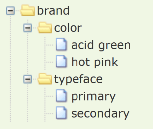
Token Tiers: From Raw Values to Component Properties
Token tiers layer your design system from abstract to concrete: raw values become semantic names, which then style components. This lets you change a core color and see it update everywhere.
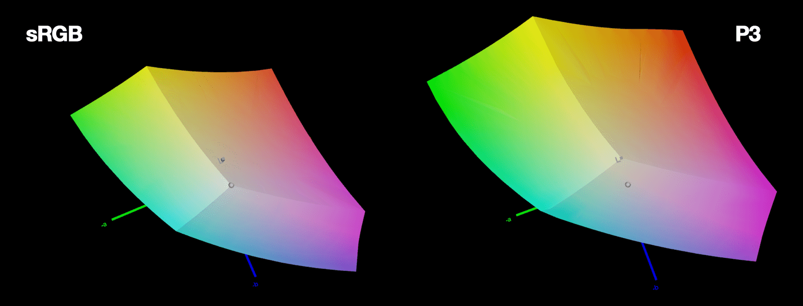
LCH Color: More Vivid, Predictable UI Colors
LCH is a color space that aligns with human perception. It fixes HSL's broken lightness and unlocks 50% more vivid colors on modern screens. The footgun: LCH hue angles don't match HSL's; 0° is magenta, not red, so you can't just swap them.
Automated Token Pipelines: A Single Source of Truth
Automated token pipelines turn design decisions into code, using a standard format to sync styles from design tools to production. This is critical for multi-platform systems, preventing drift.
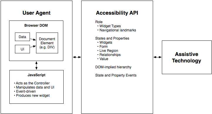
WAI-ARIA: A Script for Custom UI Accessibility
WAI-ARIA gives custom UI a voice for assistive tech. It's the script telling a screen reader what a <div> acting as a button is and if it's "pressed." Use it for custom widgets when native HTML can't.
Tree Shaking: Shipping Only the Code You Use
Tree shaking is a build-time optimization that eliminates unused code. For component libraries, it means importing a Button won't bundle the unused DataGrid. The main footgun is side effects: code that modifies global state can't be safely removed.
ESM vs. CJS: Navigating JavaScript's Module Divide
JavaScript has two module systems: modern, static ESM (import) and legacy, dynamic CJS (require). When publishing a library, you must support both. The footgun is shipping only ESM, as it breaks downstream projects that still use require().
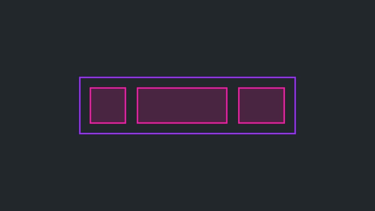
The Slot Pattern: Making UI Components Composable
The Slot Pattern makes components flexible by defining areas for custom content, like a picture frame for your UI. It's used in Cards or Modals to allow varied content in a consistent frame. The footgun is that too much flexibility can break consistency.

Pitching Design Systems with Business Value
Design systems fail without people, not tools. Pitch them by asking stakeholders if they like saving time and money, then frame consistency, speed, and shared vocabulary as business value instead of design ideology.

Automated Prop Docs with Storybook Autodocs
Treat your component stories as the single source of truth for documentation. Storybook's autodocs reads your code to generate interactive docs automatically. It's used in design systems to prevent stale docs. The footgun: sparse types yield sparse docs.
Chromatic: Visual Regression Testing for Components
Chromatic is a smoke detector for your UI's appearance, taking snapshots of every component on every commit to catch unintended visual changes. It's used in CI/CD to prevent visual regressions when refactoring. The footgun is relying on it for business logic.
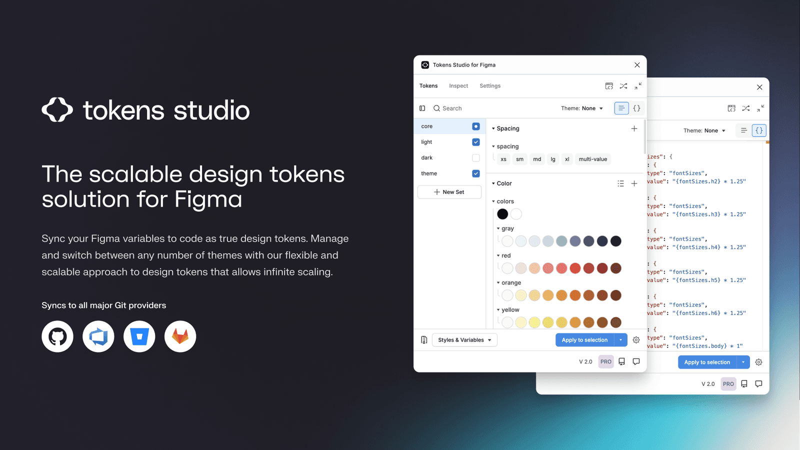
Token Studio: Bridge Figma Designs to Production Code
Token Studio is a control panel for your design system's raw values, bridging Figma with production code. Use it to manage themes and sync design decisions to a developer-accessible Git repo. The main footgun is using it only locally for Figma styles.
Forced Colors Mode: When the User Overrides Your Palette
Forced Colors Mode is an accessibility feature where the browser overrides your site's colors with a user-defined, high-contrast palette. This ensures readability for users who depend on it. The footgun is disabling it and making your UI invisible.

Accessibility E2E Testing: Automating User Journeys
Accessibility E2E testing integrates automated checks into simulated user journeys, testing the rendered app as a user would. It's used in CI/CD to validate flows like sign-up or checkout.
VPAT vs. ACR: The Nutrition Label for Accessibility
An ACR is a standardized report card for a product's accessibility, based on a template called a VPAT. It's a nutrition label stating conformance facts, not a pass/fail grade.
Design System Governance: Preventing UI Drift
Design system governance is the rulebook that stops your UI from becoming a free-for-all. It's used to manage contributions, maintain consistency, and ensure updates are intentional, preventing drift as teams and products scale.
Contributor License Agreement (CLA): A Legal Pre-Nup for Code
A Contributor License Agreement (CLA) is a legal pre-nup for code contributions, giving the project owner clear rights to use your work. It's used by projects like Angular or Go to avoid legal ambiguity. The footgun is confusing it with the project's license.

Licensing Your Open Source Design System
An open-source license legally defines how others can use, modify, and share your design system. It's essential when sharing a system publicly to encourage adoption. The biggest footgun is not choosing one, which defaults your work to 'look but don't touch'.
Gamification for Design System Engagement
Turn design system adoption from a chore into a challenge by applying game mechanics. Use it to track component usage or encourage contributions with leaderboards and achievements.
We are hiring for this. Every open role lists the topics its interview covers, so you can prepare for the real thing rather than guessing.
See open roles