Intermediate everything in Design Systems, page 7
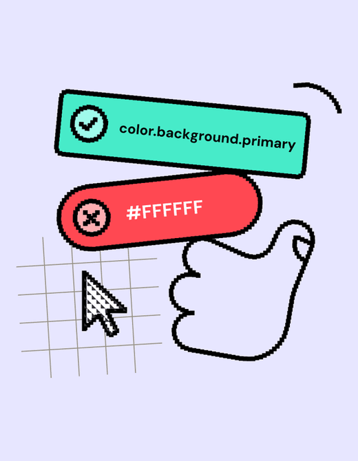
Design Linting: A Spellchecker for Your Designs
Design linting is like a spellchecker for your design files, automatically flagging inconsistencies against your design system's rules. It helps maintain visual consistency at scale and speeds up design reviews.
Your Design System's SLA: The Contract for Reliability
A Design System SLA is a contract defining the system's reliability and support promises. It specifies uptime guarantees, support hours, and incident response times, helping you assess if the system is a dependable foundation for your product.

Shift-Left Accessibility: Build It In, Don't Bolt It On
Shift-left accessibility treats accessibility as a core feature, not a last-minute fix. It integrates checks throughout the development lifecycle, from design to deployment, preventing costly rework. The footgun is treating it as just an earlier QA step.
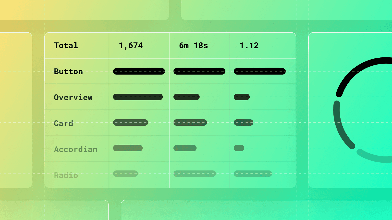
Measuring Documentation Effectiveness
Treat your design system docs like a product, not a library. Use analytics on page views, search queries, and user feedback to find confusing components and content gaps. The footgun: high traffic can signal a confusing page, not just a popular one.
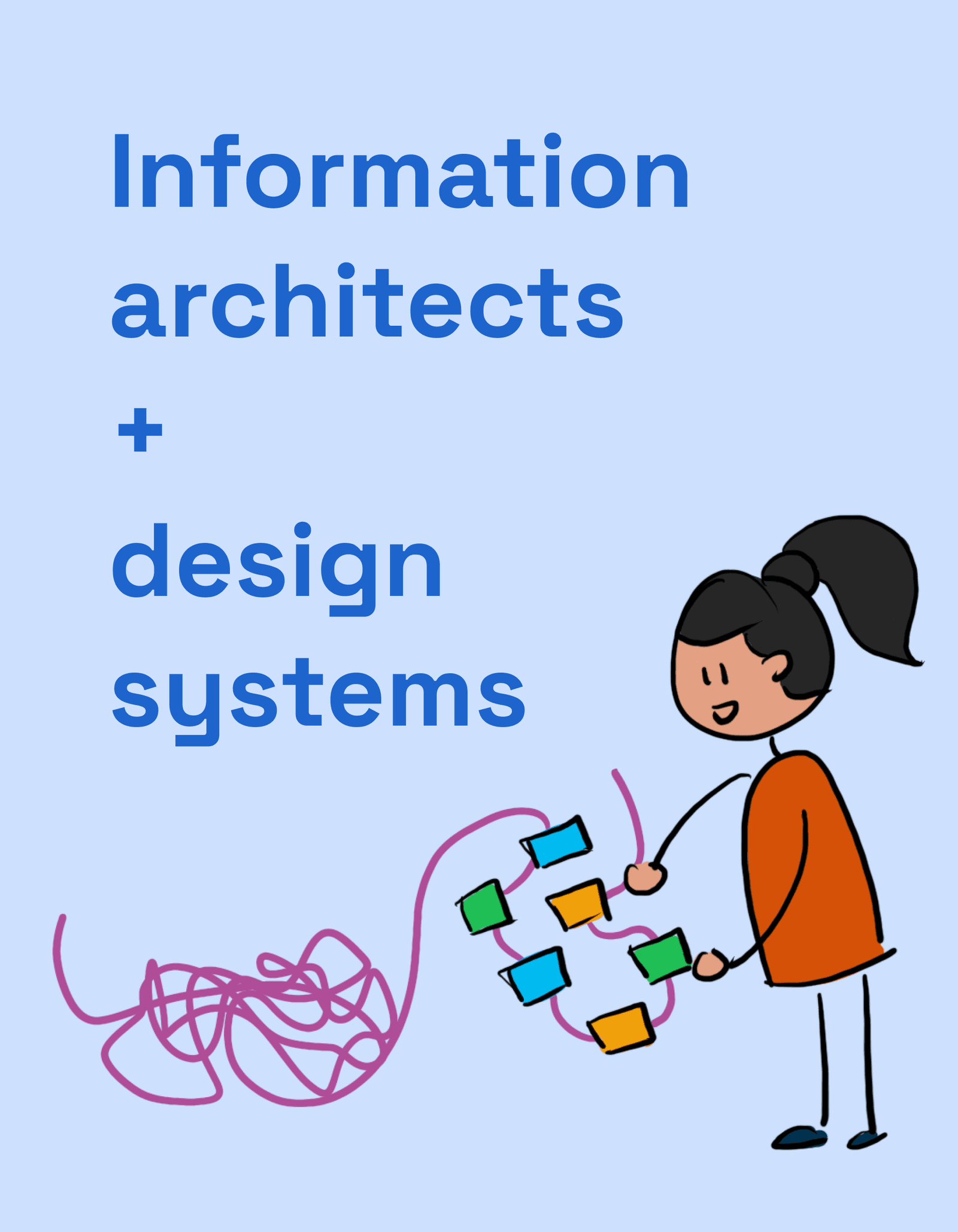
IA: How to Organize Docs So People Use Your Design System
Think of your design system docs like a library. Information Architecture (IA) is the shelving and catalog system that lets users find the right component or guideline. It's crucial for any system where discoverability impacts adoption.

Empty State Pattern: More Than Just a Blank Page
An empty state turns a blank screen into a helpful guide, showing users what's possible and how to get there. It's crucial for first-time use, 'no results' searches, or after data deletion. The footgun is treating it as an afterthought, leaving users stuck.
Semantic Colors: Naming a Color's Job, Not Its Value
Semantic colors name a color's purpose (e.g., color-background-interactive) instead of its value (#007BFF). This simplifies theming, like light/dark mode, by mapping roles to specific primitive colors, ensuring a consistent UI across an application.
Design System Adoption: Treat It Like a Product
Treat your design system like a product you're selling to internal teams, not just a library. Without an adoption strategy focused on real workflows, even a perfect system will be ignored, leading teams to build from scratch or create their own mini-systems.

Design System Governance: A Process for Evolution
Design system governance is a process for when components don't meet a team's needs. It guides teams on whether to create a one-off "snowflake" or contribute a new component back to the system. The footgun is letting teams "find a way," leading to chaos.

Systematizing Haptics: Beyond Simple Vibrations
Treat haptics like a design system for touch, not just random vibrations. Use them to confirm actions or signal state changes. The biggest footgun is overuse, which turns meaningful feedback into annoying noise that users will disable.
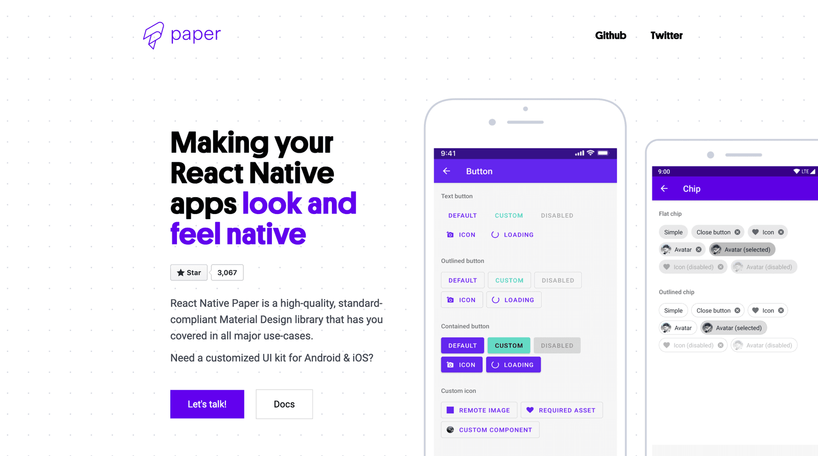
Using Component Libraries in React Native
A component library is a pre-fab UI kit for your app. Instead of building every button from scratch, you get polished, ready-to-use pieces that handle platform-specific animations and accessibility.

CSS `color-scheme`: Opting Into Browser UI Themes
The color-scheme property tells the browser your site supports light/dark modes, automatically styling UI like scrollbars and form controls to match the user's OS preference.
Dynamic Theme Switching with CSS
Let your app's theme automatically follow the user's OS setting. CSS's prefers-color-scheme media query lets you define styles for light and dark modes. The footgun is forgetting the 'no-preference' state, which can result in an unstyled default.

White-Label UI: Design Once, Rebrand Infinitely
White-label UI is like a WordPress theme for your product: a single design that other companies can rebrand. It lets agencies serve multiple clients without rebuilding the UI from scratch.
Component Feature Flags: Opt-in to Breaking Changes
Component feature flags are a temporary opt-in switch for new versions, letting you adopt breaking changes before a major release. Design systems use them to roll out updates without forcing an immediate migration.
Release Trains: Aligning Multiple Agile Teams
A Release Train is a long-lived 'team of teams' (50-125 people) building a large solution together. It aligns multiple Agile teams to a common roadmap, ensuring they deliver value in sync.
Thematic Analysis: Finding Meaning in Qualitative Data
Thematic analysis turns messy qualitative data into clear insights. Instead of just counting words, you identify patterns of meaning—or themes—to understand the 'why' behind user feedback, interview transcripts, or support tickets.
Component Detachment Rate: A Design System Health Metric
Component Detachment Rate is a design system health metric, like customer churn. It tracks how often designers must break a component's link to its source to make custom changes, signaling that the component is too rigid or lacks needed variants.

How Design Systems Lower Your UI Bug Rate
A design system is a factory for pre-tested UI parts. By using standardized components instead of hand-crafting them each time, you reduce one-off bugs. This is a key metric for proving a design system's ROI, but teams often fail to track it.

Component Coverage: The 80/20 Rule for Design Systems
Component coverage applies the 80/20 rule to your UI, measuring what's built from a design system versus custom code. It helps track adoption and justify freeing up dev time for unique features.
We are hiring for this. Every open role lists the topics its interview covers, so you can prepare for the real thing rather than guessing.
See open roles