More in Design Systems — page 10

Shift-Left Accessibility: Build It In, Don't Bolt It On
Shift-left accessibility treats accessibility as a core feature, not a last-minute fix. It integrates checks throughout the development lifecycle, from design to deployment, preventing costly rework. The footgun is treating it as just an earlier QA step.
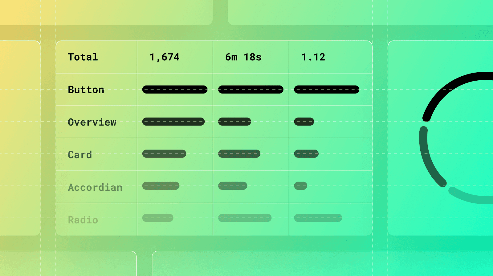
Measuring Documentation Effectiveness
Treat your design system docs like a product, not a library. Use analytics on page views, search queries, and user feedback to find confusing components and content gaps. The footgun: high traffic can signal a confusing page, not just a popular one.
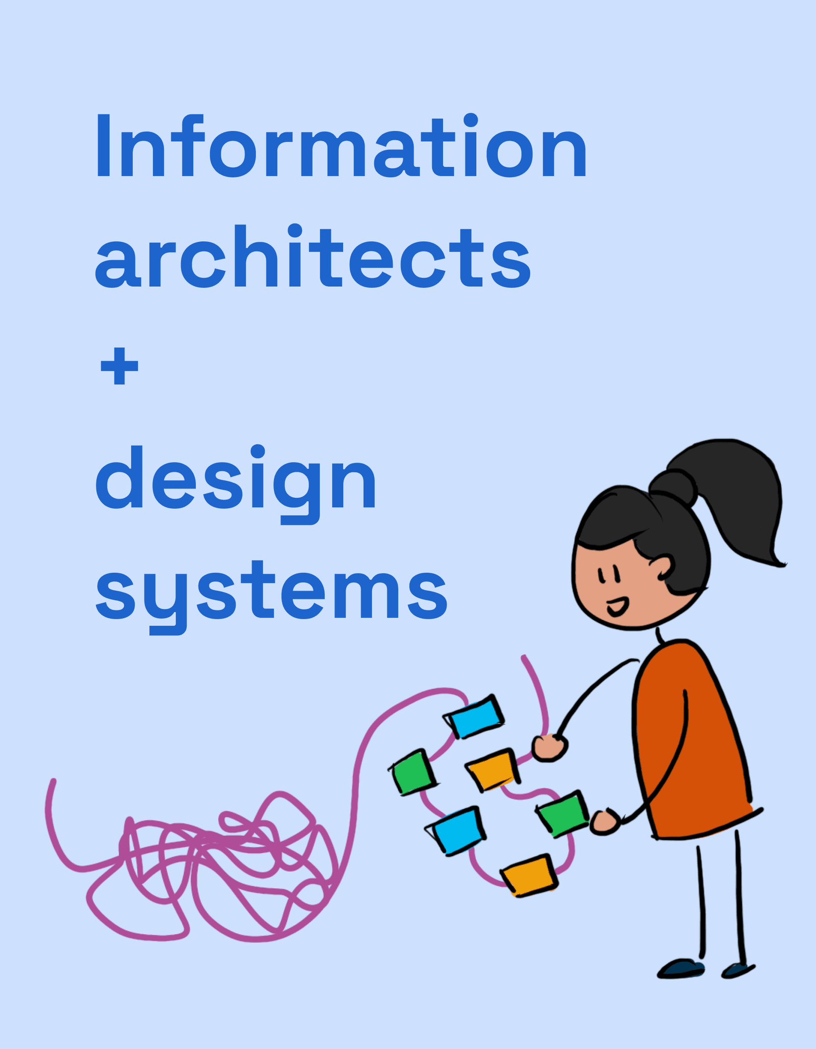
IA: How to Organize Docs So People Use Your Design System
Think of your design system docs like a library. Information Architecture (IA) is the shelving and catalog system that lets users find the right component or guideline. It's crucial for any system where discoverability impacts adoption.

Empty State Pattern: More Than Just a Blank Page
An empty state turns a blank screen into a helpful guide, showing users what's possible and how to get there. It's crucial for first-time use, 'no results' searches, or after data deletion. The footgun is treating it as an afterthought, leaving users stuck.
Semantic Colors: Naming a Color's Job, Not Its Value
Semantic colors name a color's purpose (e.g., `color-background-interactive`) instead of its value (`#007BFF`). This simplifies theming, like light/dark mode, by mapping roles to specific primitive colors, ensuring a consistent UI across an application.
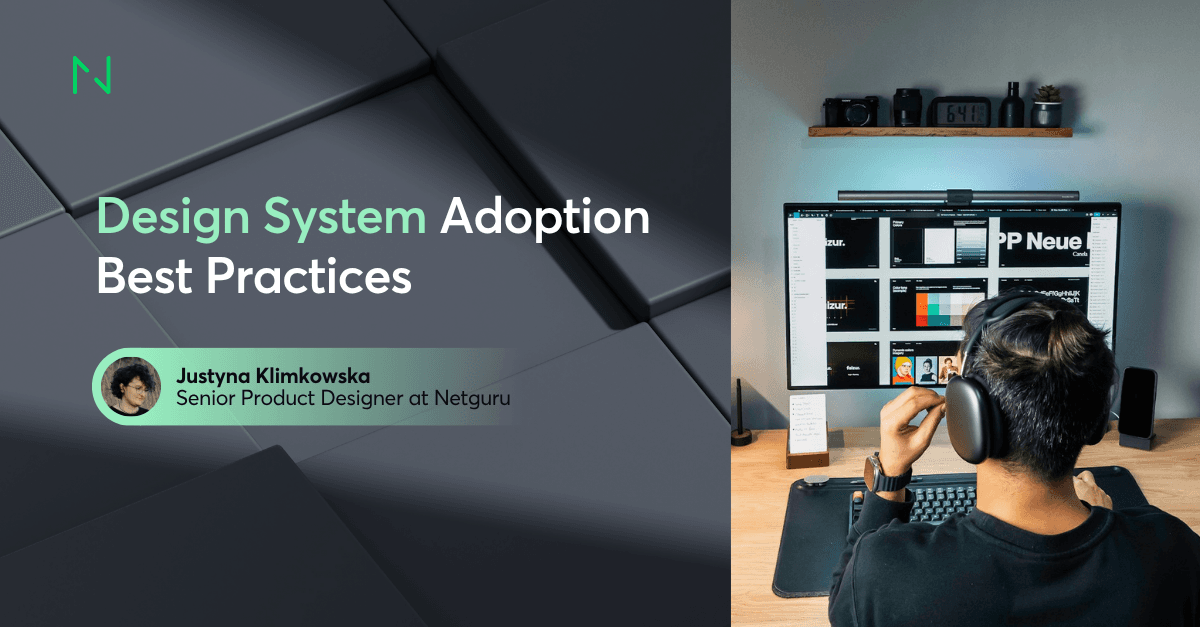
Design System Adoption: Treat It Like a Product
Treat your design system like a product you're selling to internal teams, not just a library. Without an adoption strategy focused on real workflows, even a perfect system will be ignored, leading teams to build from scratch or create their own mini-systems.

Design System Governance: A Process for Evolution
Design system governance is a process for when components don't meet a team's needs. It guides teams on whether to create a one-off "snowflake" or contribute a new component back to the system. The footgun is letting teams "find a way," leading to chaos.
Spatial UI Design Systems
Spatial UI design systems define how interfaces behave in 3D space on devices like Vision Pro: depth-based hierarchy, distance-aware scale, and gaze-and-pinch interaction, replacing the flat, pointer-driven rules of traditional 2D design systems.

Adaptive UI for Foldables: Thinking in Postures
An adaptive UI for foldables thinks in "postures," not just screen sizes, reacting to states like folded or tabletop mode. This is key for apps on devices like the Pixel Fold. The footgun is treating a foldable like a big tablet, ignoring its unique physical.
SwiftUI Theming with the Environment
Treat SwiftUI's Environment as a cascading style sheet for your app. You define design tokens like colors and fonts once at the top, and all child views automatically inherit them. This is key for building design systems or multi-brand apps.
Jetpack Compose Theming for Design Systems
Compose theming uses `CompositionLocal` to implicitly pass design tokens like colors and fonts down the UI tree. This is key for building a design system where you can swap themes (like light/dark) without rewriting components.
Systematizing Haptics: Beyond Simple Vibrations
Treat haptics like a design system for touch, not just random vibrations. Use them to confirm actions or signal state changes. The biggest footgun is overuse, which turns meaningful feedback into annoying noise that users will disable.
Using Component Libraries in React Native
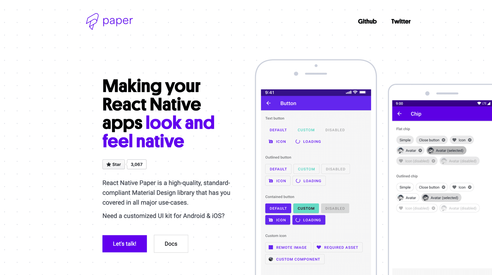
A component library is a pre-fab UI kit for your app. Instead of building every button from scratch, you get polished, ready-to-use pieces that handle platform-specific animations and accessibility.

VUI Design: Making Computers Talk Like People
Think of VUI design as scripting a helpful human conversation, not just a command-line interface with a voice. It's key for voice assistants and smart speakers. The footgun is ignoring persona; if you don't design one, you'll get 'boring' by default.

Theming with CSS data-* Attributes
Think of `data-` attributes as labels for UI state, like `data-theme='dark'`. CSS uses attribute selectors (`[data-theme='dark']`) to apply styles directly, avoiding complex class logic.
CSS `color-scheme`: Opting Into Browser UI Themes
The `color-scheme` property tells the browser your site supports light/dark modes, automatically styling UI like scrollbars and form controls to match the user's OS preference.
Dynamic Theme Switching with CSS
Let your app's theme automatically follow the user's OS setting. CSS's `prefers-color-scheme` media query lets you define styles for light and dark modes. The footgun is forgetting the 'no-preference' state, which can result in an unstyled default.

White-Label UI: Design Once, Rebrand Infinitely
White-label UI is like a WordPress theme for your product: a single design that other companies can rebrand. It lets agencies serve multiple clients without rebuilding the UI from scratch.
Theme Object: Your Design System's Single Source of Truth
A theme object is a central dictionary for your UI's design tokens, like colors and font sizes. It ensures consistency across components by providing a single, shared source for styling values.
prefers-color-scheme: Respect User Theme Preferences
The `prefers-color-scheme` media query lets your CSS automatically adapt to a user's system-wide light or dark mode. It's used to create themes that respect user preferences.