More in Design Systems — page 12

Licensing Your Open Source Design System
An open-source license legally defines how others can use, modify, and share your design system. It's essential when sharing a system publicly to encourage adoption. The biggest footgun is not choosing one, which defaults your work to 'look but don't touch'.
Contributor License Agreement (CLA): A Legal Pre-Nup for Code
A Contributor License Agreement (CLA) is a legal pre-nup for code contributions, giving the project owner clear rights to use your work. It's used by projects like Angular or Go to avoid legal ambiguity. The footgun is confusing it with the project's license.
Breaking Change Policy: Managing API Evolution
A breaking change policy is a contract with your users, ensuring disruptive API changes are predictable, not chaotic. It governs how you alter shared libraries or design systems, like removing a prop, to prevent downstream failures and maintain trust.
Driving Design System Adoption
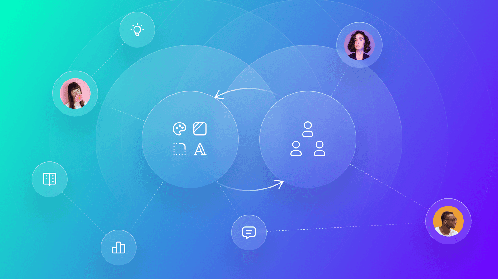
A design system's value isn't in its components, but in its use. Drive adoption by creating collaborative feedback loops with users through interactive workshops and dedicated office hours.
Design System Triage: Treating Your DS Like a Product
Treat your design system like a product, not a static library. It requires a triage process to handle bugs and feature requests from its users—your designers and developers. This applies when a component breaks or needs a new feature.
Design System Governance: Preventing UI Drift
Design system governance is the rulebook that stops your UI from becoming a free-for-all. It's used to manage contributions, maintain consistency, and ensure updates are intentional, preventing drift as teams and products scale.
Who Can Change the Button? Design System Contribution Models
A contribution model defines who can change the design system, balancing consistency with evolution. It dictates whether you can fix a typo or must lobby for a new component.

Design System Intake Process: The Gatekeeper for Quality
A design system intake process is the formal "front door" for new components, defining how they get proposed, built, and approved. It's crucial for coordinating contributions across teams.

The Design System PM: Treating Internal Tools as Products
A Design System Product Manager treats the system as a product, not a project. They define the roadmap and prioritize components for their internal engineering and design "customers."
VPAT vs. ACR: The Nutrition Label for Accessibility
An ACR is a standardized report card for a product's accessibility, based on a template called a VPAT. It's a nutrition label stating conformance facts, not a pass/fail grade.
Accessibility E2E Testing: Automating User Journeys
Accessibility E2E testing integrates automated checks into simulated user journeys, testing the rendered app as a user would. It's used in CI/CD to validate flows like sign-up or checkout.
Forced Colors Mode: When the User Overrides Your Palette
Forced Colors Mode is an accessibility feature where the browser overrides your site's colors with a user-defined, high-contrast palette. This ensures readability for users who depend on it. The footgun is disabling it and making your UI invisible.
Accessibility Linters: Automate Compliance in Your Design System
An accessibility linter is like a spellchecker for WCAG compliance, automatically flagging component errors like bad contrast or missing labels. It runs in CI/CD to catch bugs early, preventing them from propagating. The footgun: it can't catch everything.

Image Alt Text: What Screen Readers Say About Pictures
Alt text tells screen readers what to say when an image can't be seen. For a photo, describe the scene. For a button, describe its action ("Submit form"). For pure decoration, use an empty alt="" to tell screen readers to skip it.
Keyboard Focus Order: Navigating by Tab
Keyboard focus order is the path a user takes through your UI using only the Tab key. It must follow a logical sequence that preserves meaning, especially in forms and modals. The footgun is when CSS creates a visual layout that diverges from the HTML.
WCAG Conformance Levels: A, AA, and AAA
WCAG levels are a tiered rating for web accessibility. Level A is the minimum, AA is the widely accepted standard, and AAA is the highest. This helps teams set clear, testable goals. The footgun: don't require AAA for an entire site, as it's often impossible.
Token Studio: Bridge Figma Designs to Production Code
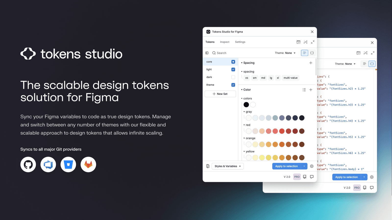
Token Studio is a control panel for your design system's raw values, bridging Figma with production code. Use it to manage themes and sync design decisions to a developer-accessible Git repo. The main footgun is using it only locally for Figma styles.
Chromatic: Visual Regression Testing for Components
Chromatic is a smoke detector for your UI's appearance, taking snapshots of every component on every commit to catch unintended visual changes. It's used in CI/CD to prevent visual regressions when refactoring. The footgun is relying on it for business logic.
Figma-to-Code: From Pixels to Production Code?
Figma-to-code tools act as translators, turning visual mockups into code. This speeds up bootstrapping new components or prototypes, but the output is rarely production-ready and often needs heavy refactoring to be performant and maintainable.
Unit Testing UI Components: Beyond the DOM Mock
Unit tests for UI components verify individual pieces in a mocked browser environment (jsdom). This is standard for checking component logic with Jest or Vitest, but it can't test visual rendering, element sizes, or layout, creating critical blind spots.