More in Design Systems — page 14

Style Encapsulation with Shadow DOM
Shadow DOM creates a private DOM tree for a component, acting like a one-way mirror for CSS. This prevents style collisions in complex UIs, ensuring a button's CSS doesn't break a header.
Component-Driven Development: Build UIs Bottom-Up
Component-Driven Development (CDD) builds UIs bottom-up, like assembling a car from its engine and wheels. It's used to manage complex UIs by creating small, independent components first. The footgun is building components too coupled to app-specific logic.

Controlled vs. Uncontrolled Components
A controlled component is a puppet; its parent pulls the strings via props. An uncontrolled one manages its own state. This pattern is key for coordinating siblings, like ensuring only one panel in an accordion is open.
Component Composition: Treat a Group Like an Individual
Component composition treats a group of objects the same as a single one. This allows building complex UIs by nesting simple components, like putting a Button inside a Form. The footgun is creating monolithic components instead of small, reusable ones.
Component Variants: One Component, Many Forms
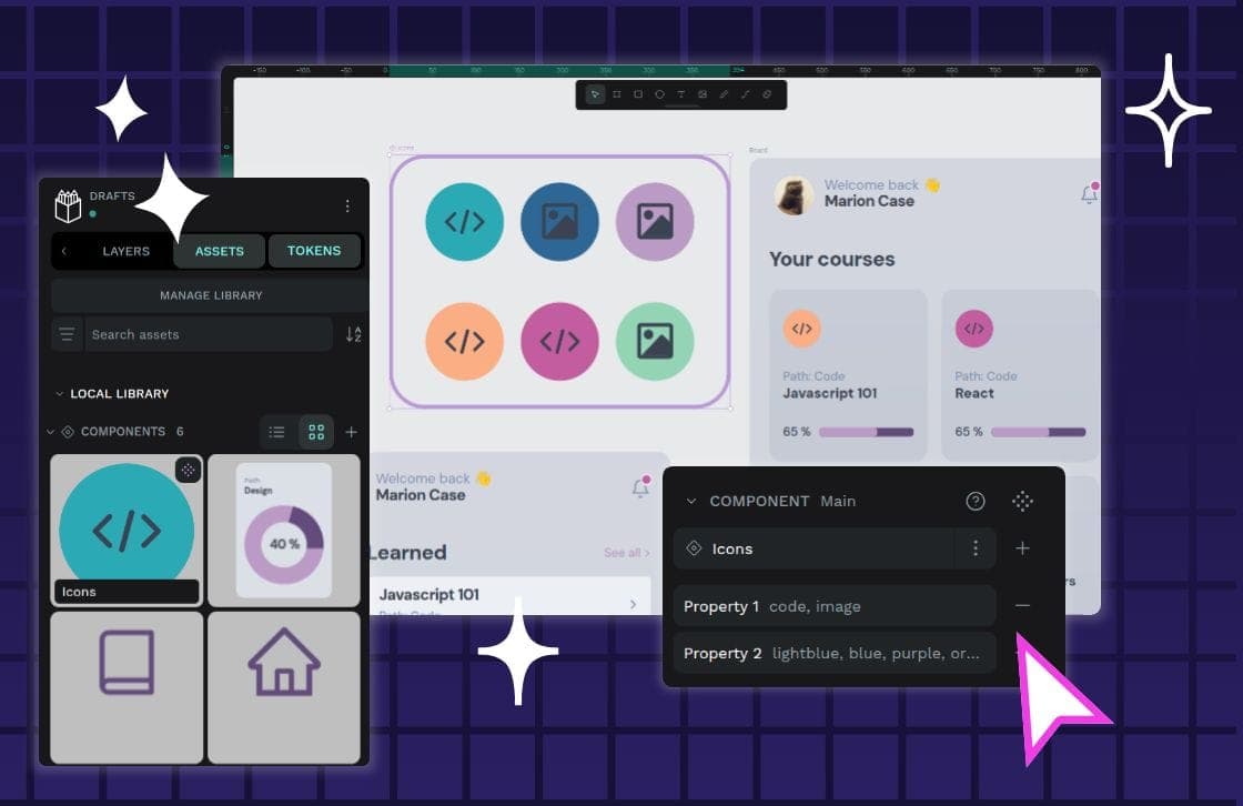
Component variants are like Lego bricks for your UI: one block can build many things. Instead of creating a unique component for every button state or size, you define properties to manage its variations.
Automated Token Pipelines: A Single Source of Truth
Automated token pipelines turn design decisions into code, using a standard format to sync styles from design tools to production. This is critical for multi-platform systems, preventing drift.
LCH Color: More Vivid, Predictable UI Colors
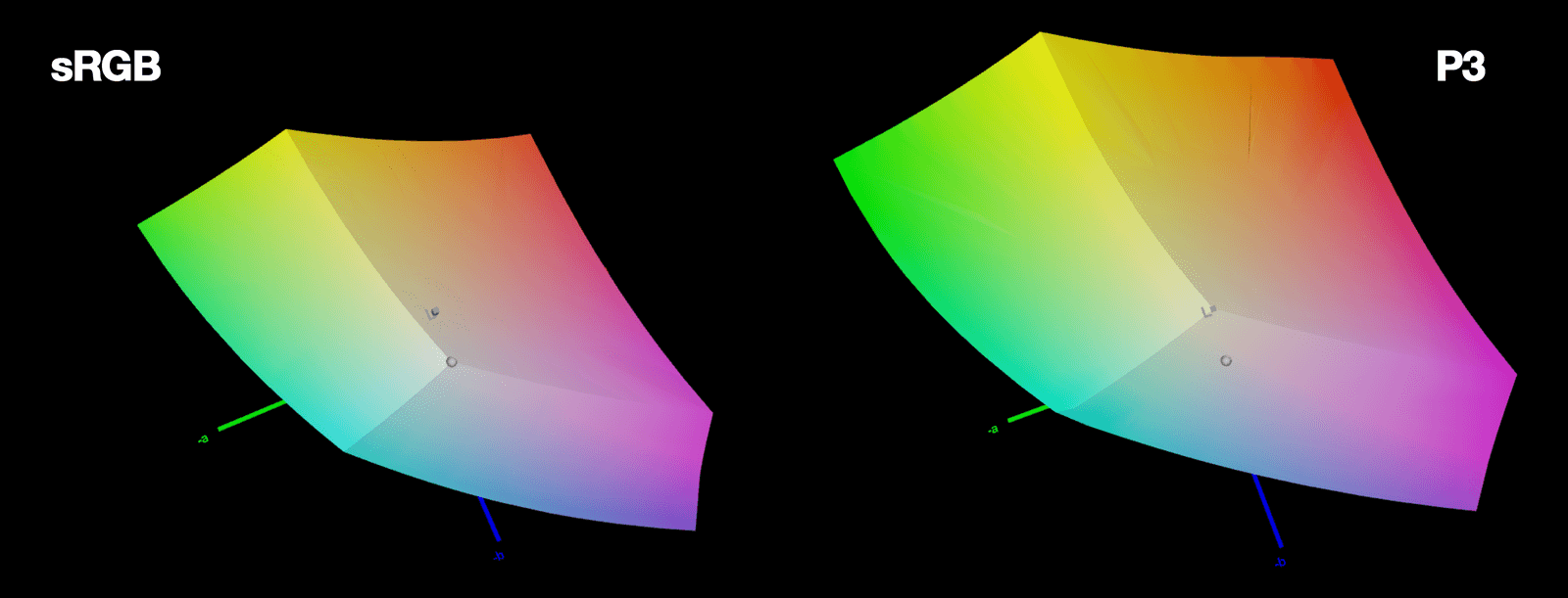
LCH is a color space that aligns with human perception. It fixes HSL's broken lightness and unlocks 50% more vivid colors on modern screens. The footgun: LCH hue angles don't match HSL's; 0° is magenta, not red, so you can't just swap them.
Token Tiers: From Raw Values to Component Properties
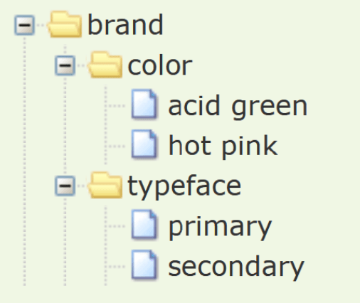
Token tiers layer your design system from abstract to concrete: raw values become semantic names, which then style components. This lets you change a core color and see it update everywhere.
CSS clamp(): Fluid Sizing Without Media Queries
CSS clamp() sets guardrails for a value, letting it scale fluidly but never going outside a min/max bound. It's ideal for responsive typography, allowing font-size to grow with the viewport. The footgun: the preferred value is ignored at extreme screen sizes.

Vertical Rhythm: A Formula for Consistent Spacing
Vertical rhythm is a system for consistent spacing derived from your body text's line height. Use this calculated unit between all elements—paragraphs, lists, and after headings—to create harmony.
WCAG Color Contrast: The 4.5:1 Rule for Readability
WCAG contrast ratios ensure text is readable for people with low vision by measuring relative luminance, not just color. Standard text needs a 4.5:1 ratio against its background.
Spacing Scales: Using Multiples for Consistent UI
A spacing scale builds consistent UI layouts from a limited set of values, usually multiples of a base unit like 8px. It's used for everything from button padding to page gaps. The footgun is using arbitrary pixel values, which breaks the system's rhythm.

Typographic Scale: A System for Consistent Text
A typographic scale is a predefined set of font sizes and line heights that creates visual harmony. Design systems use it for consistent, readable text across devices. The footgun is adding one-off font sizes, which breaks the system's rhythm and consistency.
System of Systems: Managing Design Systems at Scale
A "system of systems" isn't one giant design system, but a fleet of interconnected ones. It's how large organizations manage multiple brands or products without total fragmentation.

Measuring Design System Health and ROI
A design system isn't a one-off project; it's a product that decays without measurement. Track metrics like component adoption and design-to-code parity to prove its value and guide maintenance.

Theming: One Design System, Many Visual Styles
Theming lets one component library wear many visual styles, like skins on a character. You can support multiple brands or dark/light modes by swapping design tokens instead of rebuilding components.
Design Systems: Your UI's Single Source of Truth
A design system is the single source of truth for UI, giving designers and developers a shared toolkit of reusable components and standards. It ensures consistency and efficiency across projects.
Design Systems: From UI Kits to Business Infrastructure
A design system is business infrastructure, not just a UI kit. It translates brand consistency into measurable ROI by reducing costs and accelerating delivery.

Atomic Design: Building UIs Like Chemistry
Atomic Design is like chemistry for UIs: you build complex screens from simple, indivisible 'atoms' like buttons and inputs. It's used to create consistent design systems. The footgun is treating it as a rigid, linear process instead of a mental model.
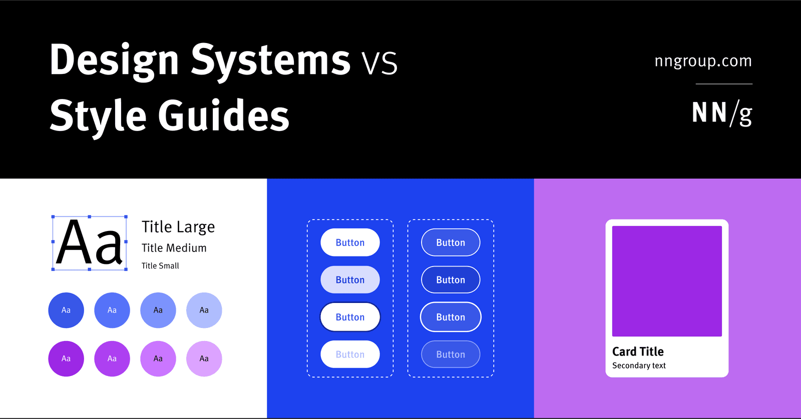
Design System: The Whole vs. Its Parts
A design system is the parent; style guides and component libraries are its children. It's the full toolkit for building consistent products at scale, containing rules, patterns, and ready-to-use code.