More in Design Systems — page 13
Monorepos: A Design System's Single Source of Truth
A monorepo places your design system and its consuming apps in one repo. This enables atomic changes: update a component and all its consumers in a single commit. It's ideal for keeping UI consistent, but requires strict tooling to avoid becoming a monolith.
Figma Variables: The Single Source of Truth for Tokens
Figma variables are the central vault for your design tokens, letting you reference a name like `color-background` instead of a hardcoded value. Use them to build scalable themes and update spacing across an entire app.

Package Publishing: Sharing Your Code with the World
Publishing a package is like adding a book to a public library, making your code reusable with one command. It's essential for sharing design system components or utilities. The footgun: accidentally publishing secrets or making a private package public.

Storybook: A Workshop for Isolated UI Components
Storybook is a workshop for building UI components in isolation, separate from your app's business logic. It's ideal for developing edge cases and documenting a design system.
Figma Team Libraries: A Single Source of Truth
Think of a Figma Library as a shared box of official LEGOs for your team. It ensures everyone uses the same approved components, styles, and variables, keeping designs consistent. The biggest footgun is forgetting to publish changes to the main components.
Automated Prop Docs with Storybook Autodocs
Treat your component stories as the single source of truth for documentation. Storybook's `autodocs` reads your code to generate interactive docs automatically. It's used in design systems to prevent stale docs. The footgun: sparse types yield sparse docs.
Writing Accessibility Docs for Your Components
Accessibility docs are the user manual for your component's a11y features. They guide consumers on correct usage, like required ARIA attributes or keyboard behavior.
Design System Changelogs: For Humans, Not Machines
A design system changelog translates code changes into human-readable impact. It's a curated notice for consumers—not a raw git log. It's essential for communicating new components, token updates, and breaking changes so teams can adopt updates safely.
Design System Onboarding: The Welcome Mat
Design system onboarding is a welcome mat, not a full manual. It orients new users by explaining the system's purpose and scope, then routes designers to interactive guides and engineers to implementation docs. The footgun is information overload.
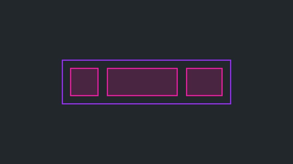
The Slot Pattern: Making UI Components Composable
The Slot Pattern makes components flexible by defining areas for custom content, like a picture frame for your UI. It's used in Cards or Modals to allow varied content in a consistent frame. The footgun is that too much flexibility can break consistency.

Wizard/Stepper Pattern: Guide Users Through Complex Tasks
A wizard or stepper pattern is like a recipe for a complex task, breaking a long process into numbered, manageable steps. It's ideal for multi-stage forms like onboarding or checkout flows.
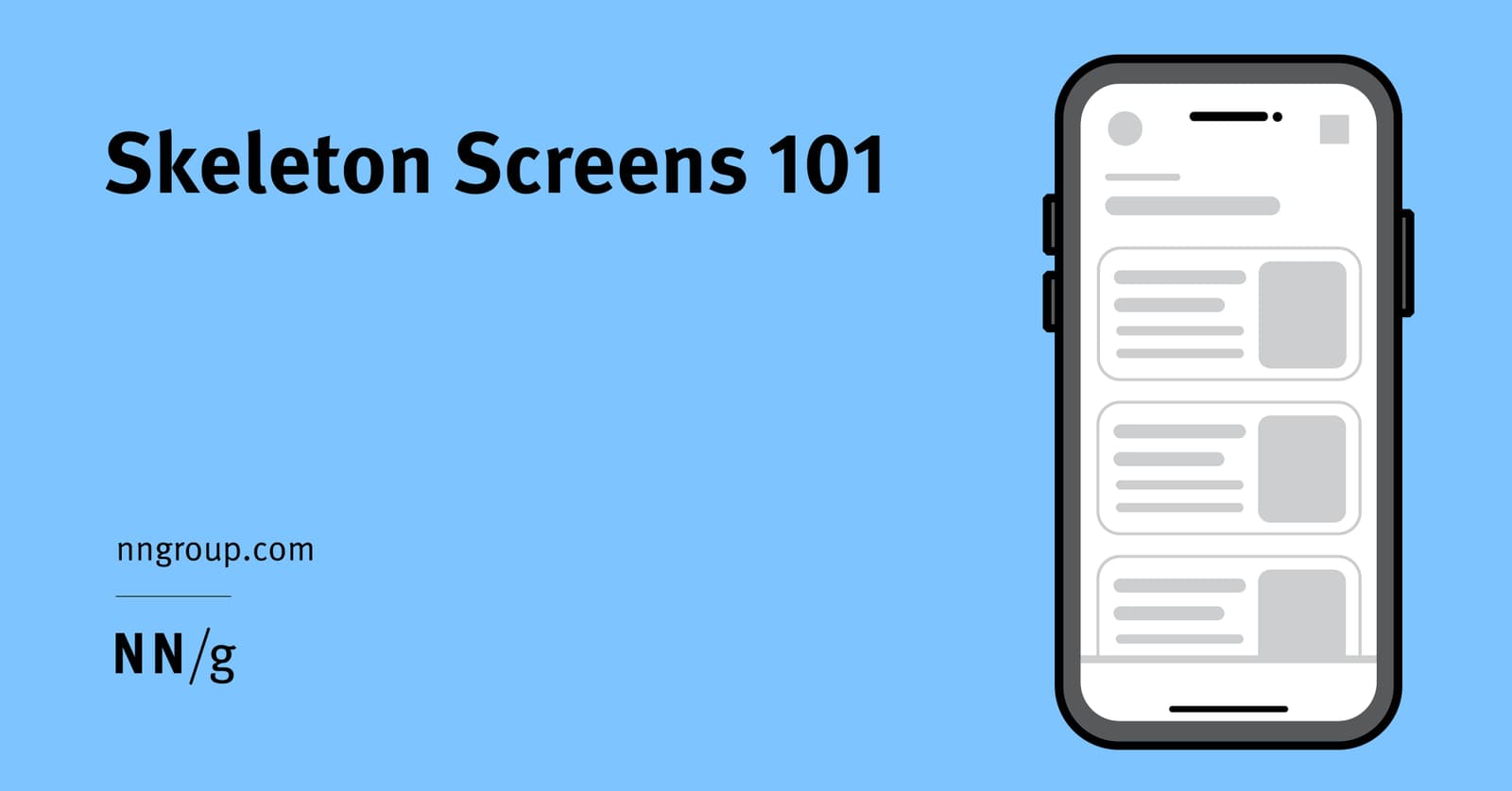
Skeleton Screens: Faster by Faking It
Skeleton screens create the illusion of speed by showing a wireframe-like preview of a page while content loads. They're used for full-page loads to set expectations about the layout. The footgun is showing just the app frame, which gives no structure.
Master-Detail: Show a List, Focus on One
The master-detail pattern splits your UI into a list of items (master) and a view for the selected one (detail). It's used in email clients and file explorers to manage information density. The footgun is a master list so sparse it forces users to click.
Header Components: An Exception to Reusability
Treat your site header as a unique beast, not a reusable component. Its complexity—managing branding, responsive navigation, and sticky positioning—makes abstraction brittle. The footgun is reusing the entire header instead of just its internal components.
Modal Dialogs: The Focus Trap Pattern
A modal dialog is a "focus trap" that overlays the UI, forcing a user to complete a task. It's used for critical confirmations or focused inputs, like a date picker. The main footgun is failing to trap keyboard focus, letting users tab into the inert.
Footer Layout Patterns
A footer is a safety net for users who reach the bottom of a page without finding what they need. Use a "Big" footer for complex sites, "Medium" for standard ones, and "Slim" for simple pages.
ESM vs. CJS: Navigating JavaScript's Module Divide
JavaScript has two module systems: modern, static ESM (`import`) and legacy, dynamic CJS (`require`). When publishing a library, you must support both. The footgun is shipping only ESM, as it breaks downstream projects that still use `require()`.
Tree Shaking: Shipping Only the Code You Use
Tree shaking is a build-time optimization that eliminates unused code. For component libraries, it means importing a `Button` won't bundle the unused `DataGrid`. The main footgun is side effects: code that modifies global state can't be safely removed.
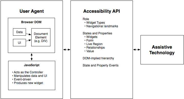
WAI-ARIA: A Script for Custom UI Accessibility
WAI-ARIA gives custom UI a voice for assistive tech. It's the script telling a screen reader what a `<div>` acting as a button is and if it's "pressed." Use it for custom widgets when native HTML can't.
Semantic Versioning: A Contract for Your Code's Evolution
Semantic Versioning is a contract for your code. The MAJOR.MINOR.PATCH format signals if an update is a breaking change, a new feature, or a bug fix. It's vital for managing dependencies safely. The footgun: SemVer is meaningless without a defined public API.