Easy concepts in Design & UX
UX Research: Building for Real People, Not Assumptions
UX Research is about watching what people *do*, not just what they *say*, to build products that solve their actual problems. It's used to design everything from websites to medical devices, guiding development with real user feedback.
User-Centered Design: Build for Who, Not What
User-Centered Design (UCD) puts the user's goals, tasks, and environment at the core of development. This process shapes software and websites through user personas and real-world testing.
Single Source of Truth (SSOT): One Place for All UI
A Single Source of Truth (SSOT) is the "don't repeat yourself" principle for UI. Define a component or style once in a central design system, and reference it everywhere. This prevents UI drift across teams.
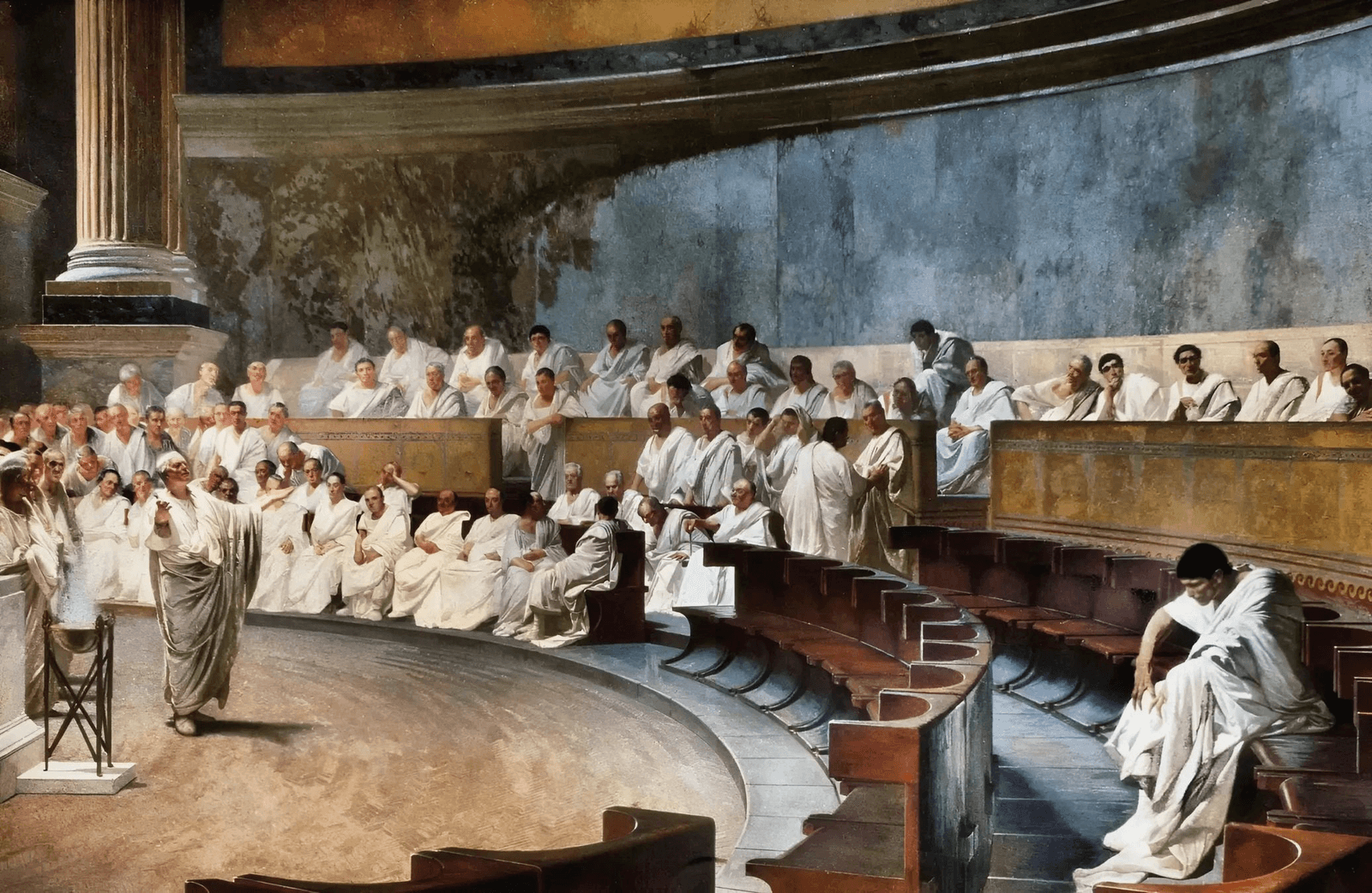
Ethos, Pathos, Logos: The Three Appeals of Persuasion
Persuade anyone by appealing to their head (logos), heart (pathos), or trust in you (ethos). Use this framework in design docs or presentations to make a stronger case.

Nielsen's 10 Heuristics: Rules of Thumb for UI Design
Nielsen's Heuristics are ten rules of thumb for evaluating if a design is user-friendly. Use them to spot usability issues in any interface, from apps to stovetops. The biggest mistake is treating them as strict laws, not flexible guidelines.
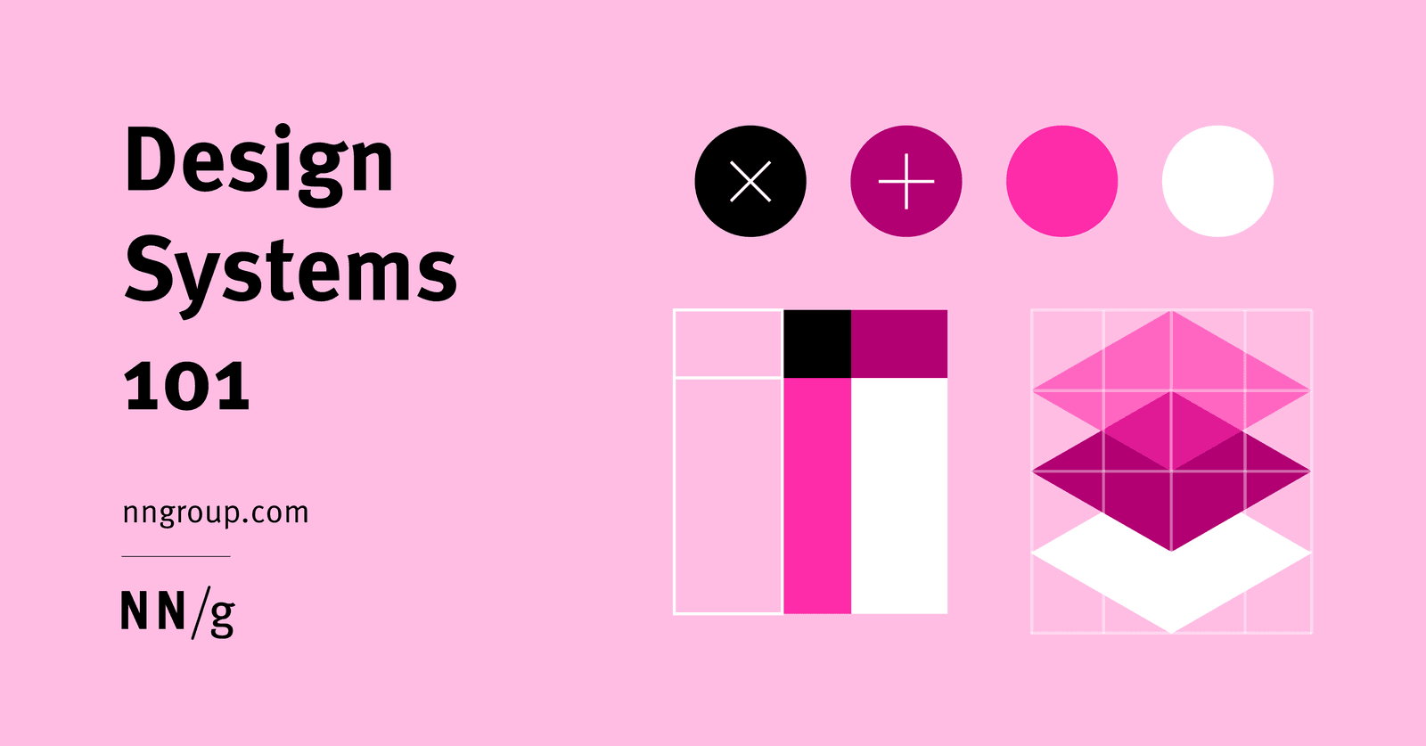
A Design System is a Shared Toolbox, Not Just a Sticker Sheet
A design system is a shared toolbox of reusable UI components and rules, not just a style guide. It ensures consistency and speed when multiple teams build products at scale.

Plain Language Writing: Write for Your Audience, Not Yourself
Plain language isn't dumbing down; it's writing so your audience can understand and act on information the first time. Use it in UI copy and docs to reduce user error. The footgun is assuming your audience shares your jargon and context.
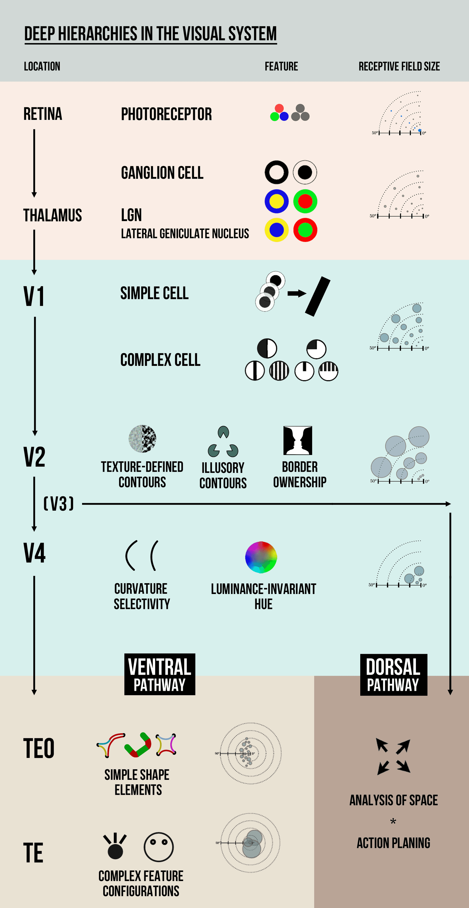
Visual Hierarchy: Guiding the User's Eye
Visual hierarchy guides the user's eye by making important things look important. It uses contrast in size, color, and placement to create a path of importance, like a big headline versus small footer text.
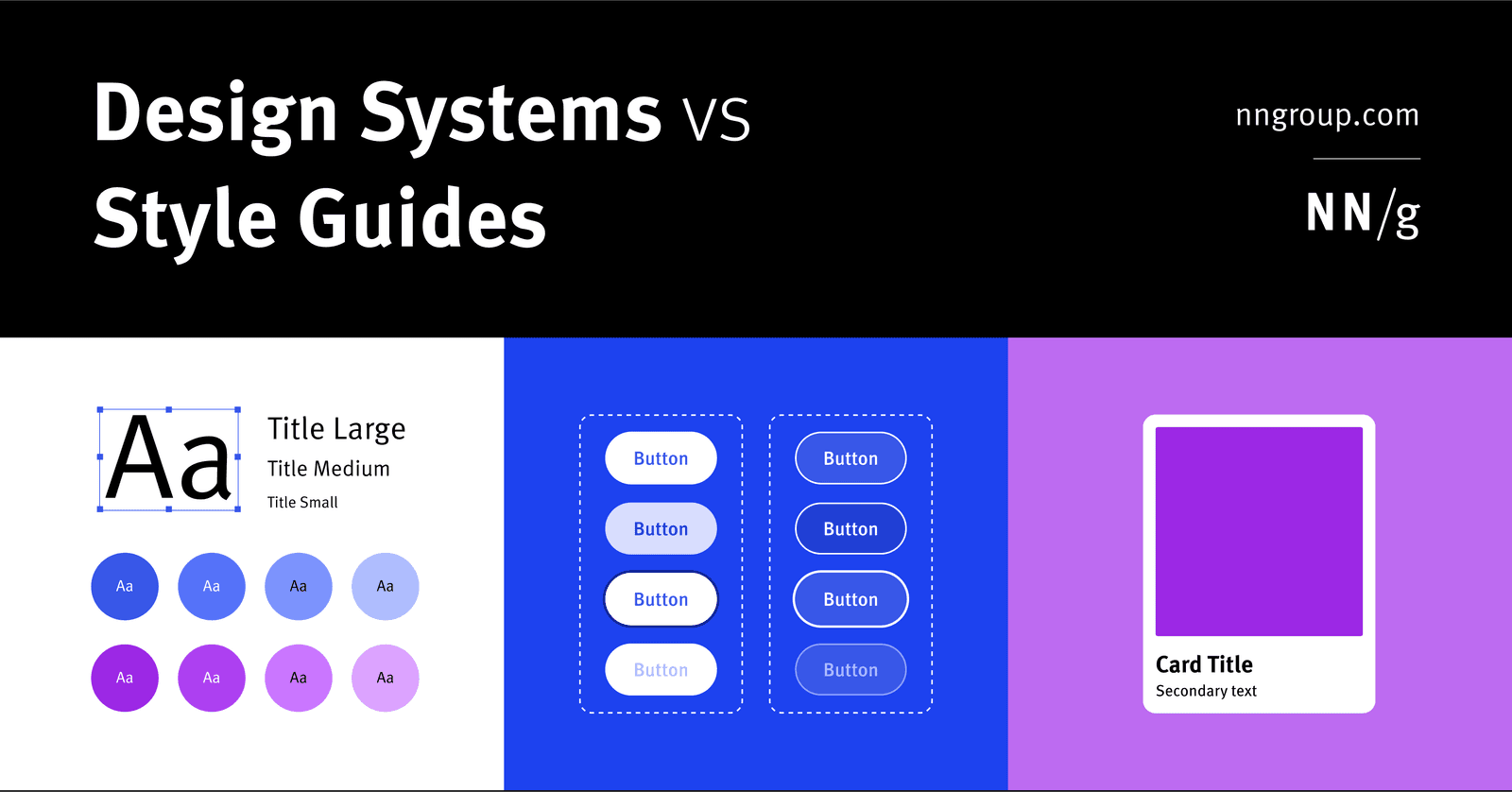
Design System: The Whole vs. Its Parts
A design system is the parent; style guides and component libraries are its children. It's the full toolkit for building consistent products at scale, containing rules, patterns, and ready-to-use code.
Debriefing: Closing the Loop in Research
Debriefing is a structured conversation after a research session to gather feedback and clarify observations. Use it after usability tests to understand a user's thought process and answer their questions.

Typographic Scale: A System for Consistent Text
A typographic scale is a predefined set of font sizes and line heights that creates visual harmony. Design systems use it for consistent, readable text across devices. The footgun is adding one-off font sizes, which breaks the system's rhythm and consistency.

User Personas: Designing for Someone, Not Everyone
A user persona is a semi-fictional character built from real user data to represent a target group. It helps teams design for "Sarah the busy manager," not a vague "user." The footgun is forgetting the persona is an archetype, not a literal person.

Spacing Scales: Using Multiples for Consistent UI
A spacing scale builds consistent UI layouts from a limited set of values, usually multiples of a base unit like 8px. It's used for everything from button padding to page gaps. The footgun is using arbitrary pixel values, which breaks the system's rhythm.
Competitive Analysis: Sizing Up the Competition
Competitive analysis is systematically assessing rivals' strengths and weaknesses to find your own edge. It helps identify market opportunities and threats before you act. The footgun is focusing only on direct competitors and missing the indirect ones.
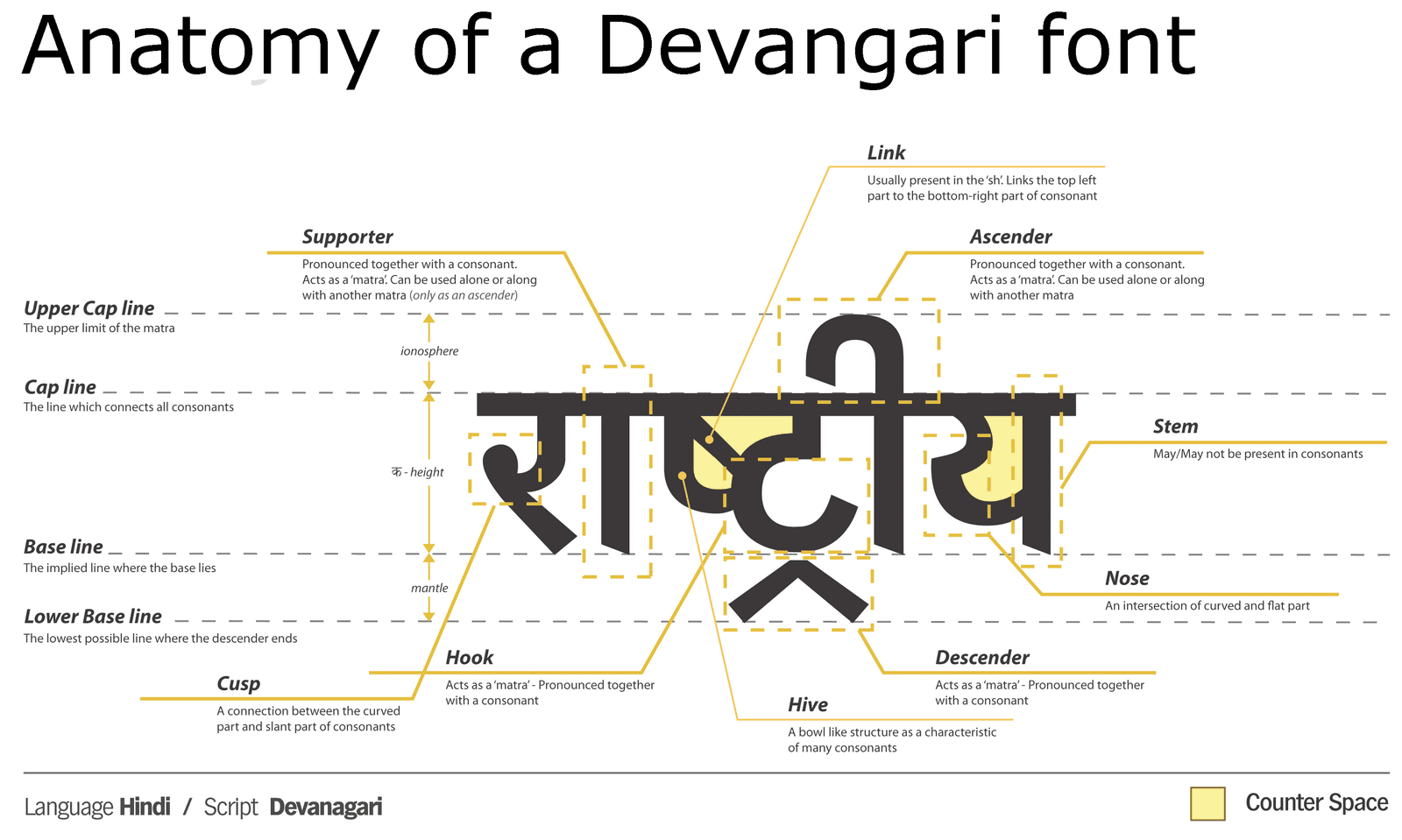
Anatomy of a Typeface: Why Letters Lie to Your Eyes
Typeface anatomy is a system of optical illusions. Letters are drawn with inconsistent dimensions to appear uniform. This is why a circle must be taller than a square to look the same size. The footgun is trusting bounding boxes over your eyes for alignment.
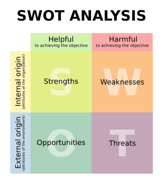
SWOT Analysis: A Structured Brainstorming Framework
SWOT analysis is a 2x2 grid for decision-making, mapping internal factors (Strengths, Weaknesses) against external ones (Opportunities, Threats). Use it for strategic planning or project evaluation.

RGB vs. HSL: Two Ways to Tell a Computer 'Color'
RGB tells a computer how to mix light (Red, Green, Blue), while HSL describes color how humans perceive it (Hue, Saturation, Lightness). Use RGB for brand colors and HSL for intuitive variations. The footgun is creating low-contrast UIs that are unreadable.
Survey Research: How to Ask Better Questions
Survey research is the science of asking the right questions to the right people. It's used in market research and user feedback to understand a population. The footgun: assuming any questionnaire yields truth. Biased questions or samples create garbage data.

UX Research Questions: The 'Why' Before the 'What'
A research question is your study's North Star—the high-level "why" you're conducting research, not a question you ask users. Before writing an interview guide, define these to keep your study focused.

Rule of Thirds: Guide the Eye, Don't Just Center
Don't center your subject; place key elements along the lines or intersections of a 3x3 grid. This creates a more dynamic, visually interesting composition in photos and UI layouts. The footgun is treating it as a rigid law; sometimes centering is better.
We are hiring for this. Every open role lists the topics its interview covers, so you can prepare for the real thing rather than guessing.
See open roles