More in Design & UX — page 43
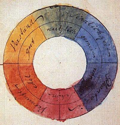
Color Theory: Harmony, Contrast, and Meaning in UI
Color theory is a system for using contrast, harmony, and symbolism to guide user experience. It's applied in UI to create visual hierarchy, evoke brand emotions, and ensure readability.
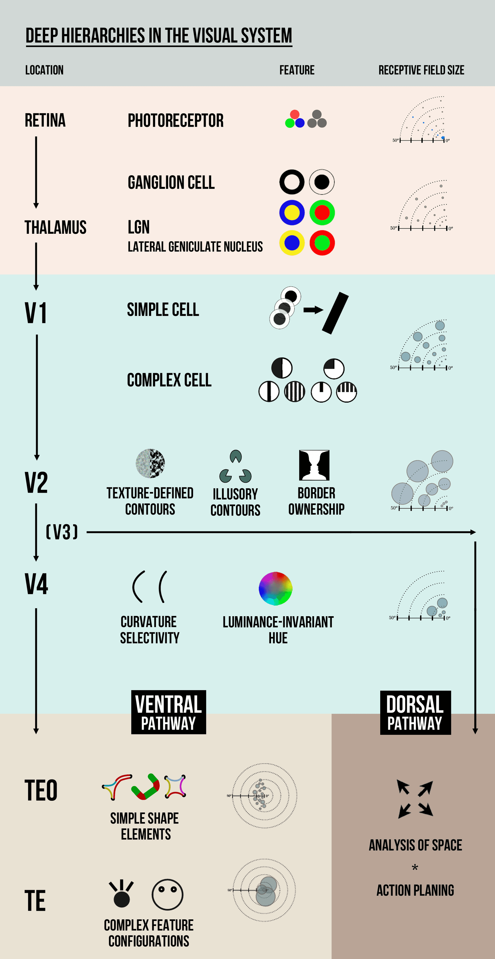
Visual Hierarchy: Guiding the User's Eye
Visual hierarchy guides the user's eye by making important things look important. It uses contrast in size, color, and placement to create a path of importance, like a big headline versus small footer text.

Nielsen's 10 Heuristics: Rules of Thumb for UI Design
Nielsen's Heuristics are ten rules of thumb for evaluating if a design is user-friendly. Use them to spot usability issues in any interface, from apps to stovetops. The biggest mistake is treating them as strict laws, not flexible guidelines.
User-Centered Design: Build for Who, Not What
User-Centered Design (UCD) puts the user's goals, tasks, and environment at the core of development. This process shapes software and websites through user personas and real-world testing.

Design Token Transformation: One Source for All Platforms
A design token standard is a universal adapter for your style. It defines properties like color in a standard JSON format, which tools then transform into platform-specific code for iOS, Android, and web. The footgun is building bespoke transformation logic.
Figma's Library Analytics API: Quantify Your Design System's Impact
Figma's Library Analytics API lets you quantify your design system's impact by tracking component usage. Use it to find adoption trends or get a snapshot of where components are used. The footgun: data for files you can't access is obfuscated, not omitted.

Reduce Time-to-Market with a Design System
A design system is a shared toolkit of pre-built UI components, not just a style guide. It lets teams build interfaces from a library of pre-coded parts, drastically cutting repetitive work. The footgun is treating it as a static document, not a living system.

A Design System Newsletter: Make Invisible Work Visible
A design system newsletter makes your team's invisible infrastructure work visible. Use it to announce component updates and share challenges, keeping stakeholders engaged.
Design System Steering Committee: Governance in Practice
A steering committee is the board of directors for a design system, ensuring its long-term stability and direction. They set technical standards, manage releases, and resolve conflicts. The footgun is becoming a bottleneck if not diverse and well-chartered.
Form Layout Best Practices
Guide users with a clear visual path, not a maze. A single-column layout with consistent spacing creates a streamlined data entry experience. Use it for everything from contact forms to complex UIs.
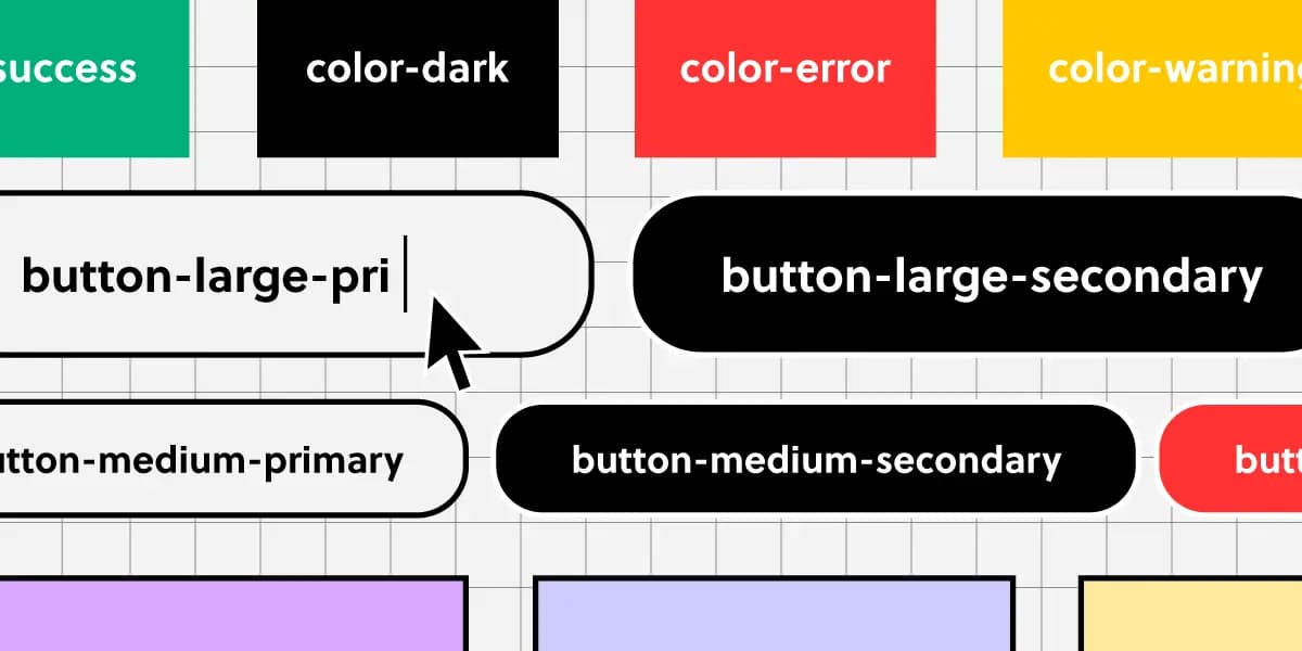
Component Naming: A Shared Language for UI
Think of naming conventions as a shared dictionary for your team. A name like `ButtonPrimary` should mean the same thing in Figma and in code, ensuring consistency.

Conversational Component Model: Building Blocks for Voice UI
Think of conversational components as LEGO bricks for dialogue. You assemble standard pieces like questions, confirmations, and apologies to build a natural flow for voice assistants or chatbots.
Versioning Your Design System Documentation
Think of it like Git for your design system: you create immutable snapshots (versions) of your docs and components. This lets product teams build against a stable spec, even as the design system evolves. The footgun is poor versioning discipline.
Design System Migration: A Campaign, Not a Mandate
Migrating to a new design system is a campaign to win over teams, not just a technical refactor. Use strategies like piggybacking on features (Trojan Horse) or starting with willing teams to build momentum and avoid getting stalled by resistance.

Design System Pilots: Test Your System Before You Ship It
A design system pilot is like a TV pilot: you test your system's core ideas on a real product before a full v1 launch. Use it to battle-test components and find the 20% of work that solves 80% of problems.

Measuring Design System Adoption: From Vanity to Value
Measuring design system adoption means tracking real usage in code, not just documentation views. It's key for justifying budget and prioritizing work. The main footgun is mistaking site traffic for actual implementation in production.
Design Linting: A Spellchecker for Your Designs
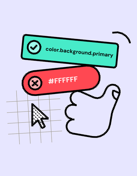
Design linting is like a spellchecker for your design files, automatically flagging inconsistencies against your design system's rules. It helps maintain visual consistency at scale and speeds up design reviews.
Your Design System's SLA: The Contract for Reliability
A Design System SLA is a contract defining the system's reliability and support promises. It specifies uptime guarantees, support hours, and incident response times, helping you assess if the system is a dependable foundation for your product.

Shift-Left Accessibility: Build It In, Don't Bolt It On
Shift-left accessibility treats accessibility as a core feature, not a last-minute fix. It integrates checks throughout the development lifecycle, from design to deployment, preventing costly rework. The footgun is treating it as just an earlier QA step.
Measuring Documentation Effectiveness
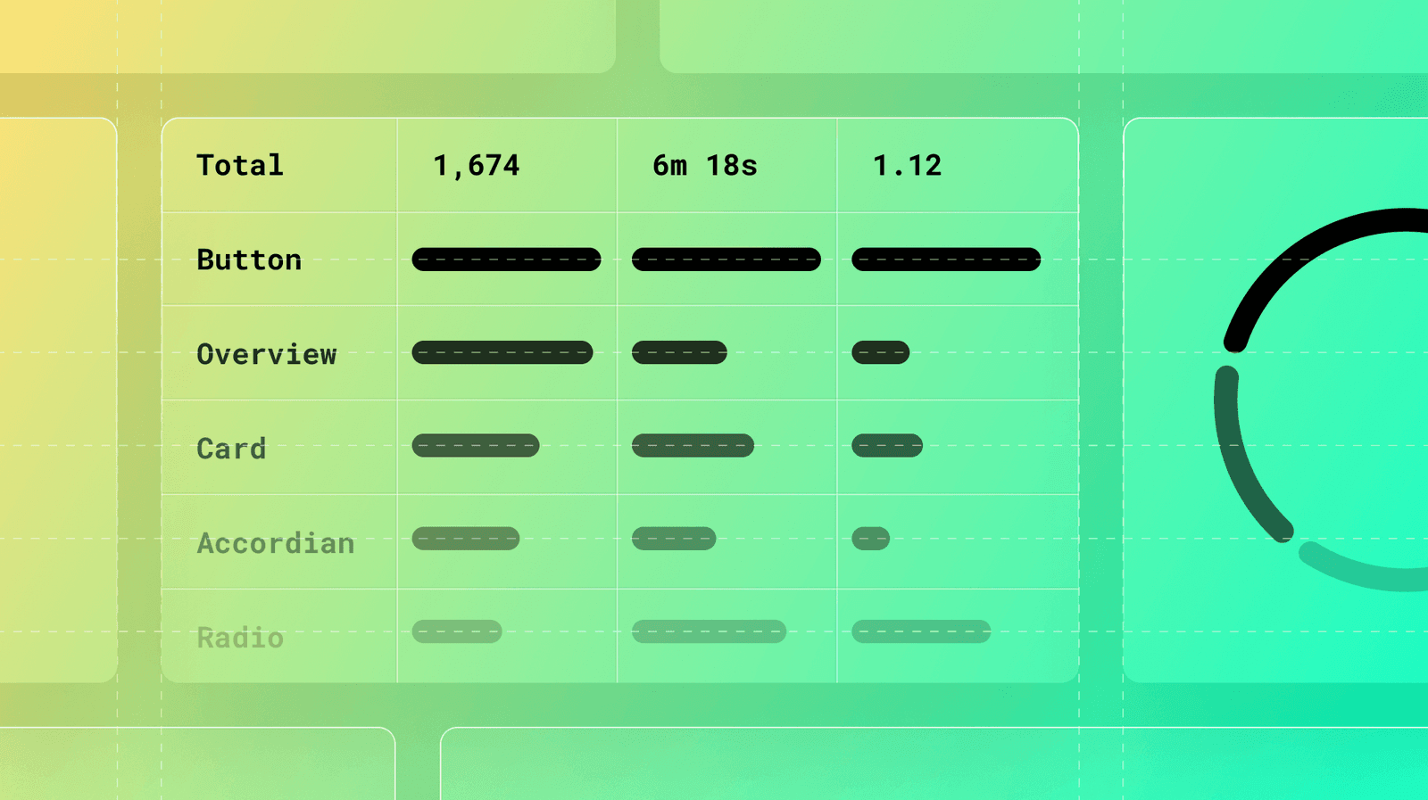
Treat your design system docs like a product, not a library. Use analytics on page views, search queries, and user feedback to find confusing components and content gaps. The footgun: high traffic can signal a confusing page, not just a popular one.