Intermediate concepts in Product Management, page 5

Data Visualization: Turning Numbers into Insight
Data visualization turns raw data into pictures, revealing stories that numbers alone can't tell. It's used to spot trends, find outliers, and grasp complex relationships in datasets.

Agile Themes: Connecting Work to Strategy
An agile theme is a strategic focus that groups related epics to achieve a larger business goal. Use themes to show stakeholders how specific features contribute to quarterly objectives like 'Improve Mobile Performance.'
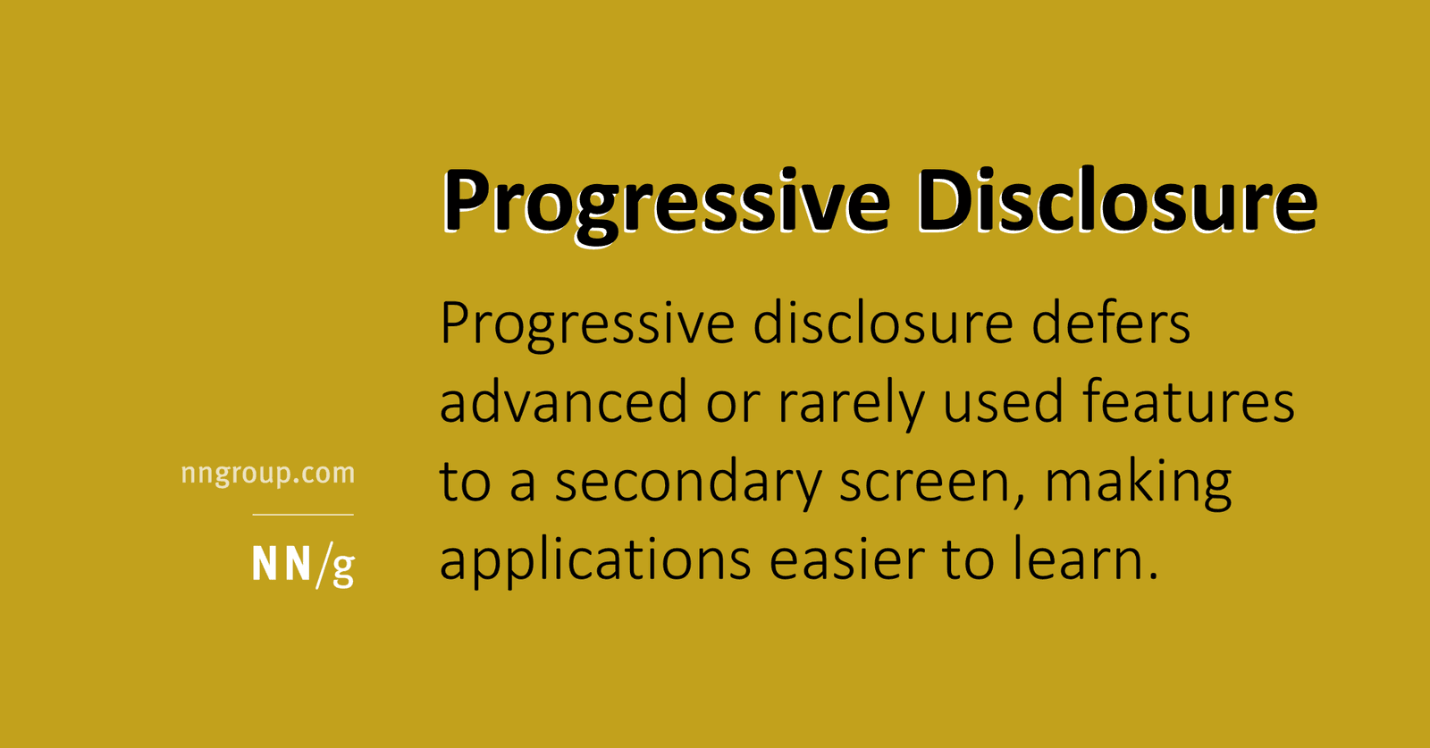
Progressive Disclosure: Show Less, Reveal More
Progressive disclosure manages complexity by showing only essential features upfront, like a "Read More" button for your UI. It's used in print dialogs and e-commerce specs to avoid overwhelming users.

What is a DEEP Product Backlog?
A DEEP backlog prevents the 'quicksand' of endless refinement with no progress. It helps teams align on customer value and create reliable plans. The footgun is that without a structured approach, backlogs become chaotic, eroding trust in agile forecasts.
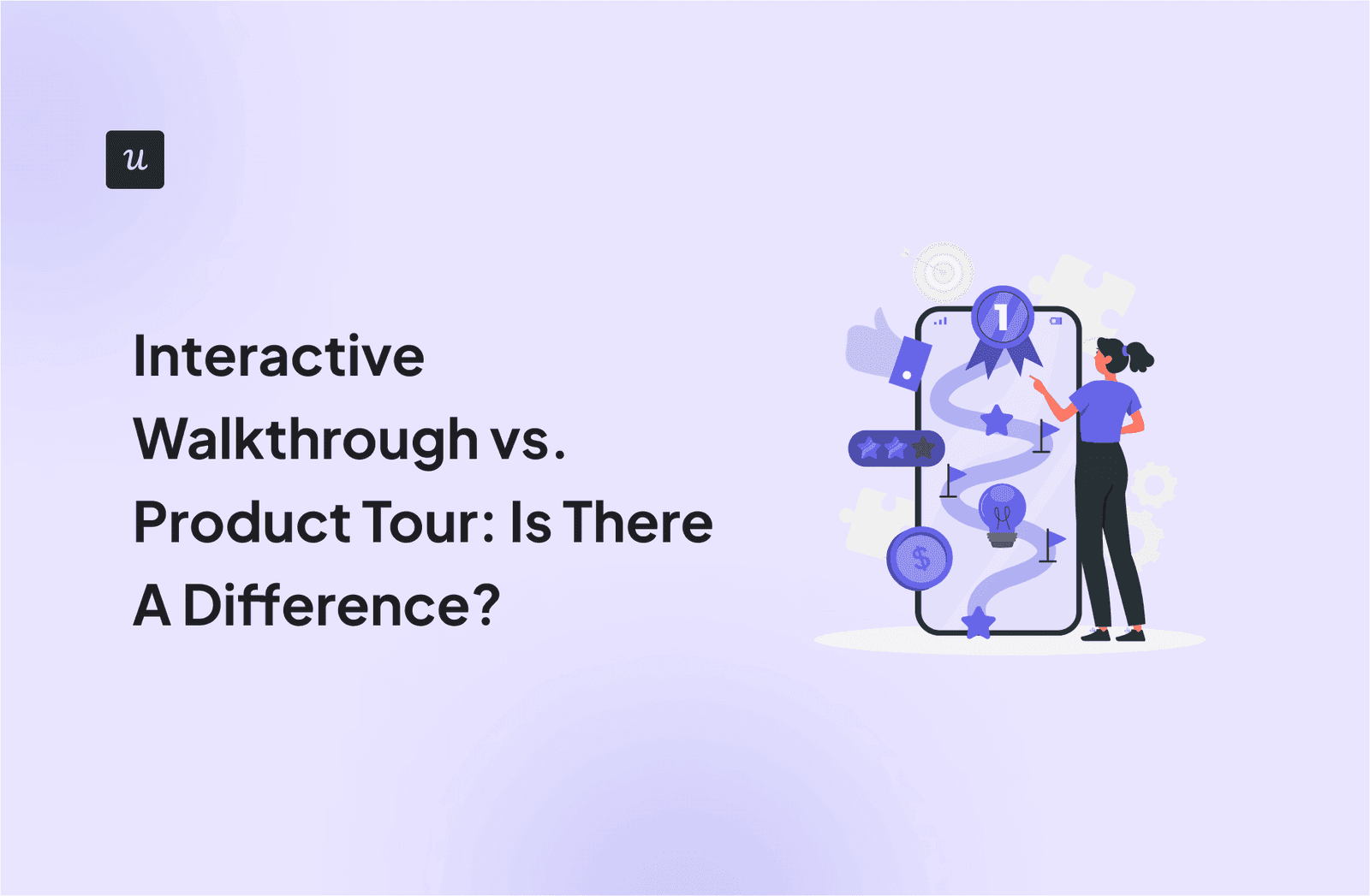
Interactive Walkthroughs: Learn by Doing, Not Just Seeing
An interactive walkthrough teaches by doing. Instead of clicking 'Next,' users must perform the actual task to advance. It's best for critical onboarding flows where learning a workflow is key to activation.

Job Stories: Focus on Motivation, Not Persona
A Job Story shifts focus from *who* is doing something to *why*. It frames work around a situation, a motivation, and an outcome. Use it when a user's context is more important than their persona. The footgun is simply rephrasing a user story.
Personas: Build for a Specific 'Who', Not a Vague 'Everyone'
Personas give your team a shared user understanding by creating a fictional, yet realistic, character profile. They guide feature prioritization and design decisions by focusing on a specific "who."
Relative Sizing: Estimate Effort, Not Hours
Relative sizing compares work items to each other instead of assigning absolute hours. A team agrees on a baseline task and estimates others as 'larger' or 'smaller' relative to it, often using story points. The footgun is mapping points back to hours.
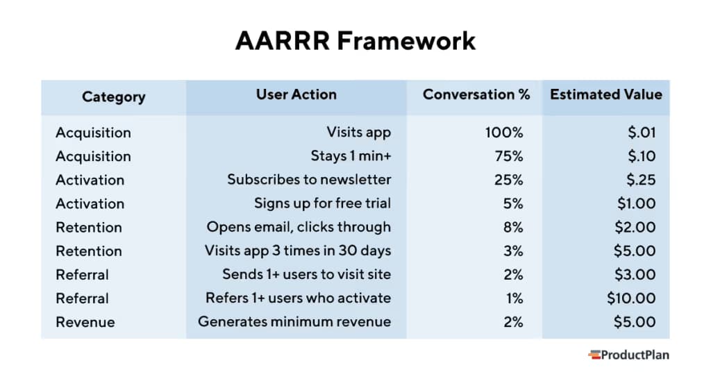
AARRR 'Pirate' Metrics: A Funnel for What Really Matters
The AARRR framework is a five-stage funnel (Acquisition, Activation, Retention, Referral, Revenue) that tracks the user journey. It helps product teams focus on metrics that directly impact business health, not vanity metrics like social media likes.

The HEART Framework for Measuring UX
The HEART framework provides a structure for measuring user experience on large-scale web applications. It helps teams define user-centered metrics to track progress towards goals and make data-driven decisions.
Data-Ink Ratio: Maximize Signal, Minimize Noise
The Data-Ink Ratio states that a good chart maximizes the ink showing data and minimizes everything else. It's a call to erase 'chart junk'—heavy gridlines or 3D effects—that doesn't convey information.

Counter Metrics: Guardrails for Your Goals
Counter metrics are the guardrails for your primary goal, preventing you from optimizing one number at the expense of user experience. If you increase ad impressions for revenue, track user retention to ensure you aren't just driving users away with spam.
Small Multiples: Comparing Data with a Grid of Charts
Small multiples are a comic strip for data, showing different dataset slices in a grid of charts with identical axes. They're used to compare trends across categories, like sales per region. The footgun is using inconsistent scales, which breaks comparison.
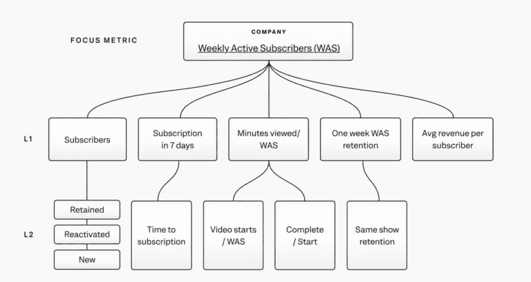
KPI Tree: Linking Product Changes to Business Outcomes
A KPI tree traces how changes ladder up to outcomes, giving metrics connective tissue. Build one when dashboards and experiments conflict and you need a defensible line from features to impact. Let it stay static and it becomes disconnected.
In-App Messaging: A Guide Inside Your Product
Think of in-app messages as a helpful guide inside your app, not an interruption. They appear based on user actions to provide timely context, unlike push notifications. Use them for onboarding or feature announcements.
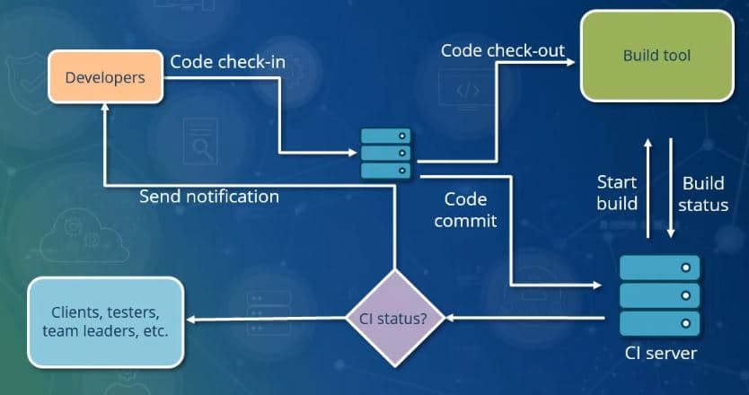
Continuous Integration: Catching Bugs Early
Continuous Integration (CI) treats code merging like a continuous stream, not a big-bang event, to keep the main codebase stable. On every commit, an automated system builds and tests the software to catch issues immediately.
Email Drip Campaigns: Automated User Nurturing
An email drip campaign is an automated conversation guiding a user from one state to another. It's used for onboarding new users or re-engaging inactive ones. The footgun is creating a rigid monologue that ignores user behavior instead of reacting to it.
Feature Toggles: Decouple Deployment from Release
A feature toggle is a runtime switch that lets you ship dormant code and activate it later, decoupling deployment from release. It enables canary rollouts and A/B tests.
Thematic Roadmaps: Focus on 'Why,' Not 'What'
A thematic roadmap organizes work around strategic goals ("themes") like "Improve User Onboarding," not just a feature list. It's used to align teams on high-level objectives and persuade executives. The footgun is mistaking a feature list for a strategy.

Streaks: Engineering Identity Through Loss Aversion
Streaks convert effort into identity, making users fear losing progress more than they enjoy extending it. Apps like Duolingo use this for daily engagement, but the footgun is when the streak itself becomes the goal, trapping users in a loop of loss aversion.
We are hiring for this. Every open role lists the topics its interview covers, so you can prepare for the real thing rather than guessing.
See open roles