All bites
The whole library, newest first. Filter by what you are here for, or pick a topic if you already know.
4247 bites
Page 163
Binning: Grouping Continuous Data into Buckets
Binning is like rounding, but for ranges. It groups continuous data into discrete 'buckets' to reduce noise. This turns messy user ages (21, 22.5) into clean categories (20-29) for analysis. The footgun: poor bin sizes can hide or create false trends.
Regular Expressions for Data Cleaning
Regex is a mini-language for describing text patterns, letting you find and fix messy data at scale. It's used to standardize phone numbers or extract zip codes from addresses. The footgun: complex regex is often unreadable and a maintenance nightmare.

Label Encoding: Turning Categories into Numbers
Label Encoding turns text categories into numbers, like assigning bib numbers to runners. It's essential for algorithms that need numerical input, but its biggest footgun is creating a fake order (e.g., 2 > 1) that can mislead linear models and neural…
Feature Engineering: Better Inputs, Better Models
Feature engineering preps raw data for a model, like a chef preps ingredients. It transforms raw inputs into a more effective set of predictive signals. The footgun is creating irrelevant features, which can harm model performance more than using raw data.
Box-Cox Transformation: Forcing Skewed Data to Look Normal
The Box-Cox transformation is a statistical lens that reshapes skewed data to better resemble a normal distribution. It helps meet the assumptions of models like linear regression, but it only works on positive data and complicates direct interpretation of…
Target Encoding: Replacing Categories with Target Stats
Target encoding replaces a category (e.g., "USA") with a statistic from your target variable (e.g., average sales). It's ideal for high-cardinality features where one-hot encoding is impractical. The footgun is data leakage, which causes severe overfitting.
Feature Selection: Making Models Better With Less Data
Feature selection improves models by giving them less data, finding signal by removing noise. Use it to speed up training, simplify models for easier interpretation, and avoid performance degradation from having too many input features.

Data Warehouse: The Central Repository for Analytics
A data warehouse is a central repository for historical analysis, integrating data from many systems. It's used for reporting and complex queries to find business insights, not for day-to-day transactions.
Data Quality Management: Is Your Data Fit for Use?
Data quality management ensures data is "fit for purpose." It's vital when training ML models or creating financial reports, as outcomes depend on data reliability. The footgun is treating quality as a one-time project, not a continuous process.

Histogram: See the Shape in Your Data
A histogram turns a raw list of numbers into a picture of its distribution, like sorting coins into stacks. It's used to see where data clusters and how it's spread out. The main footgun: the story your histogram tells depends entirely on the bin size.

Scatter Plot: Visualizing Relationships Between Two Variables
A scatter plot visualizes the relationship between two variables as a cloud of data points. It's used to quickly spot trends, like whether increased study time correlates with higher test scores. The key footgun: correlation is not causation.

Box Plot: See a Distribution's Shape at a Glance
A box plot is a cheat sheet for a dataset's distribution, showing the median, the middle 50% of data (the box), and outliers. Use it to quickly compare distributions, like server response times across regions. The footgun: the line is the median, not the mean.
Bar Chart: Compare Categories at a Glance
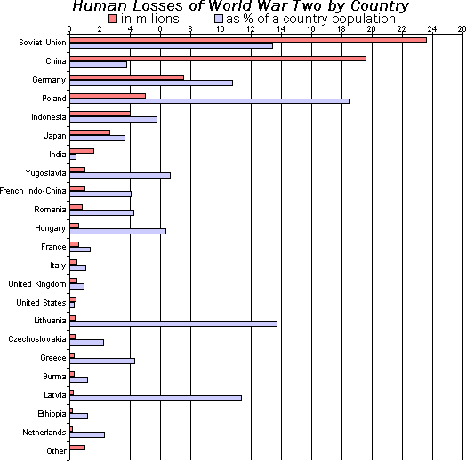
A bar chart is a lineup of rulers for different categories, making it easy to compare values. It's perfect for showing "how much" for discrete items, like monthly sales or user counts by country. The footgun: don't use it for continuous data—use a line chart.
Heatmap: Visualizing Magnitude with Color
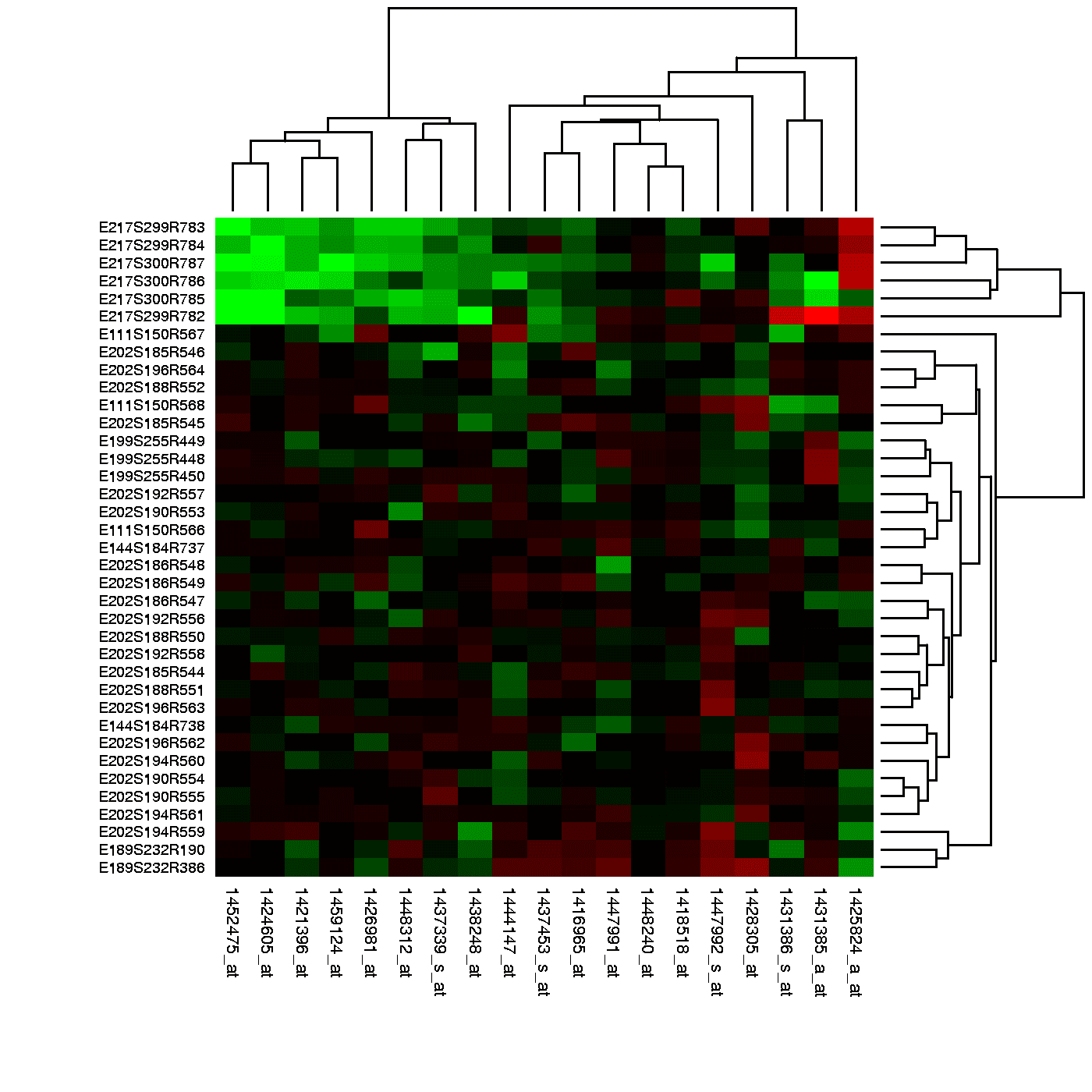
A heatmap is like coloring in a spreadsheet, using color to show the magnitude of values in a 2D grid. It's used to spot user engagement hotspots on a webpage, analyze financial data, or visualize gene expression.
Pair Plot: See All Your Data's Relationships at Once
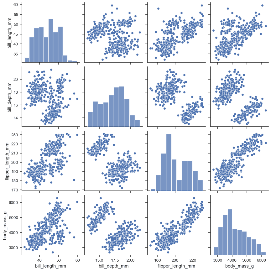
A pair plot is a matrix of charts showing every pairwise relationship in a dataset. Use it in exploratory data analysis to spot correlations and distributions at a glance. The footgun: it becomes unreadably large and slow with more than ~10 variables.
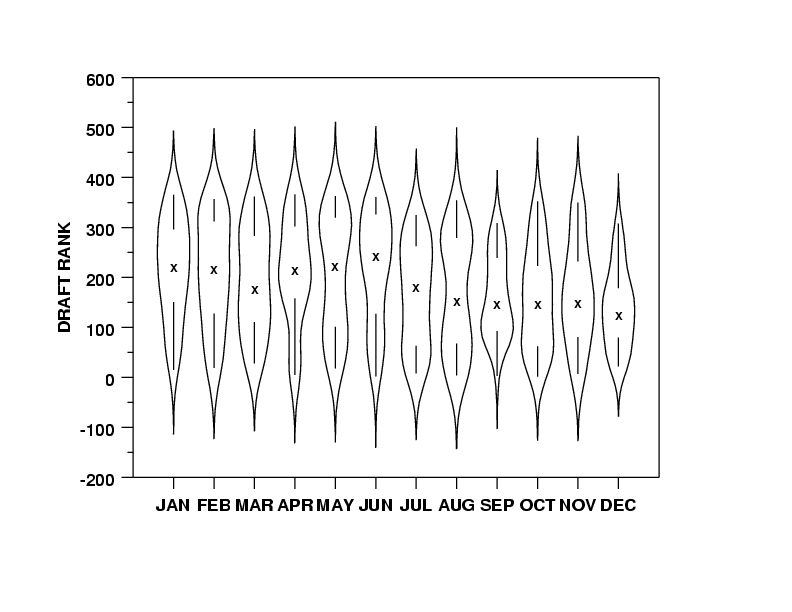
Violin Plots: Box Plots with a Sense of Shape
A violin plot is a box plot that also shows the data's shape. It reveals multi-modal distributions or skews that a simple box plot would hide. Use it to compare distributions across categories, like server response times.

Kernel Density Estimation: Beyond the Histogram
A KDE plot is a smoothed histogram, revealing a variable's distribution by summing 'bumps' over each data point instead of using rigid bins. It's great for data exploration, but the 'smoothness' (bandwidth) choice can drastically alter the plot's story.

Q-Q Plot: Visually Test if Data Fits a Distribution
A Q-Q plot visually checks if your data fits a theoretical distribution (like normal). If the points form a straight line, it's a match. Use it to validate model assumptions.
Facet Grid: A Visual GROUP BY for Your Data
A Facet Grid is a visual GROUP BY. It creates a matrix of plots, each showing a different subset of your data, to compare relationships across categories. The footgun is forgetting to call .map() to draw the plots; the grid is empty on its own.
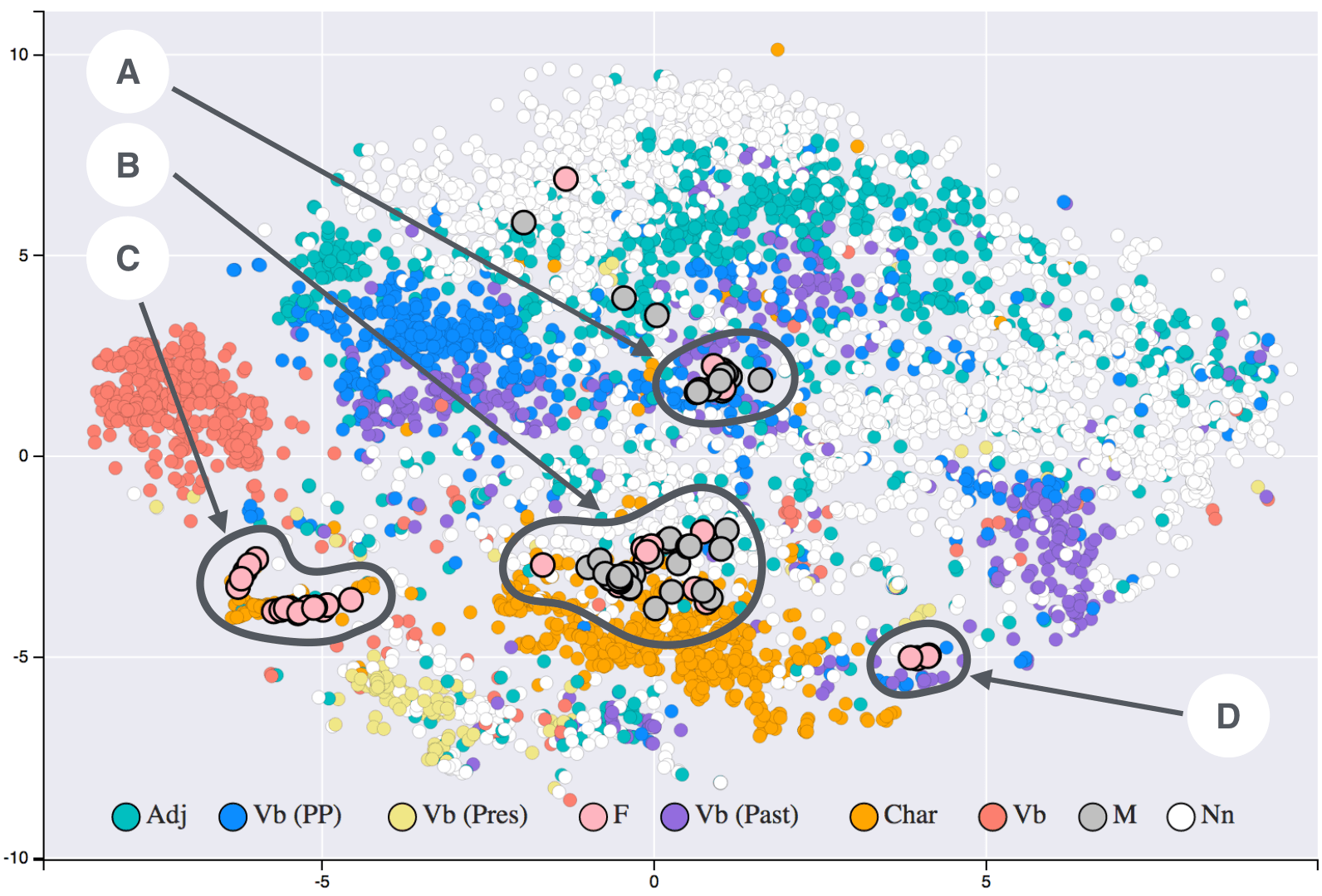
t-SNE: Map High-Dimensional Similarity to 2D
t-SNE turns high-dimensional similarity into 2D or 3D distance: similar points cluster and dissimilar points separate. Use it to visualize complex datasets on a flat map. Do not read exact distances from the plot; it preserves local probability, not geometry.