All bites
The whole library, newest first. Filter by what you are here for, or pick a topic if you already know.
8664 bites
Page 57
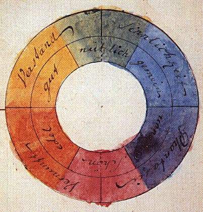
Color Theory: Harmony, Contrast, and Meaning in UI
Color theory is a system for using contrast, harmony, and symbolism to guide user experience. It's applied in UI to create visual hierarchy, evoke brand emotions, and ensure readability.

How does affordance guide choosing a native button over a styled div?
This tests if you see affordance as built-in behavior, not only looks. A strong answer picks the native button for free keyboard, focus, and reader support, noting a div needs tabindex, role, and keydown logic. A red flag is treating it as purely visual.
UI Typography for Readability
Good typography isn't about fancy fonts; it's about making content effortless to read by controlling size, spacing, and alignment. It's crucial for body copy, headings, and labels. The footgun is using justified text or lines over 90 characters long.
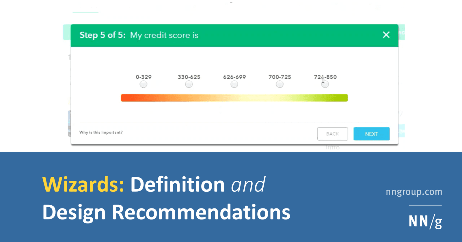
How do you design a low-cognitive-load wizard and implement it technically?
Pairing progressive disclosure with solid architecture. A strong answer hits step validation, URL-synced navigation, and isolated step components.
Affordances Are Actions, Signifiers Are Clues
An affordance is what's possible (a door can be pushed), while a signifier is the clue telling you how (the flat plate). In UI, a button's styling is a signifier for its click affordance. The footgun is saying 'affordance' when you mean 'signifier'.

How do you model and articulate long-term design debt cost to stakeholders?
Estimate refactor hours and support tickets; show fixes cost 3-5x more later; map inconsistency to trust erosion.

Jakob's Law: Don't Reinvent the UI Wheel
Users spend most of their time on other sites, so they expect yours to work like everything else they already know. Leverage familiar patterns for navigation, icons, and workflows.
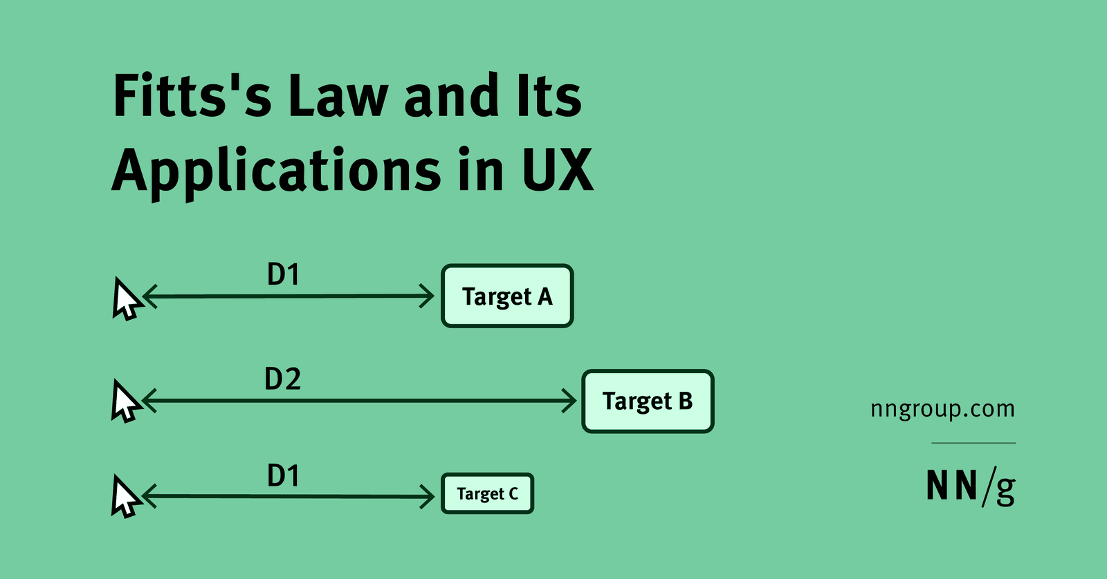
Use Fitts's Law to size and place primary vs secondary mobile actions
Large primary actions in easy thumb zones; secondary actions farther but keep minimum targets.
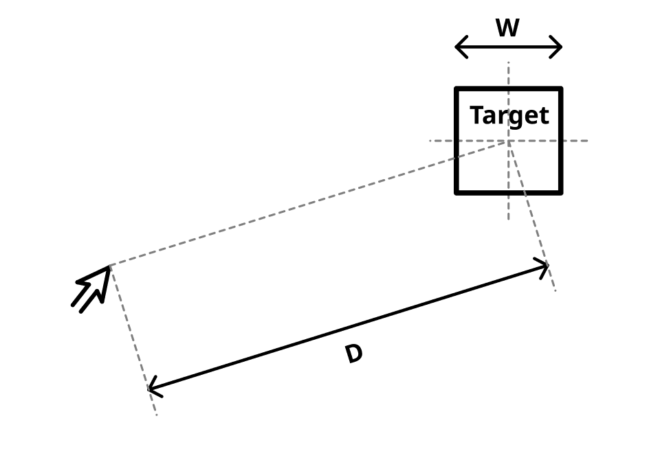
Fitts's Law: Bigger, Closer Targets Are Faster to Hit
Fitts's Law predicts that the time to hit a target depends on its distance and size. This is why mobile buttons are large and context menus appear at your cursor. The footgun is making everything huge, which sacrifices information density and visual hierarchy.

Line-height vs letter-spacing: impact on readability and values for body vs headings
This tests whether you distinguish vertical rhythm from horizontal glyph spacing. A strong answer sets body line-height to at least 1.5x per WCAG with minimal tracking, while headings use tighter line-height and tighter tracking. Red flag: identical values.
Hick's Law: More Choices, Slower Decisions
Hick's Law states that decision time increases logarithmically with the number of choices. It's why complex menus slow users down, forcing them into analysis paralysis.

How would you establish a modular typographic scale for a design system?
This tests systems thinking and contextual ratio choice. A strong answer picks a ratio by contrast—high for marketing, low for dashboards—rounds values, adds sizes for dense UIs, adjusts base size across breakpoints.
"Miller's Law" is Ambiguous and Often Misused
"Miller's Law" isn't one rule, but a name for four distinct, unrelated principles. This ambiguity causes confusion in fields like psychology and computer science.
Assess WCAG AA contrast for light grey text on off-white
Tests your fluency in WCAG relative luminance and design collaboration. A strong answer extracts sRGB values, computes contrast ratio, checks 4.5:1 or 3:1 by text size, and suggests a darker tint preserving hue.
Cognitive Load: Don't Make Users Think (Too Hard)
Think of a user's brain like a computer with limited RAM; cognitive load is the processing power your UI demands. High load from cluttered interfaces slows users down, causing them to miss details or abandon tasks.
How would you optimize and implement a full-bleed responsive hero image?
Use srcset with AVIF/WebP, CSS object-fit cover, and width/height to prevent CLS.
Anatomy of a Typeface: Why Letters Lie to Your Eyes
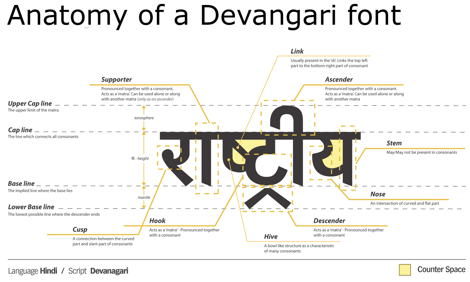
Typeface anatomy is a system of optical illusions. Letters are drawn with inconsistent dimensions to appear uniform. This is why a circle must be taller than a square to look the same size. The footgun is trusting bounding boxes over your eyes for alignment.
Building a scalable icon system in Figma
Standardize a grid, size, and stroke; make each icon a component with consistent naming, use currentColor-friendly single-color paths, and export optimized SVGs.
RGB vs. HSL: Two Ways to Tell a Computer 'Color'
RGB tells a computer how to mix light (Red, Green, Blue), while HSL describes color how humans perceive it (Hue, Saturation, Lightness). Use RGB for brand colors and HSL for intuitive variations. The footgun is creating low-contrast UIs that are unreadable.

How would you structure a multi-theme color system in Figma and CSS?
Primitives and Semantic collections with theme modes; pipeline to CSS variables; components use semantic tokens only.