Advanced concepts in Analytics & Metrics
Balanced Scorecard: Beyond Financial Metrics
A Balanced Scorecard connects daily actions to long-term strategy by measuring more than just financial results. It's used to align department goals with company objectives, ensuring work supports customer satisfaction.
Data-Driven vs. Data-Informed: Let Data Guide, Not Dictate
Data-driven means the data makes the call, like in an A/B test. Data-informed means a human makes the call, using data as one key input for strategic choices like setting a budget. The footgun is saying 'data-driven' when you mean 'data-informed'.
Customer Data Platform (CDP): Your Customer's Single Source of Truth
A Customer Data Platform (CDP) creates a single, persistent profile for each customer by unifying data from siloed sources. It's used for real-time personalization and AI-driven marketing. The footgun is confusing it with a CRM, which manages relationships.
Event Data Pipelining: From Raw Events to Analytics
Treat data not as static tables but as a continuous stream of events. Event data pipelining builds the infrastructure to capture, process, and deliver this real-time flow for analytics or AI applications.
Log Analysis: Reading Your System's Story
Log analysis turns raw, machine-generated records into a coherent story about your system's health, security, and performance. It's crucial for debugging production failures or investigating security incidents.
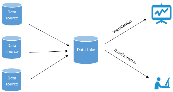
Data Lakehouse: The 'Lake' Foundation
A data lake is a central repository that stores all your data—structured or raw—in its original format. It's used to hold raw source system copies, sensor data, and social feeds for later analysis, but can become a messy "data swamp" without governance.
Slowly Changing Dimensions (SCDs)
Slowly Changing Dimensions (SCDs) are how data warehouses handle history for attributes that change infrequently, like a customer's address. This ensures historical reports remain accurate. The footgun is overwriting old values, which corrupts past analysis.
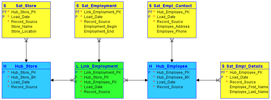
Data Vault Modeling: An Audit-First Data Warehouse
Data Vault modeling builds a warehouse like a financial ledger, where every entry is permanent and traceable. It excels at storing historical data from multiple systems for auditing.
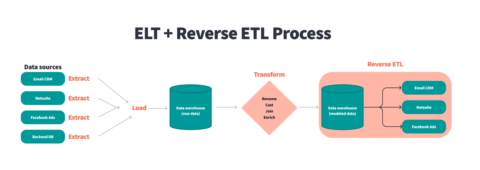
Reverse ETL: From Warehouse Insights to Operational Action
Reverse ETL pushes clean data from your central warehouse back into the operational tools business teams use daily. This powers sales with customer scores in their CRM or marketing with personalized segments, all from a single source of truth.
Data Governance: Corporate Management vs. Global Policy
Data governance operates at two scales: managing data within a company and setting data policy between nations. It applies to corporate data management and international internet governance.
Master Data Management (MDM): The Single Source of Truth
Master Data Management (MDM) creates a single source of truth for core business entities. It's used when departments have conflicting data (e.g., 'ACME Inc.' vs 'Acme Corp').
Data Stewardship: The Librarian for Your Data
A data steward is the designated owner of a data asset, responsible for its quality and business value, not just its storage. This role is crucial where data is shared across teams, ensuring consistency.
Data Masking: Protect Data, Preserve Utility
Data masking creates a realistic but fake version of your data by scrambling sensitive fields. It's used to give developers and analysts safe datasets for testing or analytics without exposing real PII.
Benchmarking: Know Where You Stand in Your Industry
Benchmarking answers "Are we good?" by comparing your performance metrics against industry bests. It's used to set realistic goals for cost, quality, or time. The main footgun is comparing apples to oranges—using benchmarks from dissimilar companies.
Exception Reporting: Focus on Signals, Not Noise
Exception reporting filters out the noise, showing only data that breaks predefined rules. It's used in financial reconciliation to flag mismatched transactions or to alert on system performance dips.
The Semantic Layer: A Business Map for Company Data
A semantic layer is a translation dictionary for data, mapping cryptic database columns to plain business terms like "Revenue." It lets non-technical teams build reports without writing SQL.

The Narrative Arc for Data Storytelling
A narrative arc gives data a story by building tension toward a key insight. It guides stakeholders from a problem (plot) to a turning point (climax) and a resolution. The footgun is oversimplifying; compelling stories have multiple smaller tension peaks.
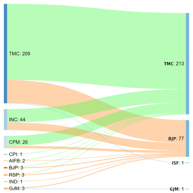
Sankey Diagram: Visualizing Proportional Flow
A Sankey diagram visualizes flow, where the width of each path is proportional to the quantity moving through it. Use it to trace user journeys or track budget allocation.

Choropleth Maps: Coloring Data by Region
A choropleth map colors geographic areas to represent a metric, like shading states red or blue on an election map. It's used to show regional data like population density or sales per territory.

Lie Factor: Quantifying Visual Distortion in Graphs
The Lie Factor measures how much a graph's visuals distort the data's story. It's used to critique charts that exaggerate changes, like with a truncated y-axis.
We are hiring for this. Every open role lists the topics its interview covers, so you can prepare for the real thing rather than guessing.
See open roles