Intermediate concepts in Analytics & Metrics, page 2

Ad Hoc Reporting: Answering One-Off Business Questions
Ad hoc reporting is your data "quick dive" for one-off questions, unlike static dashboards. A sales team might use it to see how a holiday affected regional sales.

Data Visualization: Turning Numbers into Insight
Data visualization turns raw data into pictures, revealing stories that numbers alone can't tell. It's used to spot trends, find outliers, and grasp complex relationships in datasets.

Data-Ink Ratio: Maximize Signal, Minimize Noise
The Data-Ink Ratio states that a good chart maximizes the ink showing data and minimizes everything else. It's a call to erase 'chart junk'—heavy gridlines or 3D effects—that doesn't convey information.
Small Multiples: Comparing Data with a Grid of Charts
Small multiples are a comic strip for data, showing different dataset slices in a grid of charts with identical axes. They're used to compare trends across categories, like sales per region. The footgun is using inconsistent scales, which breaks comparison.
Statistical Significance: Is Your Result Real or Just Random?
Statistical significance checks if a result is a real effect or just random chance. It answers: 'How surprising is this data if my change had no effect?' It's used in A/B tests to validate new features. The footgun: a significant result isn't always important.
P-value: Probability of Your Data, Not Your Hypothesis
A p-value measures how surprising your data is, assuming your null hypothesis (e.g., "no change") is true. It's used in A/B tests to decide if an effect is real. The footgun: a low p-value doesn't prove your theory, it just casts doubt on the null.

Confidence Interval: Quantifying Uncertainty in Your Estimates
A confidence interval puts error bars around a measurement, showing the plausible range for a true value. It's used in A/B tests to report not just a winner, but the range of its likely impact.
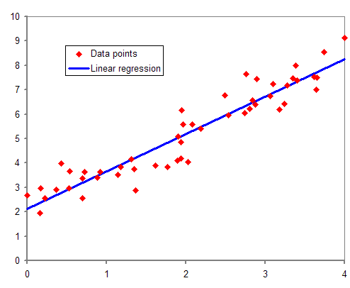
Regression Analysis: Finding the Line of Best Fit
Regression analysis draws a line through data to model relationships between variables. Use it to predict a house price from its square footage or forecast sales from ad spend. The footgun: a strong correlation doesn't prove one variable causes the other.
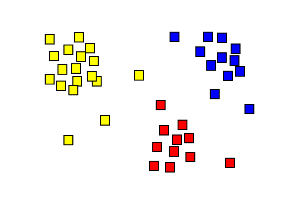
Cluster Analysis: Finding Hidden Groups in Your Data
Cluster analysis automatically finds natural groupings in unlabeled data, like sorting a mixed bag of Legos without a manual. It's used for customer segmentation or anomaly detection.
Outlier Detection: Finding Data That Doesn't Belong
Outlier detection finds data points that don't fit the pattern, signaling an error, fraud, or a new event. It's used to spot faulty sensor readings or fraudulent transactions.
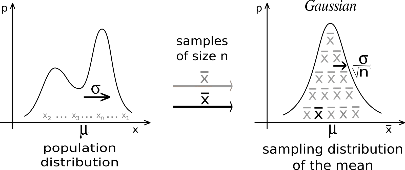
Central Limit Theorem: Why Averages Form a Bell Curve
The Central Limit Theorem explains why averages of samples tend to form a bell curve, even if the original data doesn't. It's the foundation for A/B testing and quality control. The footgun is assuming it works for small or non-independent samples.
Hypothesis Testing: Is Your Data Signal or Noise?
Hypothesis testing is a courtroom trial for your data: you assume a default 'null hypothesis' is true until your data provides enough evidence to reject it. It's used in A/B tests to validate changes.
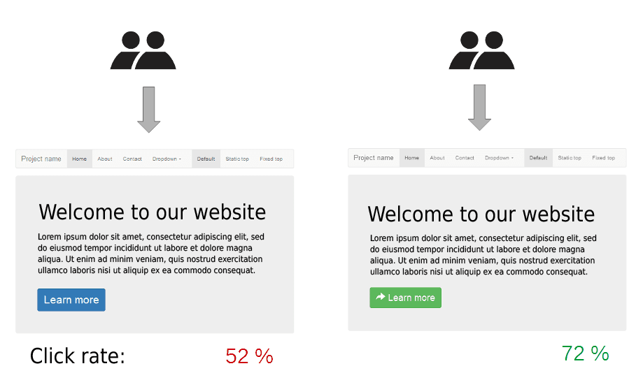
A/B Testing: Making Decisions with Data, Not Guesses
A/B testing is a controlled experiment pitting two versions of a product against each other with real users. It's used to see if a change, like a new button color, improves a metric like clicks.
Type I vs. Type II Errors: False Alarms vs. Missed Detections
A Type I error is a false alarm (a smoke alarm with no fire), while a Type II error is a missed detection (a fire with no alarm). This trade-off is crucial in A/B testing and medical diagnostics.

Standard Error: Gauging Your Measurement's Precision
Standard error measures the precision of a sample statistic, like the mean. It answers: "If I ran this experiment again, how much would my result change?" It's key for building confidence intervals and A/B testing. Don't confuse it with standard deviation.
The Counterfactual Framework for Causal Inference
The Counterfactual Framework models causality by imagining two parallel universes for each person: one with a treatment, one without. It's the basis for A/B tests and analyzing observational data.
Average Treatment Effect (ATE): Isolating the Impact of a Change
The Average Treatment Effect (ATE) isolates an intervention's true impact by comparing the average outcome of a treated group to a control group. It's used in A/B tests and policy evaluations. The footgun is assuming causation without true randomization.

The Novelty Effect: When New Isn't Always Better
The Novelty Effect is a temporary metric spike from a feature's newness, not its inherent value. It often appears in A/B tests for high-frequency products, inflating short-term metrics. The footgun is mistaking this initial excitement for a long-term win.
Sample Ratio Mismatch (SRM): When Your A/B Test Is Broken
Sample Ratio Mismatch (SRM) means your A/B test's traffic split is broken, violating random assignment. For example, a 50/50 split results in a statistically significant imbalance.
Exponential Smoothing: Weighting Recent Data More Heavily
Exponential smoothing creates forecasts from a weighted average of past data, where weights decay exponentially for older points. It's used for quick, reliable predictions like inventory demand. The footgun: simple versions ignore trends and seasonality.
We are hiring for this. Every open role lists the topics its interview covers, so you can prepare for the real thing rather than guessing.
See open roles