Intermediate interview questions in Analytics & Metrics, page 3
How do you create a 'golden record' from fragmented data?
Tests your ability to design a data reconciliation system. A great answer outlines a process: profiling sources, defining survivorship rules, implementing a matching engine, and creating a stewardship process. A red flag is suggesting a simple one-off script.
How do you create a 'golden record' for customers?
Tests your grasp of data governance and systems thinking. A strong answer defines master data, outlines a phased approach (discovery, rule-setting, implementation), and covers ongoing stewardship.
Slow dashboard querying a large fact table: first three checks?
This tests systematic diagnosis of fact-table query latency. A strong answer checks the execution plan and indexing, evaluates partitioning and data model fit, and inspects caching or pre-aggregation.
How to diagnose a slow dashboard query?
This tests systematic debugging of a data problem. A good answer investigates the query plan first, then the table's physical layout (partitioning/clustering), and finally the BI tool and warehouse load. A red flag is jumping to a solution without diagnosis.
How would you diagnose a slow dashboard query?
This tests your systematic approach to performance tuning. A great answer investigates query optimization, strategic indexing/partitioning, and the data model (like star schema).
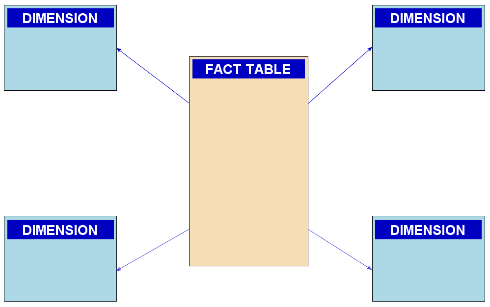
Why is star schema preferred over 3NF for analytics?
Tests your grasp of the read-performance trade-off in analytical schemas. A great answer names fact and dimension tables, emphasizes fewer joins for aggregations, and cites simpler SQL and faster query plans.
Explain the star schema and its advantages for analytics
This tests your grasp of OLAP vs. OLTP data modeling. A great answer defines fact/dimension tables, explains how denormalization leads to fewer joins and faster queries, and contrasts this with 3NF's focus on write integrity.
Explain a star schema and its advantages for analytics
Tests your grasp of data modeling trade-offs for OLAP vs. OLTP. A good answer defines fact/dimension tables, then explains how denormalization and fewer joins improve query speed for analytics. A red flag is confusing it with a snowflake schema.

How do duplicate events bias COUNT(*) and daily login reports?
Tests idempotency in streaming analytics. COUNT(*) overcounts; fix with unique event ID dedup via idempotent writes or COUNT(DISTINCT id), plus daily partition reconciliation. Red flag: SELECT DISTINCT * without a stable key or no reporting safeguard.
How do you handle duplicate events in an analytics pipeline?
Tests your grasp of data integrity and idempotent processing. Explain how duplicates inflate COUNT(*), then propose adding a unique event_id and using a stateful stream processor to track seen IDs. Mention query-time COUNT(DISTINCT event_id) as an alternative.
How do you ensure accurate counts with duplicate analytics events?
Tests your grasp of data integrity under at-least-once delivery. Explain why COUNT(*) is inflated, then propose deduplication using a unique event ID. Mention trade-offs of stateful processing. A red flag is ignoring the cost or the need for a unique ID.

How would you structure a user engagement dashboard for PMs?
Tests narrative sequencing of metrics across abstraction layers. Strong answer: DAU headline for health, retention cohorts for pattern diagnosis, feature adoption funnels for root-cause drill-down.
How would you design a product management dashboard?
This tests your ability to structure data hierarchically for a specific persona (PM). A great answer outlines a 3-tier structure: summary KPIs, trend analysis, and drill-downs. A red flag is listing charts without explaining how they guide PM decisions.
How would you design a product management dashboard?
Tests your ability to structure data into a decision-making narrative. A good answer moves from a high-level summary (DAU) to trends (retention) and then actionable details (feature adoption). A red flag is simply listing charts without a narrative connection.
Stakeholder claims feature usage drives retention. How do you validate?
Probe confounders, reverse causality, selection bias; propose diff-in-diff or propensity scores; plot lagged usage vs retention.
Stakeholder claims correlation implies causation. How do you investigate?
This tests your scientific rigor beyond the simple "correlation isn't causation" mantra. Acknowledge the finding, probe for confounding variables, suggest cohort analysis, and propose an A/B test. A red flag is reciting the mantra without a concrete plan.
Feature A correlates with retention. Should we invest more?
Tests your ability to move beyond clichés to propose concrete analysis. A great answer questions the correlation, suggests cohort analysis or A/B testing, and probes for confounding variables. Red flag: just saying 'correlation isn't causation' with no plan.

Explain pre-attentive attributes and give three examples
This tests whether you know preattentive attributes are decoded in <200ms to guide attention freely. Name three such as color hue, size, and motion; then encode one variable in a dense scatter plot so targets pop out. Never call this decoration or color all.
Explain pre-attentive attributes in data visualization
Tests designing high-signal UIs. Define pre-attentive attributes as visual cues processed instantly (e.g., color, size, shape). Apply one to make key data 'pop' in a dense chart.
Explain pre-attentive attributes in data visualization
Tests your grasp of visual psychology in data viz. Define pre-attentive attributes (instantly processed visuals), give examples (color, size, shape), and explain using one to highlight outliers in a dense plot.
We are hiring for this. Every open role lists the topics its interview covers, so you can prepare for the real thing rather than guessing.
See open roles