Concepts in Data Science & Analytics, page 4
Box-Cox Transformation: Forcing Skewed Data to Look Normal
The Box-Cox transformation is a statistical lens that reshapes skewed data to better resemble a normal distribution. It helps meet the assumptions of models like linear regression, but it only works on positive data and complicates direct interpretation of…

Target Encoding: Replacing Categories with Target Stats
Target encoding replaces a category (e.g., "USA") with a statistic from your target variable (e.g., average sales). It's ideal for high-cardinality features where one-hot encoding is impractical. The footgun is data leakage, which causes severe overfitting.
Feature Selection: Making Models Better With Less Data
Feature selection improves models by giving them less data, finding signal by removing noise. Use it to speed up training, simplify models for easier interpretation, and avoid performance degradation from having too many input features.

Data Warehouse: The Central Repository for Analytics
A data warehouse is a central repository for historical analysis, integrating data from many systems. It's used for reporting and complex queries to find business insights, not for day-to-day transactions.
Data Quality Management: Is Your Data Fit for Use?
Data quality management ensures data is "fit for purpose." It's vital when training ML models or creating financial reports, as outcomes depend on data reliability. The footgun is treating quality as a one-time project, not a continuous process.
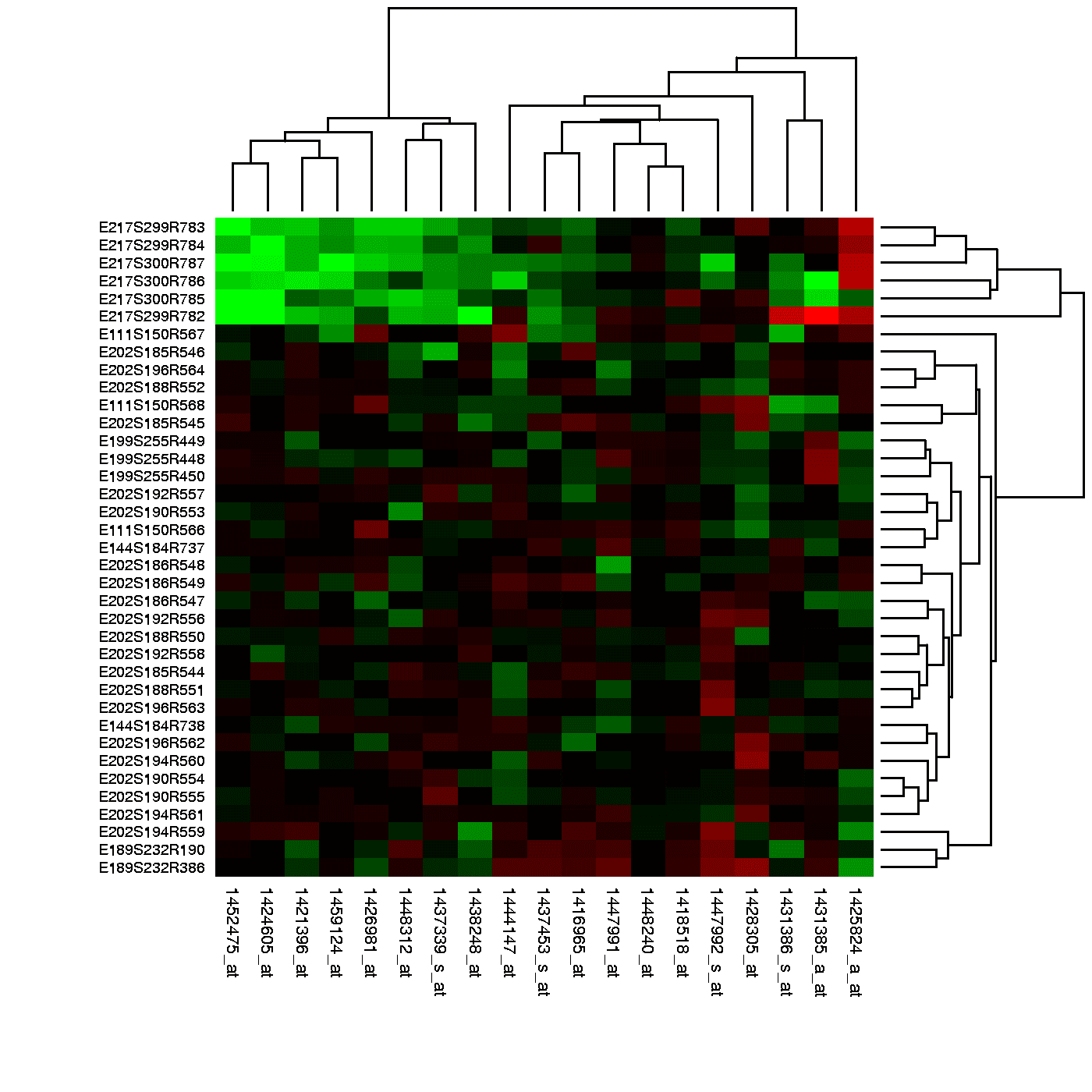
Heatmap: Visualizing Magnitude with Color
A heatmap is like coloring in a spreadsheet, using color to show the magnitude of values in a 2D grid. It's used to spot user engagement hotspots on a webpage, analyze financial data, or visualize gene expression.
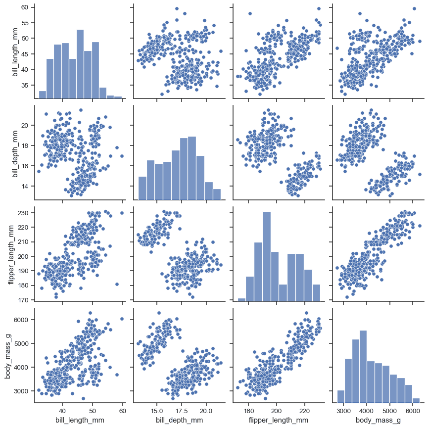
Pair Plot: See All Your Data's Relationships at Once
A pair plot is a matrix of charts showing every pairwise relationship in a dataset. Use it in exploratory data analysis to spot correlations and distributions at a glance. The footgun: it becomes unreadably large and slow with more than ~10 variables.
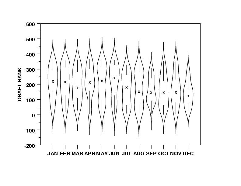
Violin Plots: Box Plots with a Sense of Shape
A violin plot is a box plot that also shows the data's shape. It reveals multi-modal distributions or skews that a simple box plot would hide. Use it to compare distributions across categories, like server response times.

Kernel Density Estimation: Beyond the Histogram
A KDE plot is a smoothed histogram, revealing a variable's distribution by summing 'bumps' over each data point instead of using rigid bins. It's great for data exploration, but the 'smoothness' (bandwidth) choice can drastically alter the plot's story.

Q-Q Plot: Visually Test if Data Fits a Distribution
A Q-Q plot visually checks if your data fits a theoretical distribution (like normal). If the points form a straight line, it's a match. Use it to validate model assumptions.
Facet Grid: A Visual GROUP BY for Your Data
A Facet Grid is a visual GROUP BY. It creates a matrix of plots, each showing a different subset of your data, to compare relationships across categories. The footgun is forgetting to call .map() to draw the plots; the grid is empty on its own.
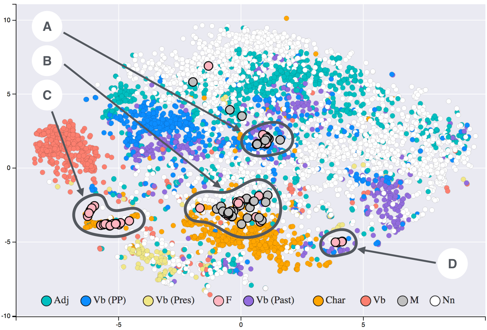
t-SNE: Map High-Dimensional Similarity to 2D
t-SNE turns high-dimensional similarity into 2D or 3D distance: similar points cluster and dissimilar points separate. Use it to visualize complex datasets on a flat map. Do not read exact distances from the plot; it preserves local probability, not geometry.
UMAP: Visualizing High-Dimensional Data's Shape
UMAP projects complex data into a 2D/3D view, preserving local structure like a faithful map of a hilly landscape. Use it to visualize clusters in customer or gene data as a faster t-SNE alternative. Footgun: Cluster sizes and distances are not meaningful.
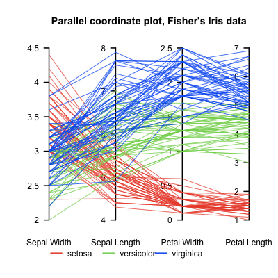
Parallel Coordinates Plot: Untangling High-Dimensional Data
A parallel coordinates plot turns high-dimensional data into a 2D image by laying axes out in parallel. Each data point becomes a line weaving across them. It helps find clusters in multivariate data, but overplotting can make it unreadable with too many…
k-Nearest Neighbors: You Are the Company You Keep
k-NN classifies new data by taking a vote from its closest neighbors. It's used for simple predictions where distance is meaningful, like product recommendations. The main footgun is choosing k: too small is noisy, too large blurs boundaries.
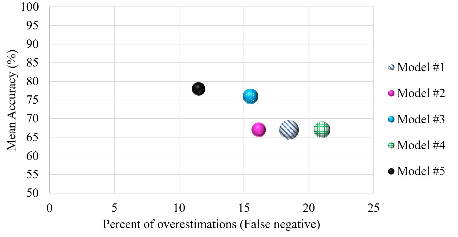
Cross-Validation: Don't Test on Your Training Data
Cross-validation stops a model from 'cheating' by testing it on unseen data. It repeatedly splits your dataset into training and testing portions to simulate real-world performance.
Support Vector Machine: Finding the Widest Street
A Support Vector Machine (SVM) finds the widest possible "street" to separate data classes. It's used for classification tasks like text analysis. The footgun is forgetting the "kernel trick," which lets SVMs solve non-linear problems, not just draw lines.
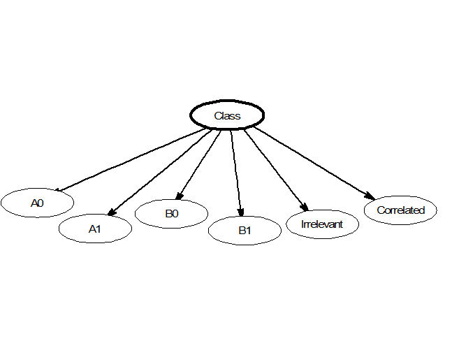
Naive Bayes: Fast Classification by Assuming Independence
Naive Bayes classifies data by assuming its features are unrelated, like judging a fruit's type by color and shape independently. This makes it fast for tasks like spam filtering or real-time predictions. Its core 'naive' assumption is almost always wrong.
Hierarchical Clustering: Building a Family Tree for Data
Hierarchical clustering builds a family tree of your data, not just a single set of groups. It's used when you don't know the number of clusters beforehand, like in biology or market segmentation. The main footgun: early merges are final and can't be undone.

Regularization: Penalizing Complexity to Prevent Overfitting
Regularization is a complexity tax on a machine learning model, forcing it to favor simpler patterns over memorizing training data. It's used to prevent overfitting in models like neural networks, improving their performance on new, unseen data.
We are hiring for this. Every open role lists the topics its interview covers, so you can prepare for the real thing rather than guessing.
See open roles