Everything in Data Science & Analytics, page 11
Causal DAGs: A Map for Cause and Effect
A Causal DAG is a map of your assumptions about what causes what. It helps you spot hidden "confounder" variables that create misleading correlations. Use it before an analysis to decide which variables to control for, ensuring you measure a true effect.
Propensity Score Matching: Simulating a Randomized Trial
Propensity Score Matching creates a 'fair' comparison from observational data, mimicking a randomized trial. It's used to estimate a treatment's effect by matching treated individuals with similar untreated ones.
SUTVA: The Assumption That Your Treatment Isn't Leaking
SUTVA assumes your treatment on one person doesn't spill over to affect others, and that the treatment is consistent for all. It's a key assumption for A/B tests, but is violated when one person's vaccine protects their unvaccinated neighbor.
Statistical Power: Is Your Test Strong Enough to Find a Real Effect?
Statistical power is your experiment's ability to detect a real effect. A low-power test is like a fishing net with holes too big—the fish swims right through. This is critical for A/B tests. The footgun is concluding "no effect" from a weak test.
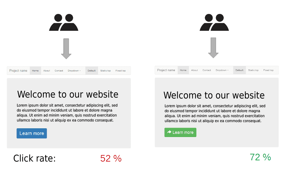
A/A Testing: Sanity-Checking Your Experiments
A/A testing is a fire drill for your A/B testing system. You run two identical versions of a page to ensure your tools are working correctly before a real experiment. The biggest footgun is panicking at a false positive; 1 in 20 tests will show.
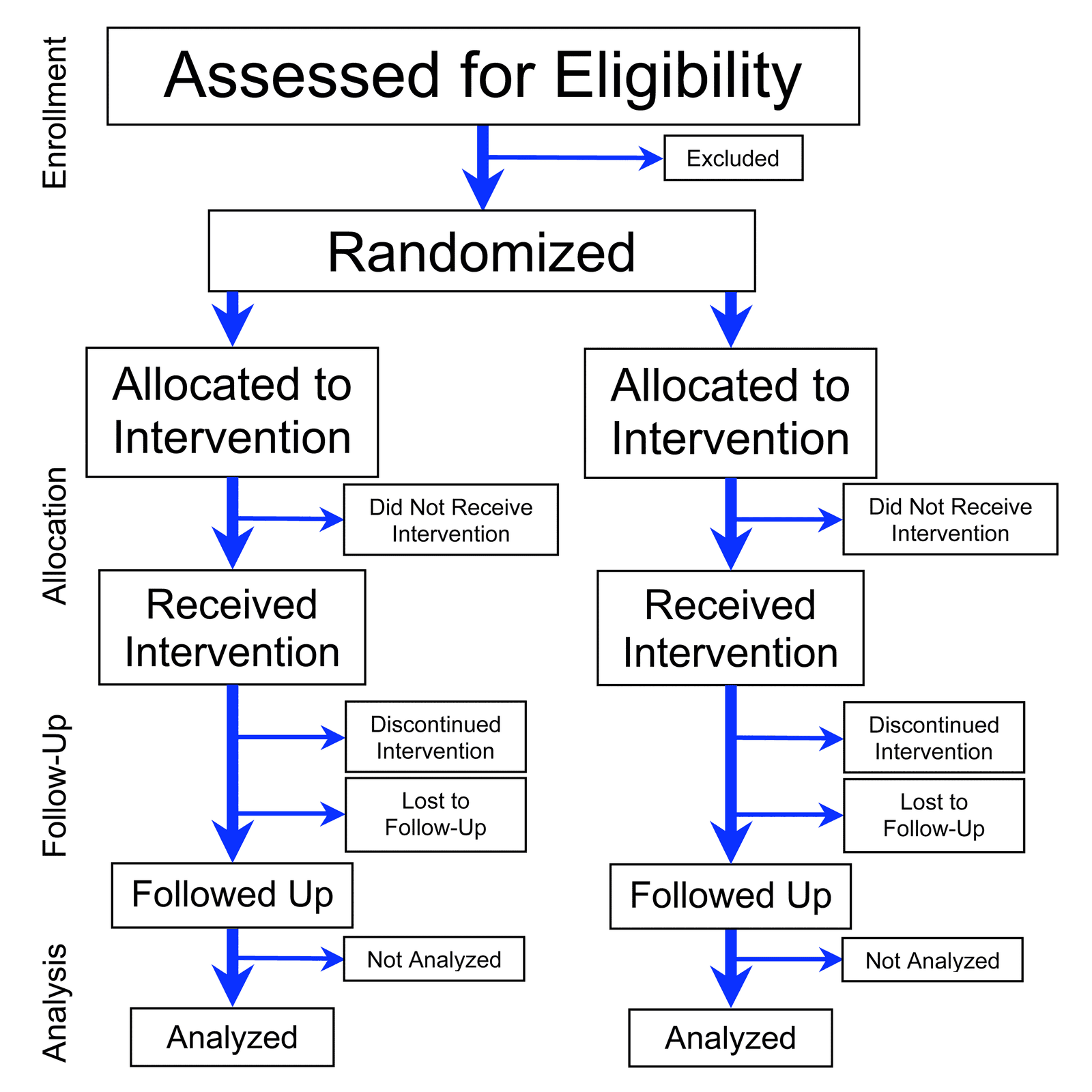
Randomization: Defeating Bias with Chance
Randomization uses chance to assign subjects to groups, isolating the effect you're testing from hidden variables. It's the foundation of A/B tests and clinical trials. The footgun is confusing 'haphazard' selection with true, unbiased randomization.
Ensemble Learning: Bagging vs. Boosting
Ensemble methods combine multiple weak models into one strong one, like a committee outperforming a single expert. Bagging reduces variance; Boosting reduces bias. The footgun: Boosting can overfit noisy data by trying to model the noise itself.
Random Forest: Many Weak Learners Make One Strong Model
A random forest asks a crowd of simple decision trees for a prediction and takes the majority vote. This ensemble approach is used for classification and regression, correcting for a single tree's tendency to overfit. The footgun is its lower interpretability.

Regularization: Penalizing Complexity to Prevent Overfitting
Regularization is a complexity tax on a machine learning model, forcing it to favor simpler patterns over memorizing training data. It's used to prevent overfitting in models like neural networks, improving their performance on new, unseen data.
Hierarchical Clustering: Building a Family Tree for Data
Hierarchical clustering builds a family tree of your data, not just a single set of groups. It's used when you don't know the number of clusters beforehand, like in biology or market segmentation. The main footgun: early merges are final and can't be undone.
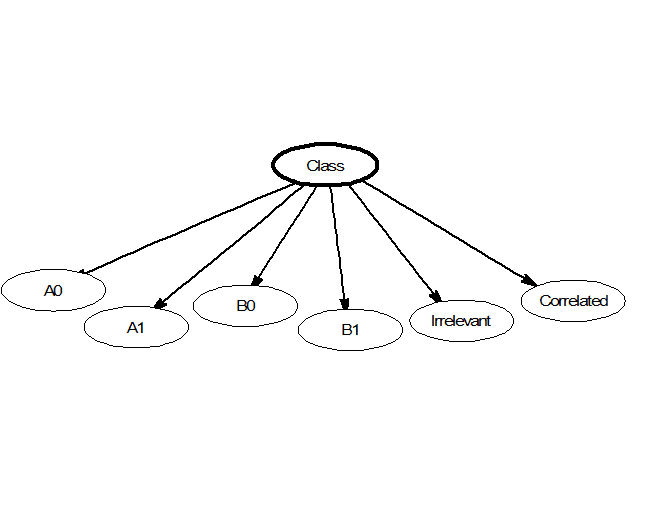
Naive Bayes: Fast Classification by Assuming Independence
Naive Bayes classifies data by assuming its features are unrelated, like judging a fruit's type by color and shape independently. This makes it fast for tasks like spam filtering or real-time predictions. Its core 'naive' assumption is almost always wrong.
Support Vector Machine: Finding the Widest Street
A Support Vector Machine (SVM) finds the widest possible "street" to separate data classes. It's used for classification tasks like text analysis. The footgun is forgetting the "kernel trick," which lets SVMs solve non-linear problems, not just draw lines.
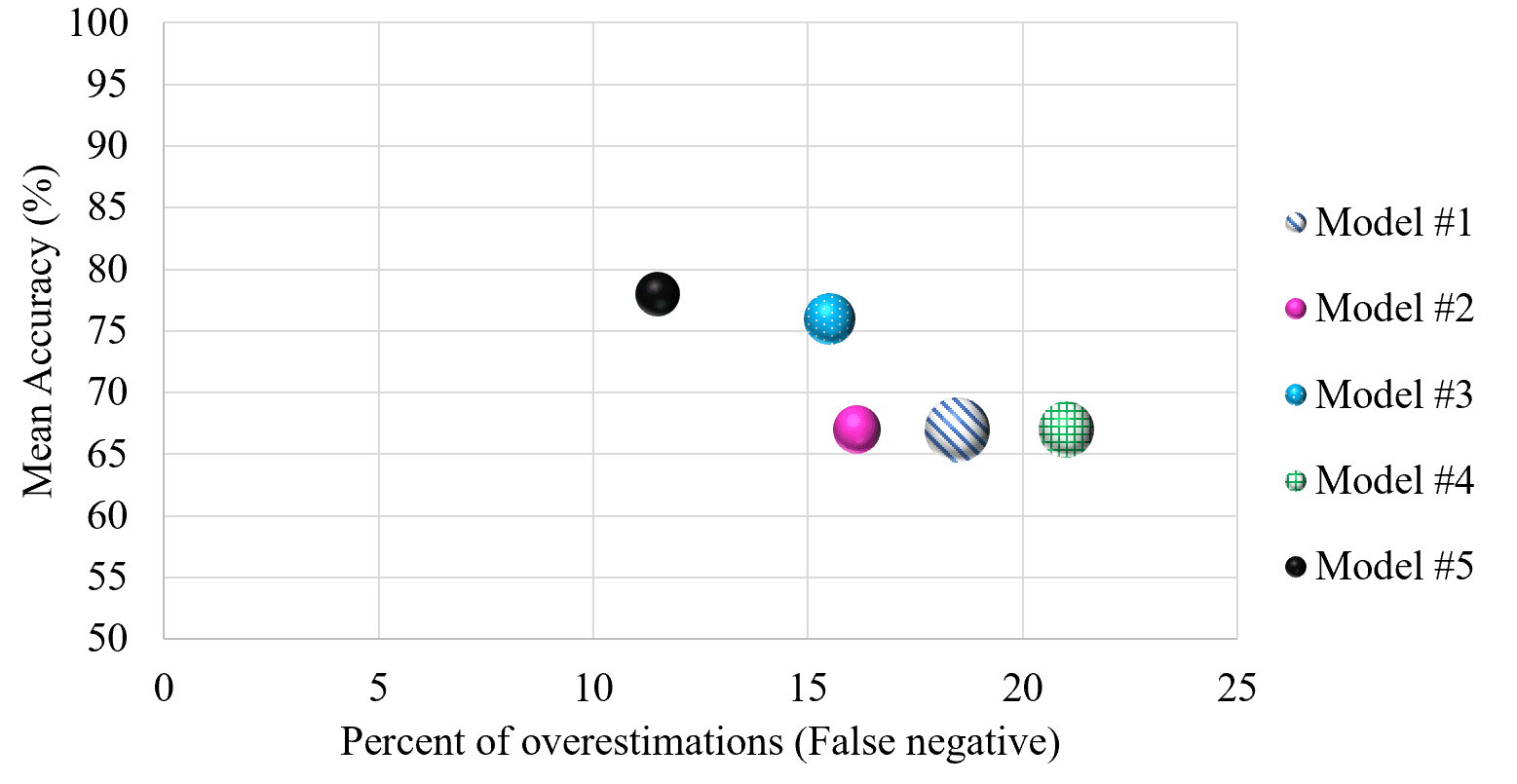
Cross-Validation: Don't Test on Your Training Data
Cross-validation stops a model from 'cheating' by testing it on unseen data. It repeatedly splits your dataset into training and testing portions to simulate real-world performance.
Decision Tree Learning: A Flowchart for Your Data
Decision tree learning builds a predictive flowchart from your data. It's used for classification (like spam vs. not spam) or regression (like predicting price). The main footgun is overfitting: creating a tree so specific it can't handle new data.
k-Means Clustering: Grouping Data Around Centroids
k-Means automatically groups data into a specified number of clusters (k) by finding the center of each group. It's used for customer segmentation, document categorization, and image compression.
k-Nearest Neighbors: You Are the Company You Keep
k-NN classifies new data by taking a vote from its closest neighbors. It's used for simple predictions where distance is meaningful, like product recommendations. The main footgun is choosing k: too small is noisy, too large blurs boundaries.

Logistic Regression: Predicting a Yes or No Outcome
Logistic regression predicts a binary outcome (yes/no, 1/0) by calculating the probability of an event. It's used for classifying things like spam email or fraudulent transactions. The footgun is mistaking its output for certainty instead of a probability.
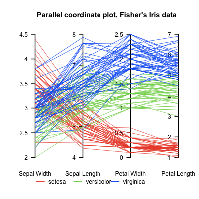
Parallel Coordinates Plot: Untangling High-Dimensional Data
A parallel coordinates plot turns high-dimensional data into a 2D image by laying axes out in parallel. Each data point becomes a line weaving across them. It helps find clusters in multivariate data, but overplotting can make it unreadable with too many…
UMAP: Visualizing High-Dimensional Data's Shape
UMAP projects complex data into a 2D/3D view, preserving local structure like a faithful map of a hilly landscape. Use it to visualize clusters in customer or gene data as a faster t-SNE alternative. Footgun: Cluster sizes and distances are not meaningful.
Facet Grid: A Visual GROUP BY for Your Data
A Facet Grid is a visual GROUP BY. It creates a matrix of plots, each showing a different subset of your data, to compare relationships across categories. The footgun is forgetting to call .map() to draw the plots; the grid is empty on its own.
We are hiring for this. Every open role lists the topics its interview covers, so you can prepare for the real thing rather than guessing.
See open roles