Concepts in Design & UX, page 6
Boilerplate: The Copy-Paste Text of Everything
Boilerplate is standardized, reusable text you can drop into new contexts. It shows up in legal disclaimers, "About Us" pages, and code libraries. The footgun is overusing it, making your work feel impersonal or applying a template where custom text was…

Screening UX Research Candidates
Screening surveys separate real users from professional testers and biased insiders before they skew your research. Without manual vetting of screener answers, convenience samples and speedrunners still pollute your design decisions.
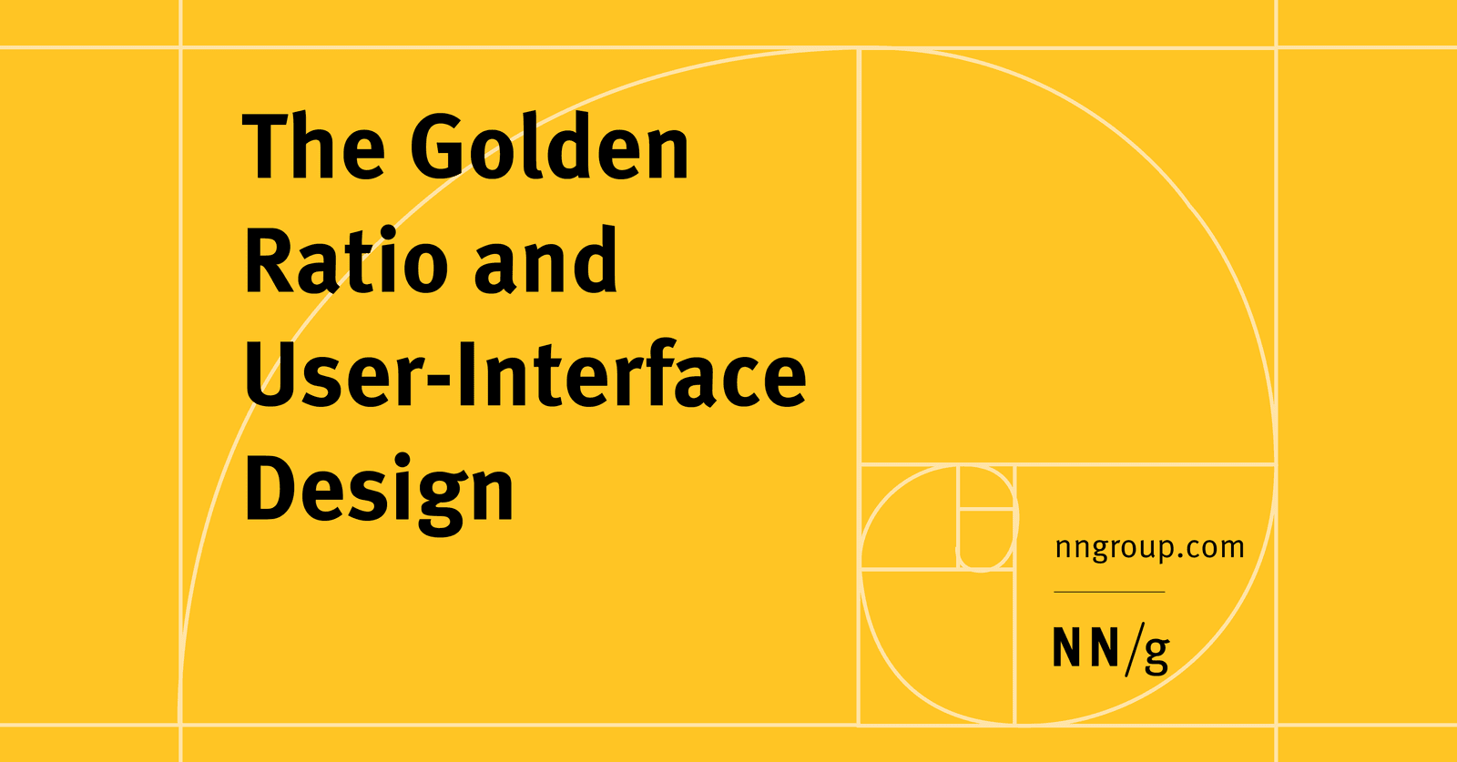
The Golden Ratio in UI Design
The Golden Ratio (1.618) is a proportion from art and nature used to create visually harmonious UI. Apply it to set layout dimensions or create a typographic scale (e.g., a 26px header for 16px body text).
Footer Layout Patterns
A footer is a safety net for users who reach the bottom of a page without finding what they need. Use a "Big" footer for complex sites, "Medium" for standard ones, and "Slim" for simple pages.
Brand Messaging Framework: From Core Idea to Consistent Copy
A brand messaging framework is your company's playbook for communication, ensuring every piece of copy expresses the same core personality and value. It guides website copy, sales pitches, and social media, keeping your team aligned.
UX Research Incentives: How Much to Pay Participants
Think of research incentives as an investment in data quality, not just a cost. For a 60-minute interview, budget $75-150 for consumers or $200-500 for specialists. The footgun is underpaying: you'll get poor data and waste everyone's time.

Baseline Grid: Aligning Text for Vertical Rhythm
A baseline grid is like ruled notebook paper for your UI, forcing all text to sit on common horizontal lines for clean vertical rhythm. Use it in text-heavy layouts to improve readability.
Modal Dialogs: The Focus Trap Pattern
A modal dialog is a "focus trap" that overlays the UI, forcing a user to complete a task. It's used for critical confirmations or focused inputs, like a date picker. The main footgun is failing to trap keyboard focus, letting users tab into the inert.
Brand Archetypes: Connecting via the Collective Unconscious
Brand archetypes apply universal patterns from myths (Jungian archetypes) to give a brand a familiar personality. This creates an emotional shortcut, making the brand feel instantly recognizable.
Header Components: An Exception to Reusability
Treat your site header as a unique beast, not a reusable component. Its complexity—managing branding, responsive navigation, and sticky positioning—makes abstraction brittle. The footgun is reusing the entire header instead of just its internal components.
Style Guides: The DNA of Consistent Writing
A style guide is the source code for your brand's voice—a rulebook for writing, formatting, and design. It's used to create a unified experience across marketing, product, and docs.
Figma: Frames vs. Groups
A Frame is a container with its own size, like an artboard; a Group's size just shrinks to fit its contents. Use Frames for UI components with fixed dimensions and clipping, and Groups for simple collections.
Master-Detail: Show a List, Focus on One
The master-detail pattern splits your UI into a list of items (master) and a view for the selected one (detail). It's used in email clients and file explorers to manage information density. The footgun is a master list so sparse it forces users to click.
Tagline vs. Slogan: Company Identity vs. Campaign Message
A tagline is your company's permanent mission statement (Nike's "Just Do It"). A slogan is a temporary message for a specific ad campaign. This clarifies brand strategy, ensuring long-term identity isn't diluted by marketing.
Semi-Structured Interviews: Uncover User Needs Through Conversation
A semi-structured interview is a guided conversation, not a rigid script, to uncover the 'why' behind user needs. Use it in discovery to define problems before designing.
Figma Shape Tools: Your Design Building Blocks
Figma's shape tools are the building blocks for any design. Use them to create everything from buttons and icons to dividers. The footgun: forgetting to hold Shift for perfect squares/circles or Option/Alt to resize from the center, slowing you down.
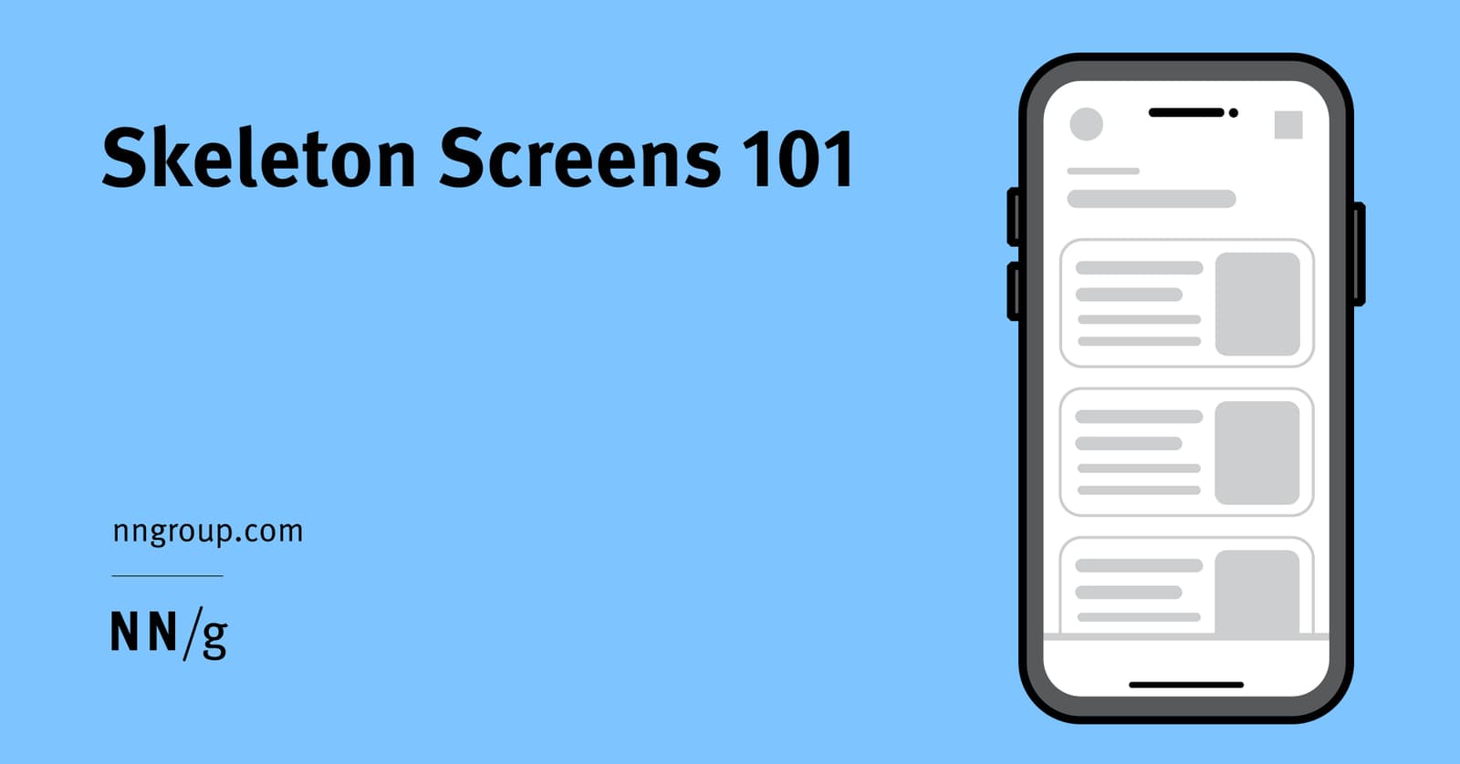
Skeleton Screens: Faster by Faking It
Skeleton screens create the illusion of speed by showing a wireframe-like preview of a page while content loads. They're used for full-page loads to set expectations about the layout. The footgun is showing just the app frame, which gives no structure.
The Messaging Matrix: Your Company's Rosetta Stone
A Messaging Matrix is your company's Rosetta Stone for communication, ensuring everyone tells the same core story. It maps benefits and proof points to audience segments, aligning sales, marketing, and product. The footgun is treating it as a one-off document.
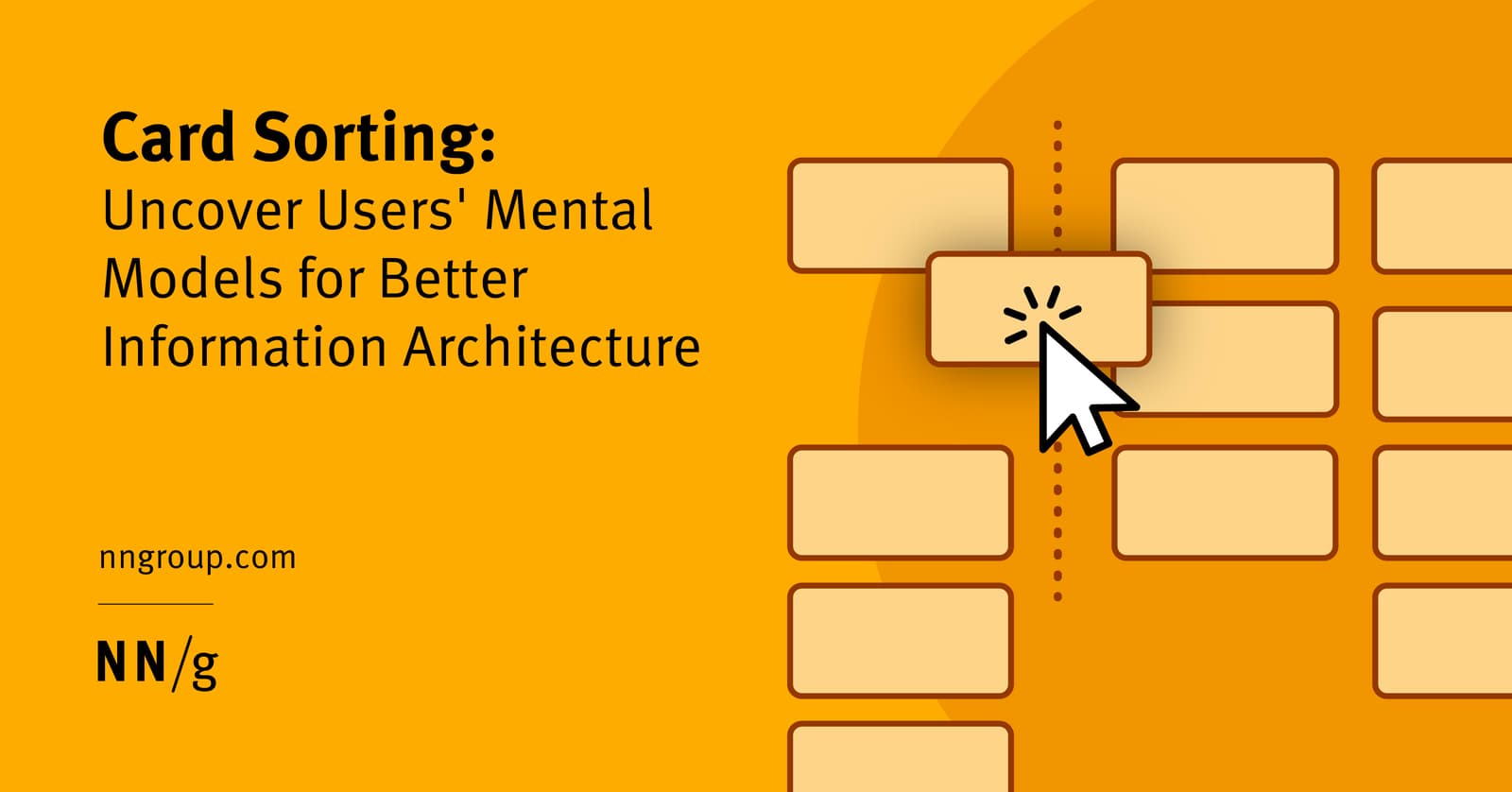
Open Card Sorting: Map Your User's Brain
Open card sorting reveals how users mentally group your content. You give them topics on cards and ask them to sort them into groups they create and name. It's ideal for designing intuitive navigation.
Figma Color Profiles: sRGB vs. Display P3
Figma's color profiles ensure consistent color across screens. Use sRGB for web standard compatibility or Display P3 for more vibrant colors on modern displays.
We are hiring for this. Every open role lists the topics its interview covers, so you can prepare for the real thing rather than guessing.
See open roles