Advanced concepts in Product Management, page 4

Personalized Onboarding: One Size Fits None
Personalized onboarding guides users based on their role or goal, not a generic script. It's key for apps with diverse user types, showing marketers and engineers different paths to value. The footgun is a one-size-fits-all tour that buries their "aha!"
Onboarding Gamification: Guiding Users with Game Mechanics
Onboarding gamification uses game-like elements to guide new users through key actions, turning a checklist into a challenge. It's used to boost activation by making initial setup feel rewarding, like earning a badge for completing your profile.

Buy a Feature: Prioritize by Making Customers Spend
Buy a Feature turns prioritization into a game where customers spend a limited budget on their desired features. It's used in product planning to force trade-offs and reveal true value.
Cost of Delay: Quantifying the Price of Waiting
Cost of Delay puts a price tag on waiting, quantifying the value lost for every week a feature isn't shipped. It helps prioritize work by its economic impact, not just effort.
Impact Mapping: From Business Goals to Code
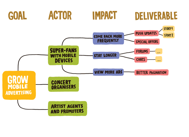
Impact Mapping is a visual roadmap that connects business goals directly to features, forcing you to answer "Why?" before "What?". Use it to align stakeholders on a new vision or prioritize a backlog. The footgun is starting with features and working backward.

The Narrative Arc for Data Storytelling
A narrative arc gives data a story by building tension toward a key insight. It guides stakeholders from a problem (plot) to a turning point (climax) and a resolution. The footgun is oversimplifying; compelling stories have multiple smaller tension peaks.
Goal-Question-Metric: Measure What Matters, Not What's Easy
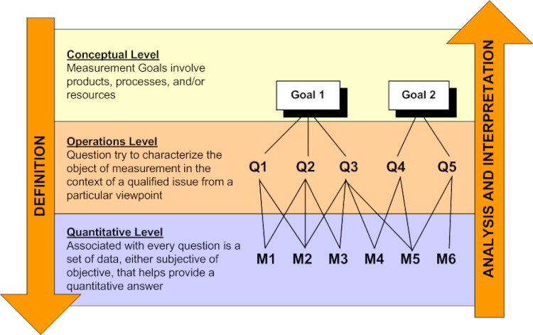
GQM is a top-down framework for defining metrics. You start with a Goal, ask Questions to clarify it, then define Metrics to answer them. This avoids the common trap of collecting vanity metrics that don't reflect true software quality or business goals.
Sankey Diagram: Visualizing Proportional Flow
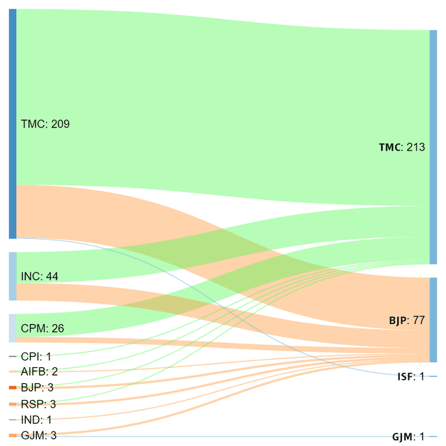
A Sankey diagram visualizes flow, where the width of each path is proportional to the quantity moving through it. Use it to trace user journeys or track budget allocation.

Choropleth Maps: Coloring Data by Region
A choropleth map colors geographic areas to represent a metric, like shading states red or blue on an election map. It's used to show regional data like population density or sales per territory.

Lie Factor: Quantifying Visual Distortion in Graphs
The Lie Factor measures how much a graph's visuals distort the data's story. It's used to critique charts that exaggerate changes, like with a truncated y-axis.
Emergent Architecture: Build Just Enough, Just in Time
Emergent architecture lets design evolve as you build, prioritizing adaptation over upfront planning. It's used in agile teams where requirements are unclear.
Negative Churn: When Losing Customers Still Means Growth
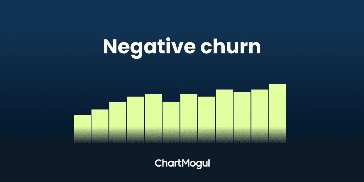
Negative churn means existing customers upgrade faster than others leave, growing your revenue even if you lose logos. It's a key SaaS metric for variable pricing models. The footgun: you can have negative revenue churn while still losing many customers.
Continuous Delivery vs. Deployment: The Final Step
Continuous Delivery automates releases to a staging environment for a manual go-live decision, while Continuous Deployment automatically pushes every passing build to production. Use Delivery for business-timed releases; use Deployment for maximum velocity.
Customer Health Score: A Predictive Churn Signal
A Customer Health Score is like a credit score for customer loyalty, predicting churn risk. SaaS companies use it to focus retention efforts on at-risk accounts before they cancel. The footgun is using vanity metrics like logins over true value signals.
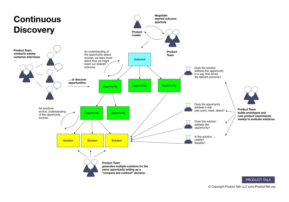
Continuous Discovery: Talk to Users Weekly, Not Yearly
Continuous discovery means small, weekly chats with customers, not a big upfront research phase. It's for teams building products that are never 'done,' like Netflix or your SaaS app. The footgun is treating discovery as a project, leading to stale insights.

Roadmap Commitment Levels: Now, Next, Later
Agile roadmaps replace fixed timelines with commitment levels: 'Now' (in progress), 'Next' (planned), and 'Later' (potential ideas). This structure communicates decreasing certainty, allowing teams to adapt without breaking promises.
Value-Based Pricing: Charge for Impact, Not Cost
Value-based pricing anchors your price to the customer's perceived benefit, not your production costs. It's used for unique goods like art or software where value is high. The main footgun is assuming value instead of researching customer willingness to pay.
Price Elasticity: How Price Changes Affect Demand
Price elasticity measures how sensitive sales are to price changes. An elasticity of -2 means a 1% price increase causes a 2% drop in quantity sold. It's key for forecasting revenue from price tests, but the biggest footgun is assuming this ratio is constant.

Simpson's Paradox: When Averages Mislead
Simpson's Paradox is when a trend seen in separate groups reverses when you combine them. This happens when a hidden variable, like user experience level, skews the results, making a bad feature look good overall. Always segment your data to avoid this trap.
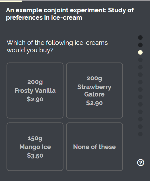
Conjoint Analysis: What Features Do Users *Really* Value?
Stop asking users what they want; make them choose. Conjoint analysis reveals true priorities by forcing trade-offs between product features, like price vs. battery life. It's used for pricing and roadmapping.
We are hiring for this. Every open role lists the topics its interview covers, so you can prepare for the real thing rather than guessing.
See open roles