All bites
The whole library, newest first. Filter by what you are here for, or pick a topic if you already know.
8667 bites
Page 364
Hierarchical Clustering: Building a Family Tree for Data
Hierarchical clustering builds a family tree of your data, not just a single set of groups. It's used when you don't know the number of clusters beforehand, like in biology or market segmentation. The main footgun: early merges are final and can't be undone.
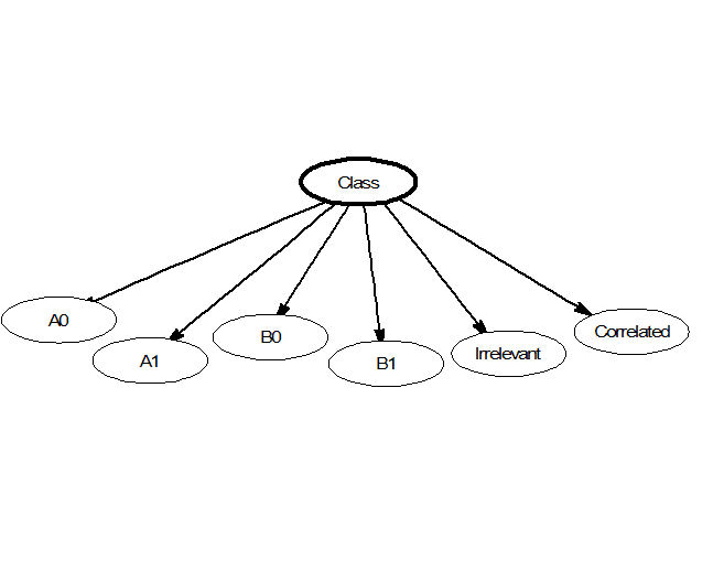
Naive Bayes: Fast Classification by Assuming Independence
Naive Bayes classifies data by assuming its features are unrelated, like judging a fruit's type by color and shape independently. This makes it fast for tasks like spam filtering or real-time predictions. Its core 'naive' assumption is almost always wrong.
Support Vector Machine: Finding the Widest Street
A Support Vector Machine (SVM) finds the widest possible "street" to separate data classes. It's used for classification tasks like text analysis. The footgun is forgetting the "kernel trick," which lets SVMs solve non-linear problems, not just draw lines.
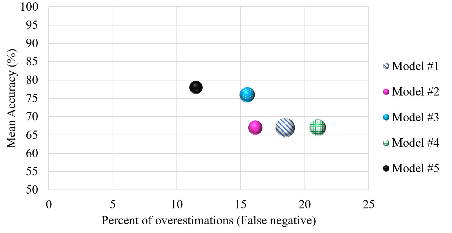
Cross-Validation: Don't Test on Your Training Data
Cross-validation stops a model from 'cheating' by testing it on unseen data. It repeatedly splits your dataset into training and testing portions to simulate real-world performance.
Decision Tree Learning: A Flowchart for Your Data
Decision tree learning builds a predictive flowchart from your data. It's used for classification (like spam vs. not spam) or regression (like predicting price). The main footgun is overfitting: creating a tree so specific it can't handle new data.
k-Means Clustering: Grouping Data Around Centroids
k-Means automatically groups data into a specified number of clusters (k) by finding the center of each group. It's used for customer segmentation, document categorization, and image compression.
k-Nearest Neighbors: You Are the Company You Keep
k-NN classifies new data by taking a vote from its closest neighbors. It's used for simple predictions where distance is meaningful, like product recommendations. The main footgun is choosing k: too small is noisy, too large blurs boundaries.

Logistic Regression: Predicting a Yes or No Outcome
Logistic regression predicts a binary outcome (yes/no, 1/0) by calculating the probability of an event. It's used for classifying things like spam email or fraudulent transactions. The footgun is mistaking its output for certainty instead of a probability.
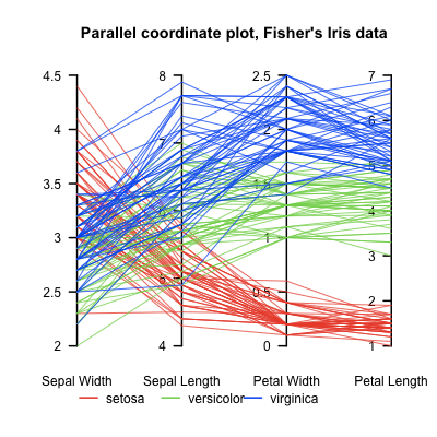
Parallel Coordinates Plot: Untangling High-Dimensional Data
A parallel coordinates plot turns high-dimensional data into a 2D image by laying axes out in parallel. Each data point becomes a line weaving across them. It helps find clusters in multivariate data, but overplotting can make it unreadable with too many…
UMAP: Visualizing High-Dimensional Data's Shape
UMAP projects complex data into a 2D/3D view, preserving local structure like a faithful map of a hilly landscape. Use it to visualize clusters in customer or gene data as a faster t-SNE alternative. Footgun: Cluster sizes and distances are not meaningful.
Facet Grid: A Visual GROUP BY for Your Data
A Facet Grid is a visual GROUP BY. It creates a matrix of plots, each showing a different subset of your data, to compare relationships across categories. The footgun is forgetting to call .map() to draw the plots; the grid is empty on its own.

Q-Q Plot: Visually Test if Data Fits a Distribution
A Q-Q plot visually checks if your data fits a theoretical distribution (like normal). If the points form a straight line, it's a match. Use it to validate model assumptions.

Kernel Density Estimation: Beyond the Histogram
A KDE plot is a smoothed histogram, revealing a variable's distribution by summing 'bumps' over each data point instead of using rigid bins. It's great for data exploration, but the 'smoothness' (bandwidth) choice can drastically alter the plot's story.
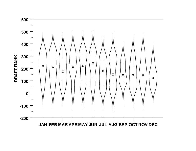
Violin Plots: Box Plots with a Sense of Shape
A violin plot is a box plot that also shows the data's shape. It reveals multi-modal distributions or skews that a simple box plot would hide. Use it to compare distributions across categories, like server response times.
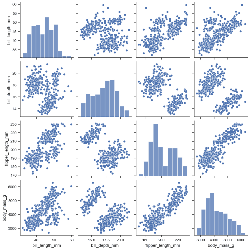
Pair Plot: See All Your Data's Relationships at Once
A pair plot is a matrix of charts showing every pairwise relationship in a dataset. Use it in exploratory data analysis to spot correlations and distributions at a glance. The footgun: it becomes unreadably large and slow with more than ~10 variables.
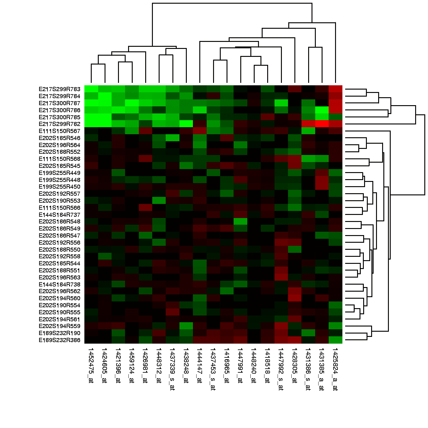
Heatmap: Visualizing Magnitude with Color
A heatmap is like coloring in a spreadsheet, using color to show the magnitude of values in a 2D grid. It's used to spot user engagement hotspots on a webpage, analyze financial data, or visualize gene expression.
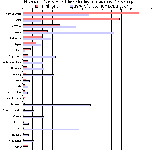
Bar Chart: Compare Categories at a Glance
A bar chart is a lineup of rulers for different categories, making it easy to compare values. It's perfect for showing "how much" for discrete items, like monthly sales or user counts by country. The footgun: don't use it for continuous data—use a line chart.

Box Plot: See a Distribution's Shape at a Glance
A box plot is a cheat sheet for a dataset's distribution, showing the median, the middle 50% of data (the box), and outliers. Use it to quickly compare distributions, like server response times across regions. The footgun: the line is the median, not the mean.

Scatter Plot: Visualizing Relationships Between Two Variables
A scatter plot visualizes the relationship between two variables as a cloud of data points. It's used to quickly spot trends, like whether increased study time correlates with higher test scores. The key footgun: correlation is not causation.

Histogram: See the Shape in Your Data
A histogram turns a raw list of numbers into a picture of its distribution, like sorting coins into stacks. It's used to see where data clusters and how it's spread out. The main footgun: the story your histogram tells depends entirely on the bin size.