Concepts in Analytics & Metrics, page 4

Data-Ink Ratio: Maximize Signal, Minimize Noise
The Data-Ink Ratio states that a good chart maximizes the ink showing data and minimizes everything else. It's a call to erase 'chart junk'—heavy gridlines or 3D effects—that doesn't convey information.
Small Multiples: Comparing Data with a Grid of Charts
Small multiples are a comic strip for data, showing different dataset slices in a grid of charts with identical axes. They're used to compare trends across categories, like sales per region. The footgun is using inconsistent scales, which breaks comparison.

The Narrative Arc for Data Storytelling
A narrative arc gives data a story by building tension toward a key insight. It guides stakeholders from a problem (plot) to a turning point (climax) and a resolution. The footgun is oversimplifying; compelling stories have multiple smaller tension peaks.
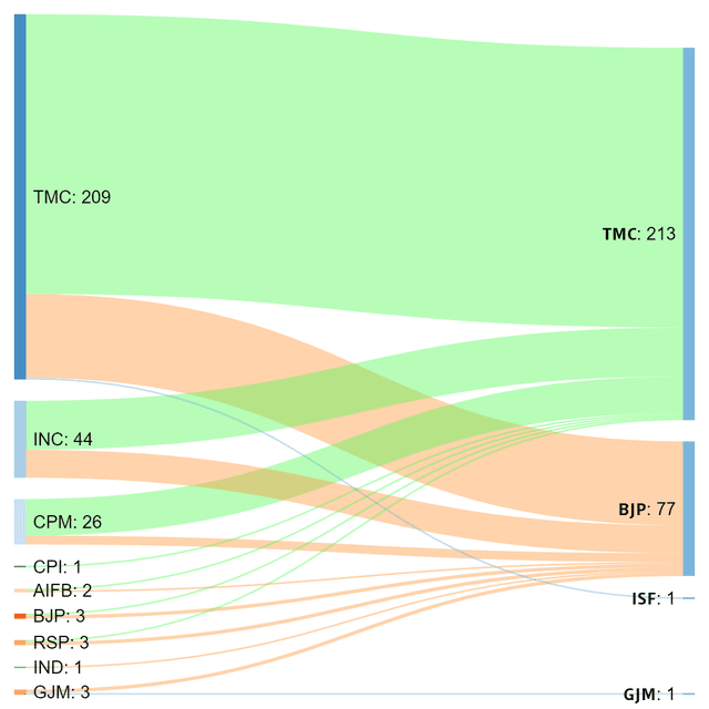
Sankey Diagram: Visualizing Proportional Flow
A Sankey diagram visualizes flow, where the width of each path is proportional to the quantity moving through it. Use it to trace user journeys or track budget allocation.

Choropleth Maps: Coloring Data by Region
A choropleth map colors geographic areas to represent a metric, like shading states red or blue on an election map. It's used to show regional data like population density or sales per territory.

Lie Factor: Quantifying Visual Distortion in Graphs
The Lie Factor measures how much a graph's visuals distort the data's story. It's used to critique charts that exaggerate changes, like with a truncated y-axis.
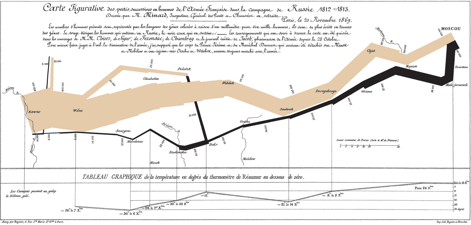
Exploratory Data Analysis (EDA): Look Before You Leap
Exploratory Data Analysis (EDA) is like being a detective with your data: you look for clues, patterns, and outliers before forming a theory. It's the first step in any data project, from building a model to creating a dashboard.
Correlation Is Not Causation
Just because two metrics move together doesn't mean one causes the other. This is vital when analyzing user data, as a feature launch might correlate with higher signups when the real cause was a marketing campaign.
Root Cause Analysis: Stop Fixing Symptoms, Find the Source
Root Cause Analysis digs past surface-level symptoms to find the true origin of a problem. It’s used to analyze IT outages, manufacturing defects, and even medical misdiagnoses.
Statistical Significance: Is Your Result Real or Just Random?
Statistical significance checks if a result is a real effect or just random chance. It answers: 'How surprising is this data if my change had no effect?' It's used in A/B tests to validate new features. The footgun: a significant result isn't always important.
P-value: Probability of Your Data, Not Your Hypothesis
A p-value measures how surprising your data is, assuming your null hypothesis (e.g., "no change") is true. It's used in A/B tests to decide if an effect is real. The footgun: a low p-value doesn't prove your theory, it just casts doubt on the null.

Confidence Interval: Quantifying Uncertainty in Your Estimates
A confidence interval puts error bars around a measurement, showing the plausible range for a true value. It's used in A/B tests to report not just a winner, but the range of its likely impact.
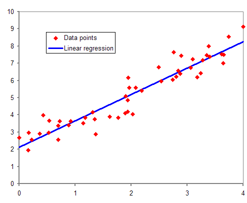
Regression Analysis: Finding the Line of Best Fit
Regression analysis draws a line through data to model relationships between variables. Use it to predict a house price from its square footage or forecast sales from ad spend. The footgun: a strong correlation doesn't prove one variable causes the other.
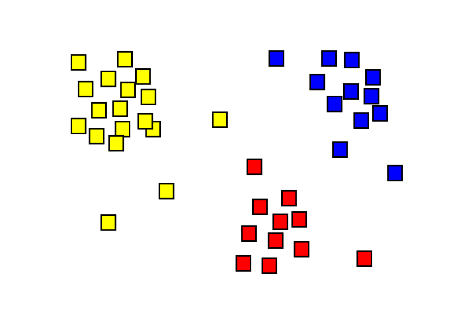
Cluster Analysis: Finding Hidden Groups in Your Data
Cluster analysis automatically finds natural groupings in unlabeled data, like sorting a mixed bag of Legos without a manual. It's used for customer segmentation or anomaly detection.
Outlier Detection: Finding Data That Doesn't Belong
Outlier detection finds data points that don't fit the pattern, signaling an error, fraud, or a new event. It's used to spot faulty sensor readings or fraudulent transactions.

Simpson's Paradox: When Averages Mislead
Simpson's Paradox is when a trend seen in separate groups reverses when you combine them. This happens when a hidden variable, like user experience level, skews the results, making a bad feature look good overall. Always segment your data to avoid this trap.

Principal Component Analysis (PCA)
PCA finds the most informative axes in your data, letting you compress many features into a few "principal components." Use it to visualize high-dimensional datasets or preprocess features for machine learning, but beware: the components are hard to interpret.
Time Series Decomposition: Separating Signal from Noise
Time series decomposition breaks a metric into its core parts: long-term trend, repeating seasonal patterns, and random noise. This helps you understand *why* a metric changed—was it a real shift or just the usual holiday rush?

Probability Distribution: Mapping What's Possible
A probability distribution maps every possible outcome of a random event to its likelihood. It's used in A/B testing to model conversions or in monitoring to predict server load. The footgun is assuming every distribution is a bell curve; many are not.
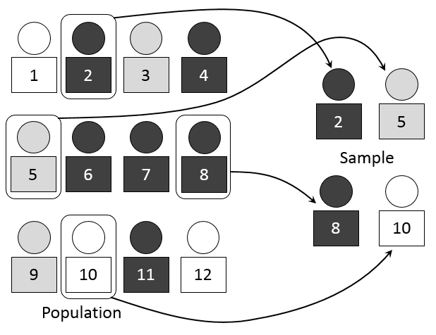
Sampling: Estimating the Whole from a Small Part
Sampling lets you understand a large group by studying a small, representative piece. Think of it like tasting a spoonful of soup to season the whole pot. It's used in A/B tests and polls, but the main footgun is a biased sample.
We are hiring for this. Every open role lists the topics its interview covers, so you can prepare for the real thing rather than guessing.
See open roles