Intermediate concepts in Design & UX, page 8

Dynamic Theme Switching with CSS
Let your app's theme automatically follow the user's OS setting. CSS's prefers-color-scheme media query lets you define styles for light and dark modes. The footgun is forgetting the 'no-preference' state, which can result in an unstyled default.

Usability Testing: Watch Real Users, Not Just Experts
Usability testing evaluates a product by observing real, first-time users interact with it, revealing flaws that designers often miss. It's used to validate design intuitiveness before launch.

UX Maturity: Six Stages of Organizational UX
UX maturity maps how deeply user-centered design lives in an organization, from ignored to user-driven. It matters when scaling research or justifying headcount.
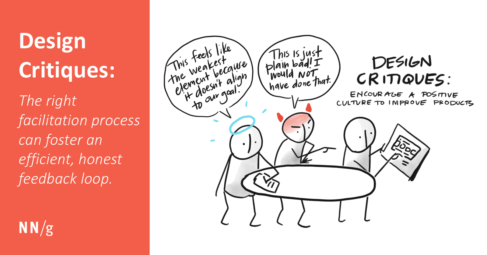
The Design Critique: Improving Work with Focused Feedback
A design critique is a structured conversation to measure a design against its goals, not a session for subjective opinions. It helps get early feedback on feasibility or catch inconsistencies.
CSS `color-scheme`: Opting Into Browser UI Themes
The color-scheme property tells the browser your site supports light/dark modes, automatically styling UI like scrollbars and form controls to match the user's OS preference.
Layout Grids: Your Blueprint for Consistent UI
Layout grids are visual blueprints for frames, enforcing structure and alignment. Use them to create consistent, responsive layouts for web and mobile. A common footgun is using fixed-width columns instead of 'Stretch' columns, which breaks responsiveness.
The 8-Point Grid: A Shared Language for UI Spacing
The 8-point grid system stops spacing debates by making every dimension and gap a multiple of 8px. It's used in design systems like Google's to create consistent layouts that render cleanly across devices. The biggest mistake is breaking the rule for "feel."
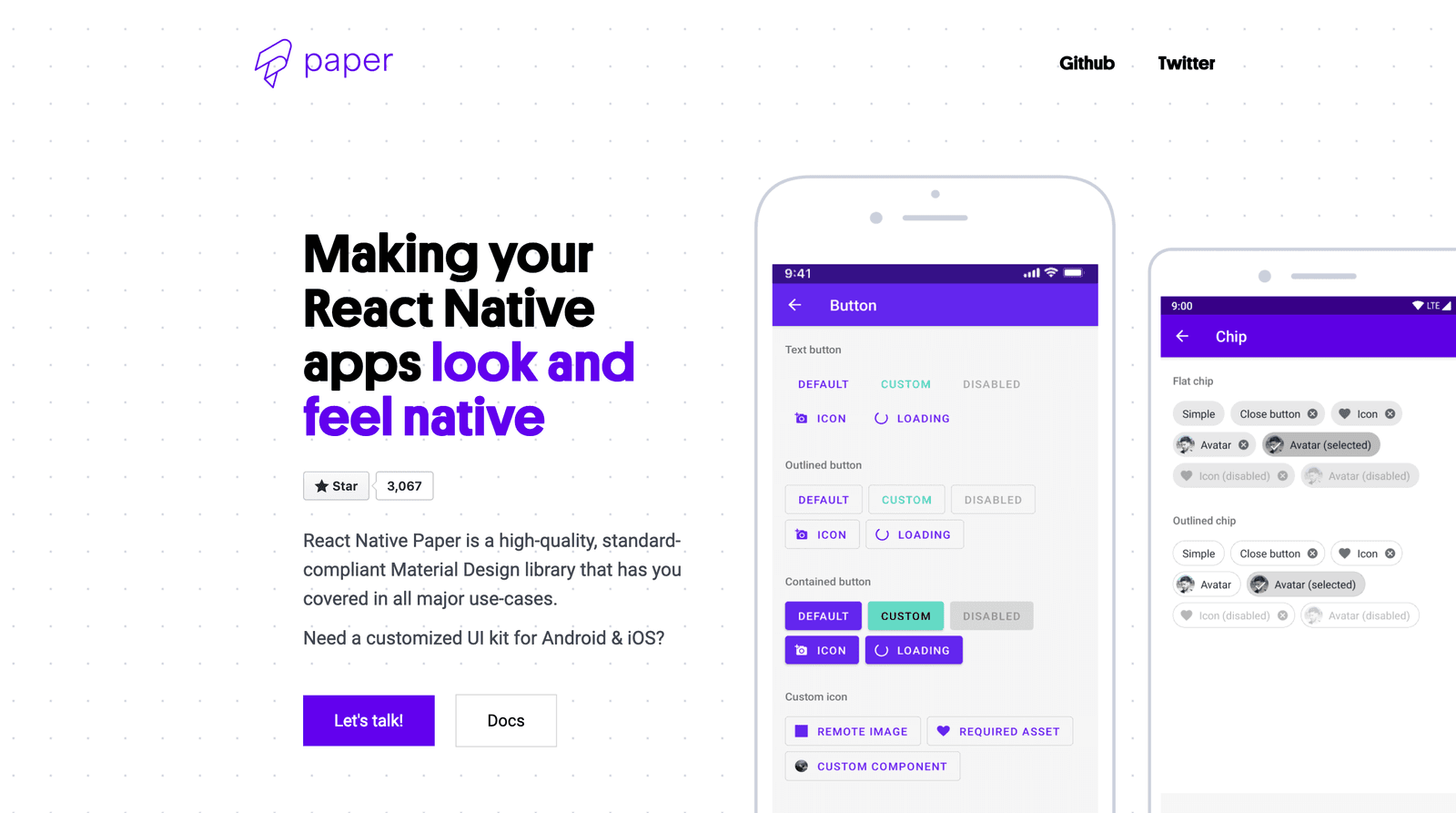
Using Component Libraries in React Native
A component library is a pre-fab UI kit for your app. Instead of building every button from scratch, you get polished, ready-to-use pieces that handle platform-specific animations and accessibility.
Cold Open: Hooking Viewers Before the Titles Roll
A cold open hooks the audience by jumping into the story *before* the opening credits. It's used in TV to prevent channel-surfing during early commercials or to recap past events. The footgun is an opening that confuses viewers instead of captivating them.
Figma Constraints: Building Responsive Layouts
Constraints are rules for how layers react when their frame is resized. Use them to build responsive designs, like pinning a logo to the top-left or stretching a background. The footgun: Constraints don't work on groups or inside Auto Layout frames.

Systematizing Haptics: Beyond Simple Vibrations
Treat haptics like a design system for touch, not just random vibrations. Use them to confirm actions or signal state changes. The biggest footgun is overuse, which turns meaningful feedback into annoying noise that users will disable.
Scripting B-Roll: Show, Don't Just Tell
Think of B-roll as the visual evidence for your main narrative. It's the supplemental footage that shows what a speaker is talking about, breaking up static shots in interviews or demos.

Informed Consent Is Comprehension, Not Paperwork
Informed consent means understanding risks and alternatives before agreeing. It applies whenever researchers collect sensitive data or expose people to risk. The footgun is treating a signature as proof of understanding; comprehension beats paperwork.

Visual Balance: Arranging UI Elements for Stability
Think of visual balance like a seesaw for your UI. Elements have "visual weight" from their size and color, and a balanced design distributes this weight so the layout feels stable.

Podcast Show Notes: Your Episode's Clickable Companion
Podcast show notes are the clickable, searchable companion to your audio, turning passive listening into action. They house affiliate links, guest bios, and resources, boosting SEO and monetization.
Right to Withdraw: Leave Anytime, No Reason
The right to withdraw is an emergency exit for research participants: leave anytime, reason optional. In usability studies and clinical trials, this protects autonomy. The footgun: pressuring hesitant users to finish destroys trust and poisons your data.
The Figma Interface: Your Digital Design Workshop
Figma's interface is a digital workshop: a central canvas for your work, a left sidebar for layers and assets, and a right sidebar for properties. It's the hub for UI/UX design, prototyping, and developer handoff.

Table Read: Hear Your Words Before You Ship Them
A table read is a dress rehearsal for your words. You gather stakeholders and read text aloud to catch awkward phrasing and unclear flow before it goes live. Use it for high-stakes content like API docs. The footgun is reading it yourself—you need fresh ears.
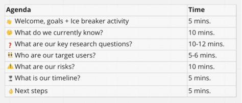
UX Research Kickoff: Align Before You Start
A UX research kickoff is a stakeholder sync before user interviews begin. It locks scope, resolves conflicting priorities, and aligns everyone on core questions. Skip it and you will research the wrong problem while stakeholders disagree on success.

Writing Sound Cues: When to Yell 'BANG!' on the Page
Don't just describe a sound; make it heard. In screenplays, write plot-critical sounds as capitalized onomatopoeia in the action lines, like a gunshot (BANG!). The footgun is capitalizing ambient noise or using it to direct an actor's vocal delivery.
We are hiring for this. Every open role lists the topics its interview covers, so you can prepare for the real thing rather than guessing.
See open roles