Concepts in Design & UX, page 21
Design System Adoption: Treat It Like a Product
Treat your design system like a product you're selling to internal teams, not just a library. Without an adoption strategy focused on real workflows, even a perfect system will be ignored, leading teams to build from scratch or create their own mini-systems.

Teleprompter Scripts: Format for Speaking, Not Reading
A teleprompter script is a performance guide, not a document. For professional video, use large sans-serif fonts, double spacing, and short sentences to help presenters sound natural. The footgun is writing dense paragraphs, which causes stilted delivery.
Single Ease Question (SEQ): Instant Task Difficulty Scores
The Single Ease Question is a 7-point post-task thermometer for perceived difficulty. Ask it immediately after a task attempt in usability tests. It correlates around r=.5 with completion and time, yet 14% of users rate failed tasks as easy.
Figma's Smart Animate: Motion Without Keyframes
Figma's Smart Animate creates fluid animations by tweening layers between frames. It's perfect for prototypes with expanding cards, sliding toggles, or parallax effects.
Semantic Colors: Naming a Color's Job, Not Its Value
Semantic colors name a color's purpose (e.g., color-background-interactive) instead of its value (#007BFF). This simplifies theming, like light/dark mode, by mapping roles to specific primitive colors, ensuring a consistent UI across an application.
Proofreading vs. Copyediting: Final Polish vs. Deep Clean
Copyediting is a deep clean for your writing, fixing style, flow, and clarity. Proofreading is the final spot-check for typos and formatting errors before you publish. They happen at different stages: copyediting on the draft, proofreading on the final layout.
Research Socialization: Make UX Insights Visible
UX research only drives outcomes if people see it. Research socialization pushes insights beyond design and product teams to the wider business. When studies sit trapped in folders, strategy gets built blind.

Empty State Pattern: More Than Just a Blank Page
An empty state turns a blank screen into a helpful guide, showing users what's possible and how to get there. It's crucial for first-time use, 'no results' searches, or after data deletion. The footgun is treating it as an afterthought, leaving users stuck.

Flesch-Kincaid: Measuring Readability with Math
Flesch-Kincaid scores aren't about quality, but simplicity, using word and sentence length to estimate reading difficulty. It's used in SEO tools and government forms to ensure accessibility. The footgun is chasing a score, which can make prose robotic.

ResearchOps Playbooks: Standardize UX Research
A ResearchOps playbook is your team's operating manual for repeatable research. It matters when multiple researchers recruit, analyze, and report across squads. The footgun is writing it once and letting it rot instead of treating it as a living process.
Figma Instance Overrides: Local Changes, Global Components
Instance overrides let you customize a component copy without breaking its link to the main. Use them to change a button's text or swap an icon for a specific context. The footgun: Overrides are lost when swapping variants if layer names don't match.
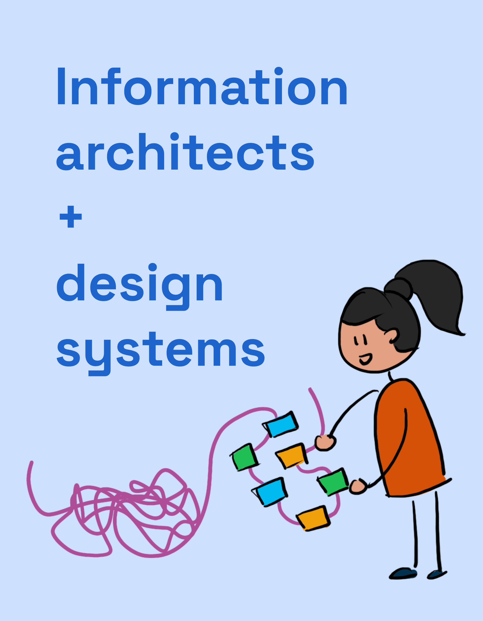
IA: How to Organize Docs So People Use Your Design System
Think of your design system docs like a library. Information Architecture (IA) is the shelving and catalog system that lets users find the right component or guideline. It's crucial for any system where discoverability impacts adoption.
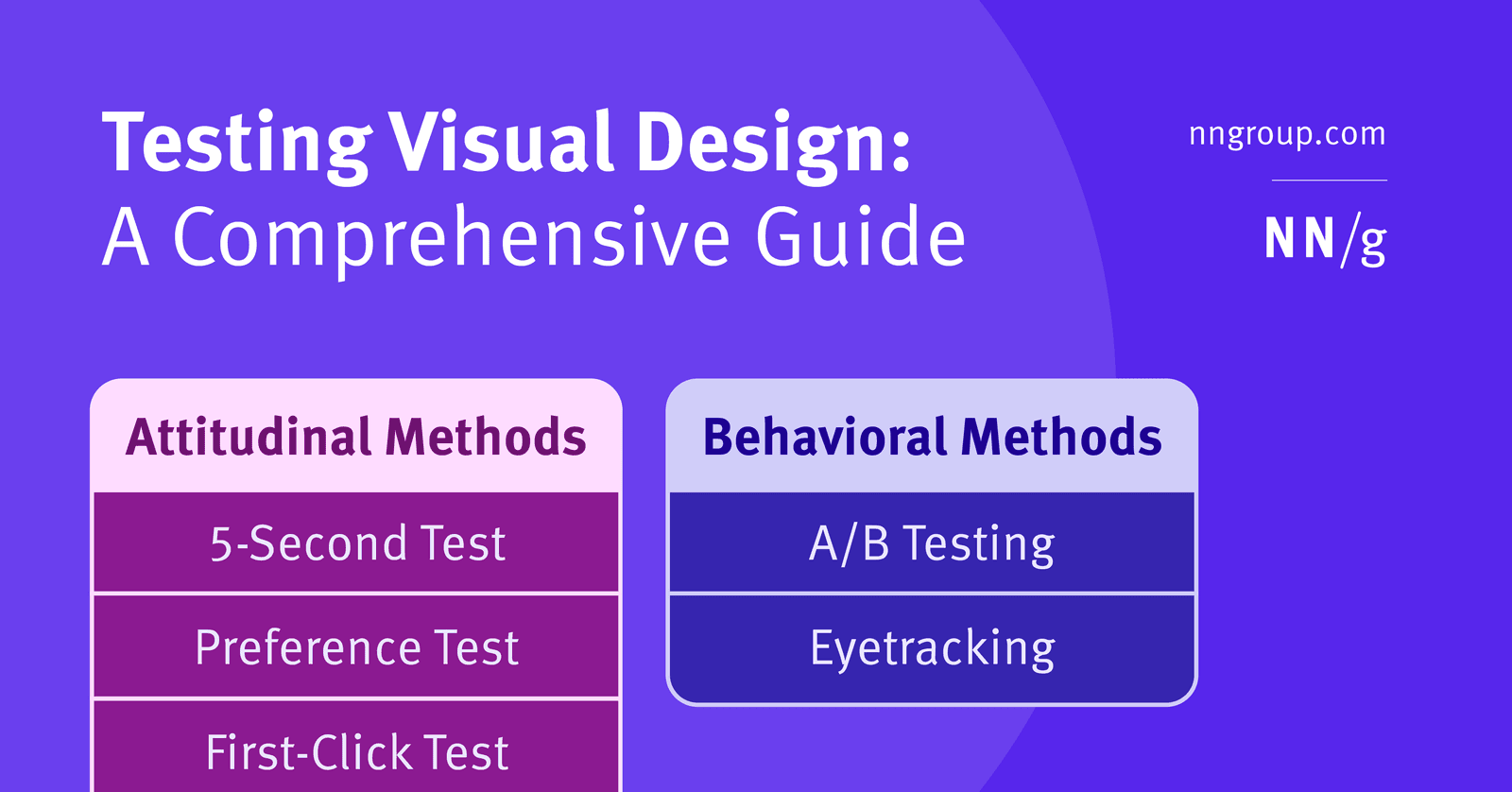
Five-Second Test: Capture a User's Gut Reaction
A five-second test captures a user's gut reaction by showing them a design for just five seconds. It's used to see if the visual style communicates the right brand identity before users have time to read. The footgun: don't warn users about the time limit.
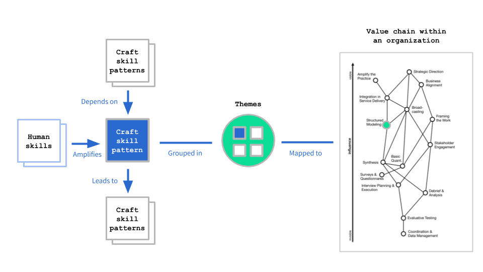
Research Competency Matrix: Mapping Team Growth
A competency matrix maps craft and human skills against career stages to reveal gaps. Use it to plan hiring and align capabilities with organizational needs. The footgun is treating it as a rigid checklist instead of a customizable reflection tool.
Base Component Pattern: Your Design System's Template
Think of a base component as a master template for UI elements. Changes to the master instantly update every copy, ensuring consistency. Use it for repeated elements like buttons or icons that need slight variations.
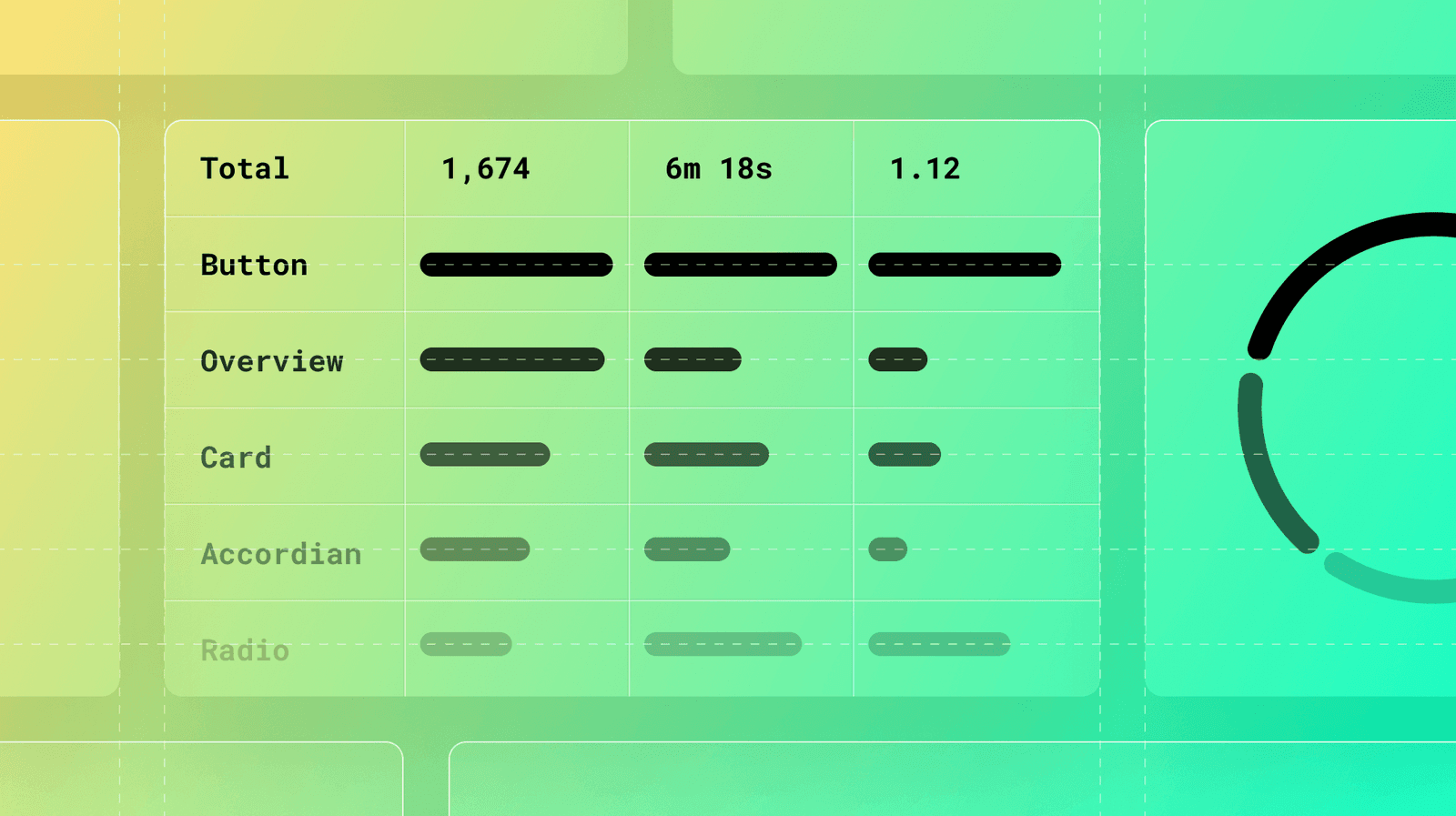
Measuring Documentation Effectiveness
Treat your design system docs like a product, not a library. Use analytics on page views, search queries, and user feedback to find confusing components and content gaps. The footgun: high traffic can signal a confusing page, not just a popular one.
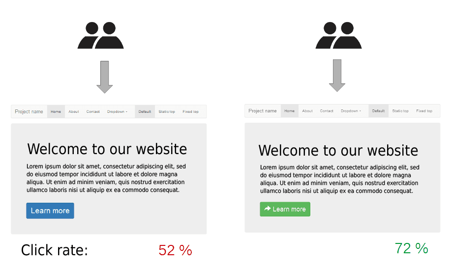
Control vs. Variation: The Core of A/B Testing
To know if a change works, compare it against the original. The original is your 'control,' and the new version is your 'variation.' This is the core of A/B testing, used to test new button colors or email subjects.
Research Tool Stack Management
A UX research tool stack is your standardized toolkit, not a random app collection. It speeds up projects and helps onboard teammates through ResearchOps. Picking tools before you know your research question forces methods to fit software instead of problems.
Figma Prototype Flows: Isolate User Journeys
Prototype Flows are named entry points for testing distinct user journeys in one file. Instead of separate pages for 'Sign Up' and 'Checkout,' create a flow for each. This keeps complex designs organized.
Shift-Left Accessibility: Build It In, Don't Bolt It On
Shift-left accessibility treats accessibility as a core feature, not a last-minute fix. It integrates checks throughout the development lifecycle, from design to deployment, preventing costly rework. The footgun is treating it as just an earlier QA step.
We are hiring for this. Every open role lists the topics its interview covers, so you can prepare for the real thing rather than guessing.
See open roles