Intermediate concepts in AI & ML, page 6
Automating MLOps with GitHub Actions
Treat your ML workflow like any other CI/CD pipeline. GitHub Actions automates MLOps tasks—like training, testing, and deployment—triggered by events in your repo. Use it to run validation on PRs or deploy models on merge.
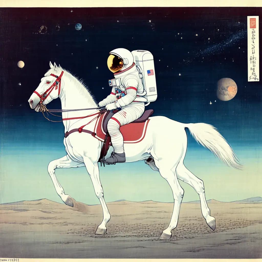
Text-to-Image Synthesis: From Prompt to Picture
Text-to-image models translate words into pixels by learning statistical links between text and images. They power creative tools like DALL-E but don't truly understand prompts, leading to errors in logic like counting or spatial arrangement.
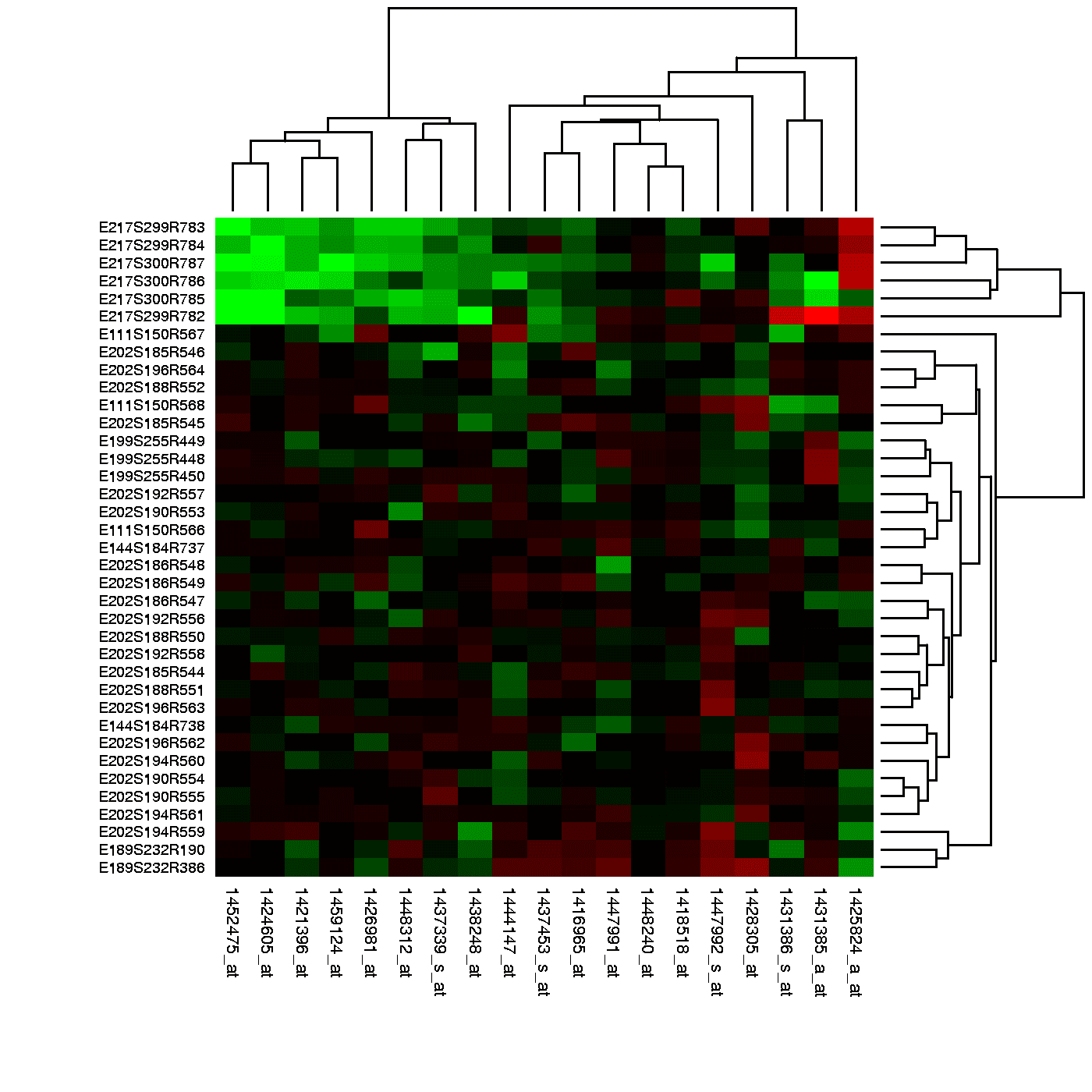
Heatmap: Visualizing Magnitude with Color
A heatmap is like coloring in a spreadsheet, using color to show the magnitude of values in a 2D grid. It's used to spot user engagement hotspots on a webpage, analyze financial data, or visualize gene expression.
Mode Collapse: When Your AI Gets Stuck in a Rut
Mode collapse is when a generative AI finds a “cheat” and produces the same few outputs over and over. This is a classic failure in GANs where the generator stops learning the full data distribution.
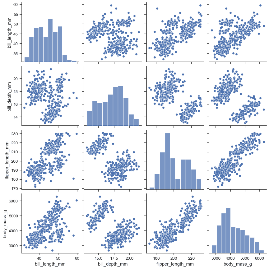
Pair Plot: See All Your Data's Relationships at Once
A pair plot is a matrix of charts showing every pairwise relationship in a dataset. Use it in exploratory data analysis to spot correlations and distributions at a glance. The footgun: it becomes unreadably large and slow with more than ~10 variables.
Region Proposal Network (RPN): The 'Where to Look' Engine
An RPN is an 'attention' mechanism for object detection, telling the model where to look. It replaces slow, external proposal methods in systems like Faster R-CNN for autonomous driving.
Fréchet Inception Distance (FID): Grading AI Art
FID grades AI-generated images by comparing their statistical "vibe" to real ones. It uses a pre-trained network (InceptionV3) to see if a batch of generated images has similar feature distributions to a real dataset. A lower score is better.
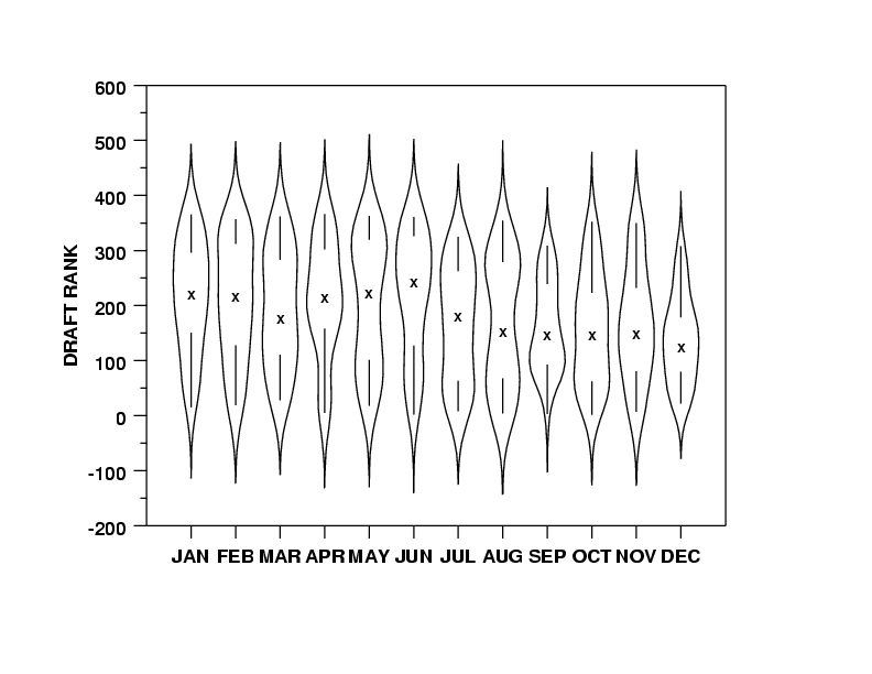
Violin Plots: Box Plots with a Sense of Shape
A violin plot is a box plot that also shows the data's shape. It reveals multi-modal distributions or skews that a simple box plot would hide. Use it to compare distributions across categories, like server response times.
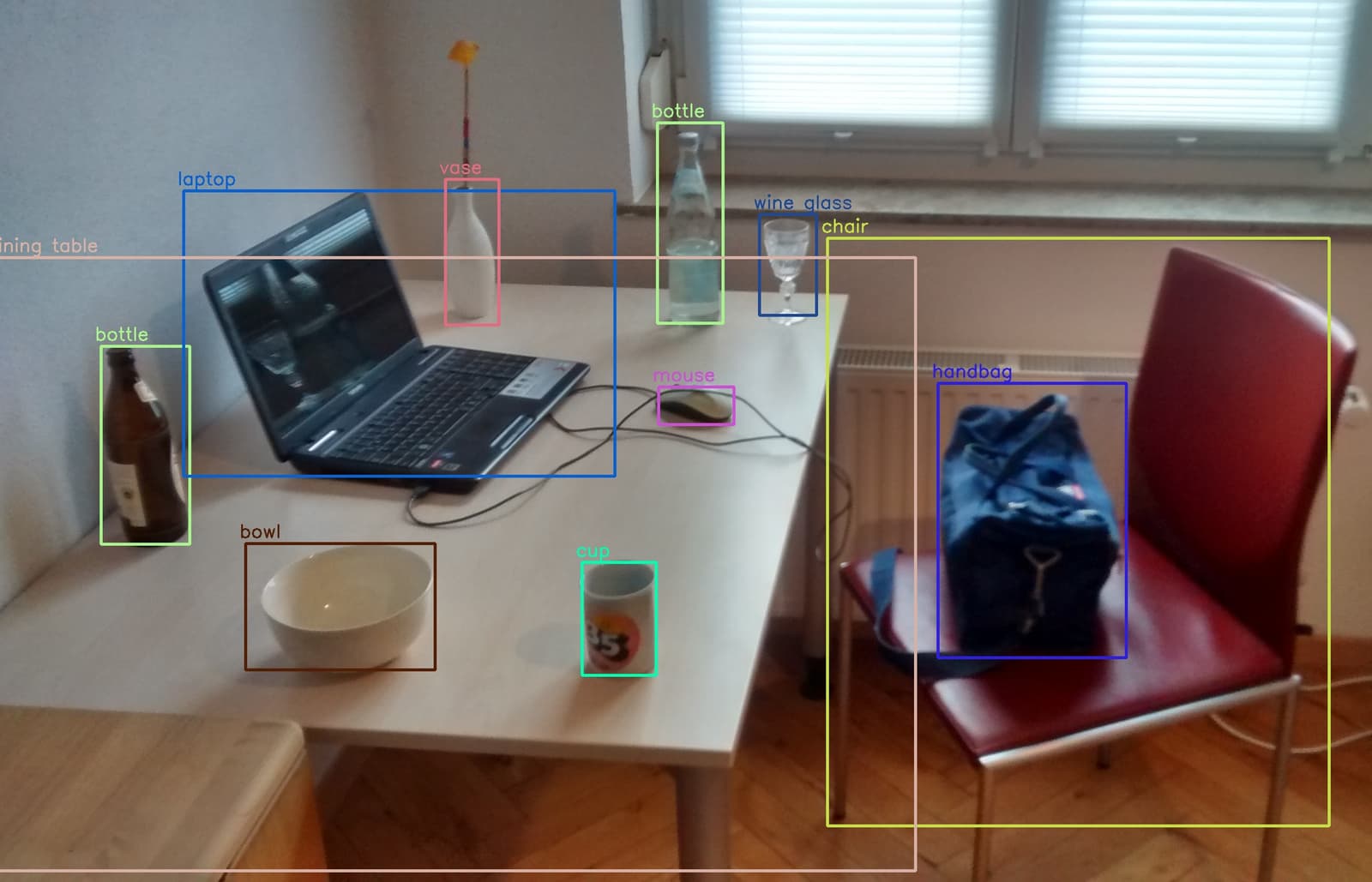
YOLO: Real-Time Object Detection in a Single Pass
YOLO treats object detection as a single regression problem, looking at an image once to predict all bounding boxes and classes. This makes it extremely fast, perfect for real-time video analysis.

Kernel Density Estimation: Beyond the Histogram
A KDE plot is a smoothed histogram, revealing a variable's distribution by summing 'bumps' over each data point instead of using rigid bins. It's great for data exploration, but the 'smoothness' (bandwidth) choice can drastically alter the plot's story.

Q-Q Plot: Visually Test if Data Fits a Distribution
A Q-Q plot visually checks if your data fits a theoretical distribution (like normal). If the points form a straight line, it's a match. Use it to validate model assumptions.
Model Server: The MLOps Deployment Bridge
A model server bridges ML training and production, operationalizing models within your release cycle. Use it when models must become first-class CI/CD citizens. The footgun is treating deployment as a one-time handoff rather than repeatable infrastructure.
Serverless Inference: Run ML Models Without Managing Servers
Serverless inference treats ML prediction like a function call, abstracting away servers. You pay for compute time per prediction, not for idle infrastructure.
Joint Embedding Space: A Rosetta Stone for AI
A joint embedding space acts like a Rosetta Stone, mapping different data types—like images and text—to a shared coordinate system where similar concepts are close together. This powers text-to-image models and cross-modal search.
Streaming Inference: Real-Time Model Predictions
Streaming inference makes predictions on data in-flight, not from a database. It's for real-time recommendations or fraud detection where millisecond decisions are critical. The footgun is assuming a single server can handle the load; you must build for scale.
Multimodal Fusion: Combining Senses for AI
Multimodal fusion lets an AI combine data types like text, images, and audio into one understanding, much like a human brain. It's key for visual question answering or analyzing video sentiment.
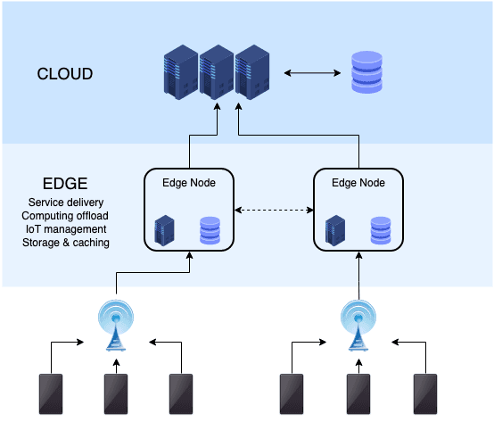
Edge AI: Running Models Where the Data Is
Edge AI runs machine learning models directly on devices, not in a distant cloud. This enables real-time, offline applications like smart cameras or voice assistants. The footgun is underestimating device hardware limits; models must be small and efficient.
Large Multimodal Models (LMMs): Beyond Text
An LMM is like a large language model that can also see and hear. It processes and connects information from multiple sources—like text, images, and audio—to perform tasks like describing a picture or answering questions about a video.
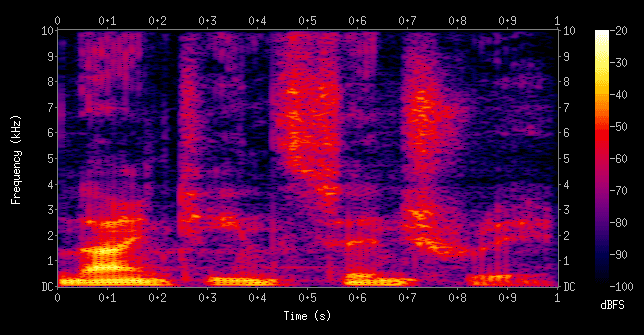
Audio Spectrograms: Turning Sound into Images for AI
A spectrogram turns sound into an image, plotting frequency against time, with color showing intensity. This lets vision-based AI models "see" audio for tasks like speech recognition or music generation. The footgun is mistaking it for a simple waveform.
Fully Convolutional Networks: From Image to Segmentation Map
An FCN turns a standard image classifier into a pixel-level labeler by replacing its final layers with convolutions to preserve spatial data. It's used for semantic segmentation, like identifying all cars and roads in a street scene.
We are hiring for this. Every open role lists the topics its interview covers, so you can prepare for the real thing rather than guessing.
See open roles