Concepts in Product Management, page 12

Customer Retention: Are Users Sticking Around?
Customer retention measures if users return to your product. It's often more valuable to keep an existing customer than acquire a new one. This is critical for any business relying on repeat engagement, from SaaS to e-commerce.
Gestalt Principles: How Brains Group Visuals
Gestalt principles explain why we see organized patterns, not random dots. Use them in data visualization to group related metrics with proximity or color, guiding users to see the intended story. Ignoring them creates confusing charts that obscure insights.
Cost of Delay: Quantifying the Price of Waiting
Cost of Delay puts a price tag on waiting, quantifying the value lost for every week a feature isn't shipped. It helps prioritize work by its economic impact, not just effort.

The HEART Framework for Measuring UX
The HEART framework provides a structure for measuring user experience on large-scale web applications. It helps teams define user-centered metrics to track progress towards goals and make data-driven decisions.
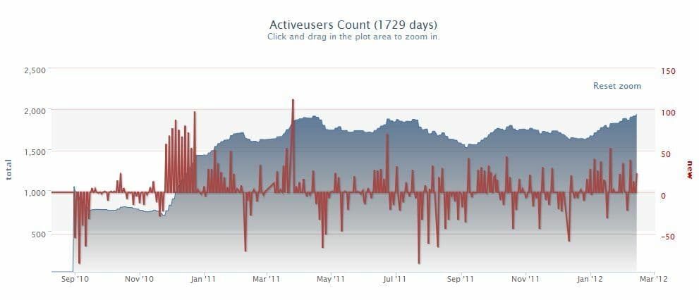
DAU/MAU Ratio: Measuring Product Stickiness
The DAU/MAU ratio measures product “stickiness” by showing what percentage of your monthly users return daily. A high ratio suggests a strong daily habit, common for social or communication apps. The footgun is judging all products by the same benchmark.
Data-Ink Ratio: Maximize Signal, Minimize Noise
The Data-Ink Ratio states that a good chart maximizes the ink showing data and minimizes everything else. It's a call to erase 'chart junk'—heavy gridlines or 3D effects—that doesn't convey information.
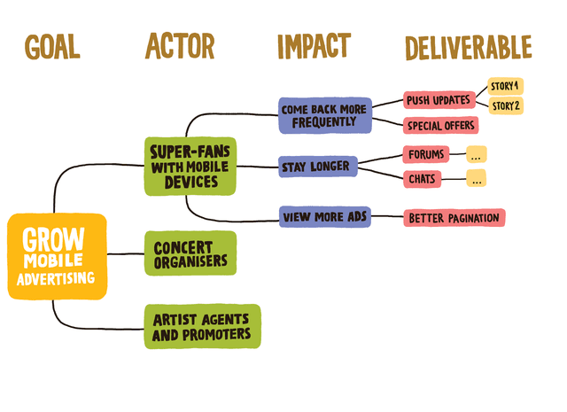
Impact Mapping: From Business Goals to Code
Impact Mapping is a visual roadmap that connects business goals directly to features, forcing you to answer "Why?" before "What?". Use it to align stakeholders on a new vision or prioritize a backlog. The footgun is starting with features and working backward.

Counter Metrics: Guardrails for Your Goals
Counter metrics are the guardrails for your primary goal, preventing you from optimizing one number at the expense of user experience. If you increase ad impressions for revenue, track user retention to ensure you aren't just driving users away with spam.
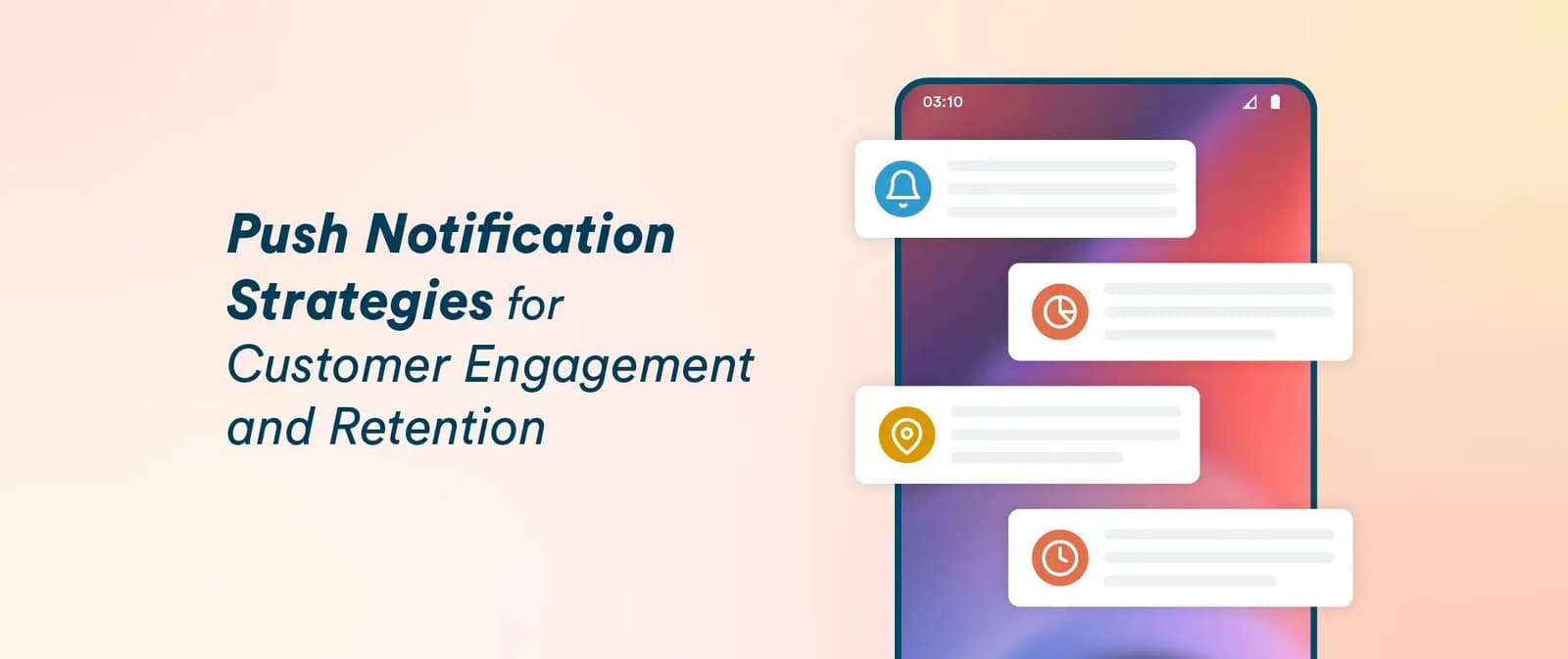
Push Notifications: Strategy Over Noise
A push notification strategy treats a user's lock screen like rented real estate, not a free megaphone. It's used by mobile apps to re-engage users with timely value, like sales or reminders.
Small Multiples: Comparing Data with a Grid of Charts
Small multiples are a comic strip for data, showing different dataset slices in a grid of charts with identical axes. They're used to compare trends across categories, like sales per region. The footgun is using inconsistent scales, which breaks comparison.
Information Radiator: Your Team's Public Billboard
An information radiator is a large, public display that broadcasts key project info to anyone walking by. It's used for build statuses or task boards to keep the team aligned without meetings. The footgun is cluttering it until it becomes ignorable noise.
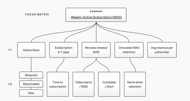
KPI Tree: Linking Product Changes to Business Outcomes
A KPI tree traces how changes ladder up to outcomes, giving metrics connective tissue. Build one when dashboards and experiments conflict and you need a defensible line from features to impact. Let it stay static and it becomes disconnected.

The Narrative Arc for Data Storytelling
A narrative arc gives data a story by building tension toward a key insight. It guides stakeholders from a problem (plot) to a turning point (climax) and a resolution. The footgun is oversimplifying; compelling stories have multiple smaller tension peaks.
Timeboxing: Fix the Time, Flex the Scope
Timeboxing fixes the duration for a task, not the scope. You work for a set period and then stop, forcing focus and preventing endless work. It's the core of Agile sprints and daily stand-ups. The footgun is treating it as a hard deadline to cram.
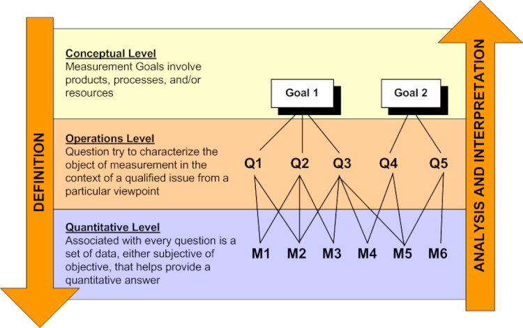
Goal-Question-Metric: Measure What Matters, Not What's Easy
GQM is a top-down framework for defining metrics. You start with a Goal, ask Questions to clarify it, then define Metrics to answer them. This avoids the common trap of collecting vanity metrics that don't reflect true software quality or business goals.

In-App Messaging: A Guide Inside Your Product
Think of in-app messages as a helpful guide inside your app, not an interruption. They appear based on user actions to provide timely context, unlike push notifications. Use them for onboarding or feature announcements.
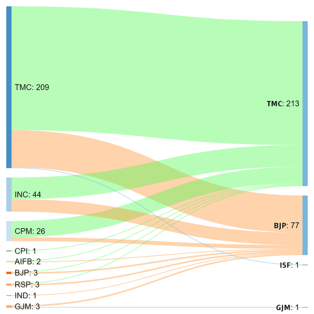
Sankey Diagram: Visualizing Proportional Flow
A Sankey diagram visualizes flow, where the width of each path is proportional to the quantity moving through it. Use it to trace user journeys or track budget allocation.
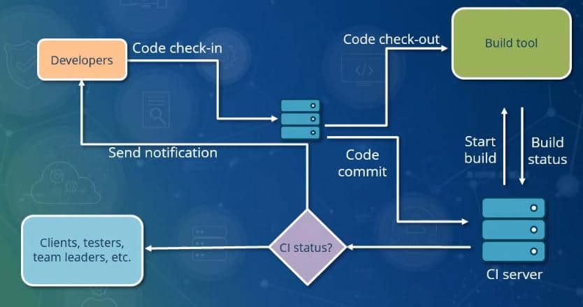
Continuous Integration: Catching Bugs Early
Continuous Integration (CI) treats code merging like a continuous stream, not a big-bang event, to keep the main codebase stable. On every commit, an automated system builds and tests the software to catch issues immediately.

Product Roadmap vs. Backlog: Strategy vs. Tactics
A roadmap is your strategic travel plan showing major destinations (product goals), while the backlog is the turn-by-turn navigation for the current leg of the journey (development tasks). The footgun is cluttering the roadmap with backlog details.
Email Drip Campaigns: Automated User Nurturing
An email drip campaign is an automated conversation guiding a user from one state to another. It's used for onboarding new users or re-engaging inactive ones. The footgun is creating a rigid monologue that ignores user behavior instead of reacting to it.
We are hiring for this. Every open role lists the topics its interview covers, so you can prepare for the real thing rather than guessing.
See open roles