Easy concepts in Product Management, page 4
Cost-Plus Pricing: Set Price Based on Cost, Not Value
Cost-plus pricing sets a product's price by adding a fixed percentage markup to its unit cost. It's common in government contracts where costs are clear. The footgun is that it ignores what customers are willing to pay, leaving money on the table.
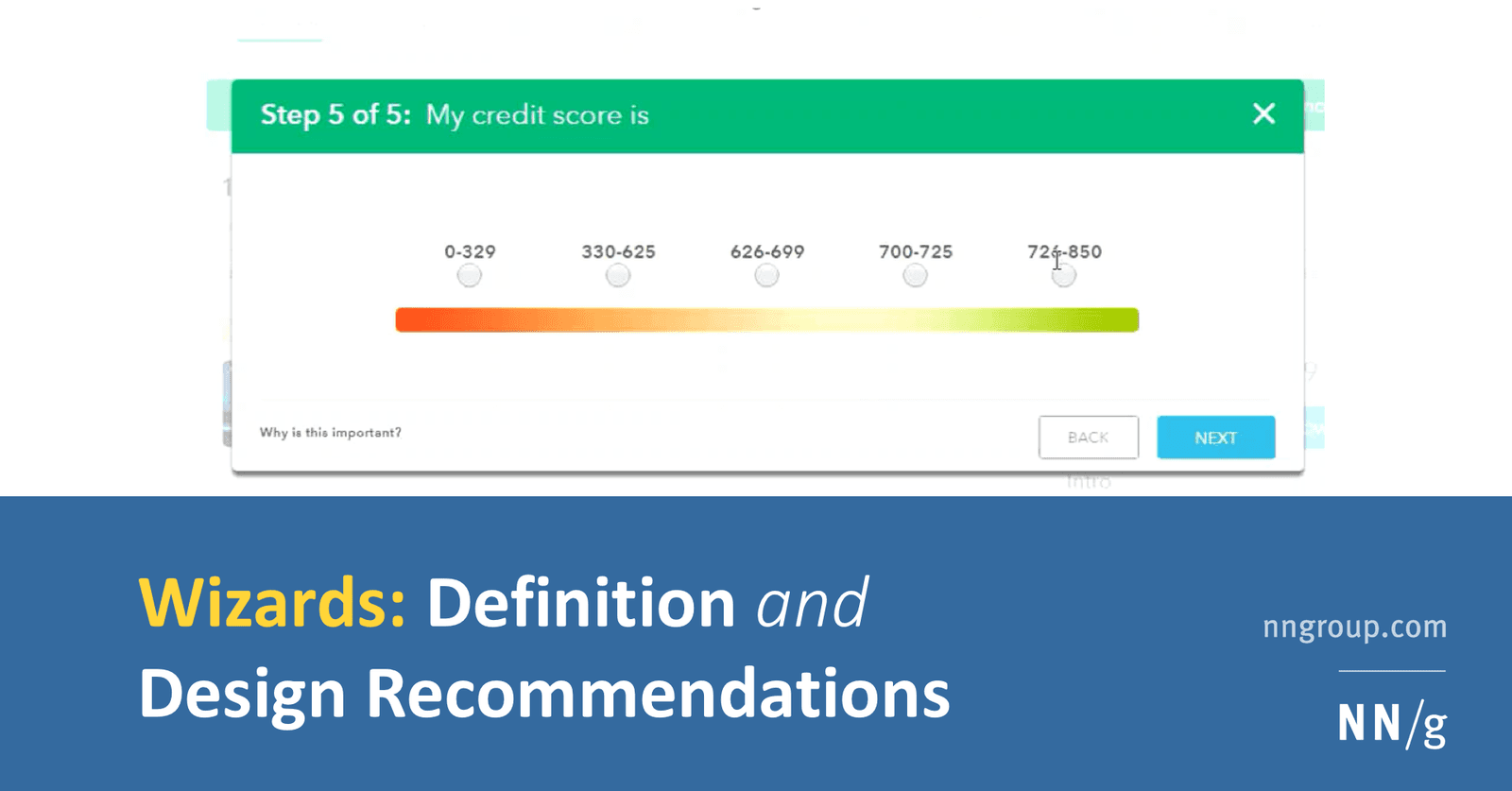
Setup Wizard: Guiding Users Through Complexity
A setup wizard turns a complex form into a simple, step-by-step conversation. It's ideal for infrequent but critical tasks like software installation, where the system determines the next best step. The footgun: A true wizard alters the user's *path*.
INVEST: The Checklist for High-Quality User Stories
INVEST is a checklist for quality user stories: Independent, Negotiable, Valuable, Estimable, Small, and Testable. Use it in backlog grooming to ensure work is clear and sprint-ready.

Welcome Email Sequence: Guide Users from Signup to Value
A welcome email sequence guides new users from sign-up to experiencing your product's core value. It's crucial for SaaS products to reduce churn by encouraging key actions. The footgun is sending just one email and hoping users figure out the rest.

SMART Goals: From Vague Hopes to Actionable Plans
SMART goals turn fuzzy ambitions into concrete plans by forcing clarity. It's a checklist for ensuring a goal is Specific, Measurable, Assignable, Realistic, and Time-bound. Use it for project planning or performance reviews to create trackable progress.

Anscombe's Quartet: When Numbers Lie
Anscombe's Quartet shows how four datasets can share identical summary stats (mean, variance) but look completely different when plotted. It's a classic reminder to always visualize your data before trusting numerical summaries.
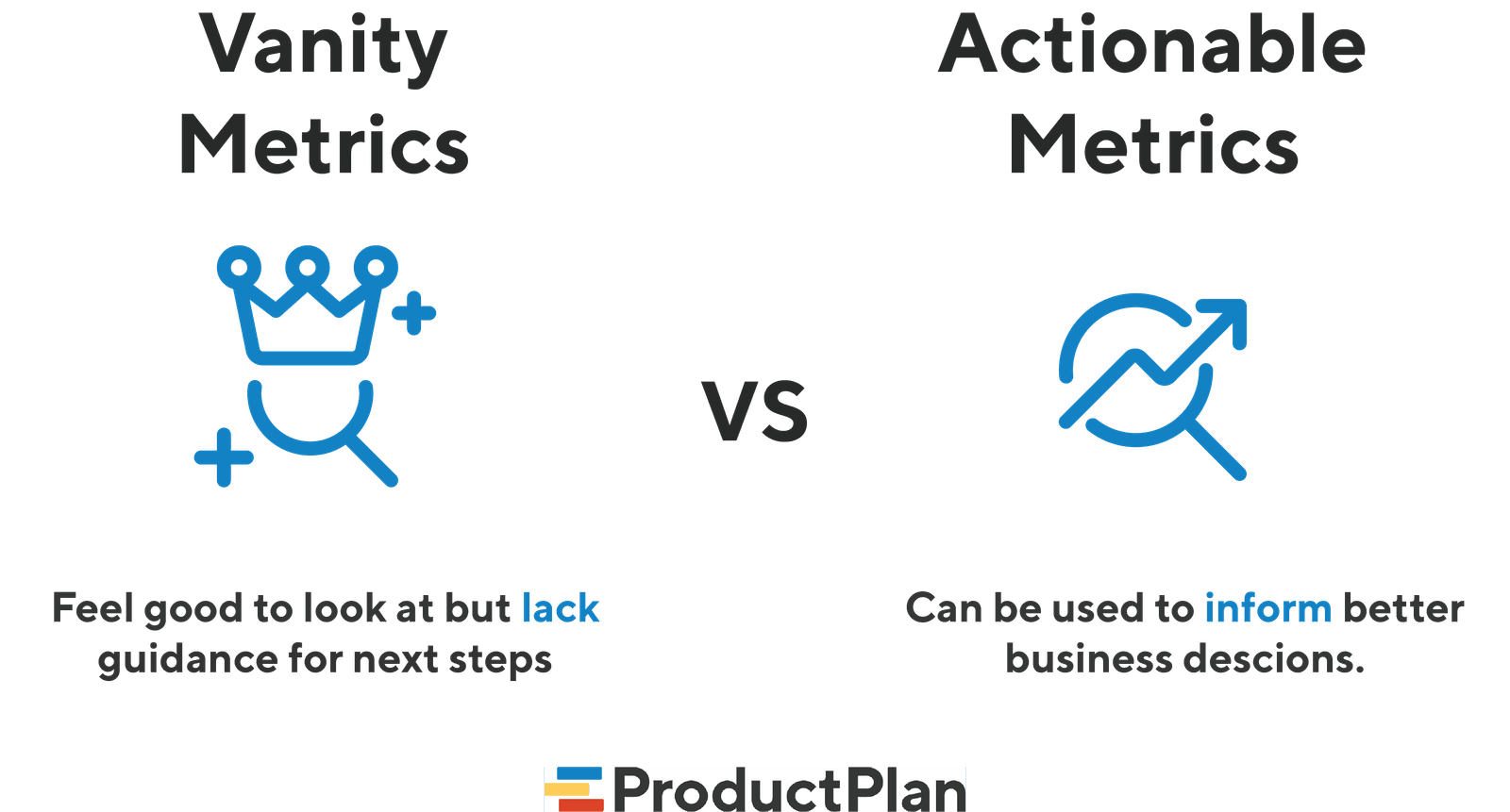
Vanity vs. Actionable Metrics: Measure What Matters
Vanity metrics look impressive but don't inform decisions (e.g., total downloads). Actionable metrics tie to business goals and guide your next move (e.g., conversion rate). This helps product teams focus on real growth, not just impressive-looking charts.

Chart Selection: Match Purpose, Not Looks
Start with the purpose, not the chart. The question you're asking—'how do these compare?' or 'what's the trend?'—determines the best visualization. A line chart shows trends; a bar chart compares categories.

Customer Retention: Are Users Sticking Around?
Customer retention measures if users return to your product. It's often more valuable to keep an existing customer than acquire a new one. This is critical for any business relying on repeat engagement, from SaaS to e-commerce.
Gestalt Principles: How Brains Group Visuals
Gestalt principles explain why we see organized patterns, not random dots. Use them in data visualization to group related metrics with proximity or color, guiding users to see the intended story. Ignoring them creates confusing charts that obscure insights.
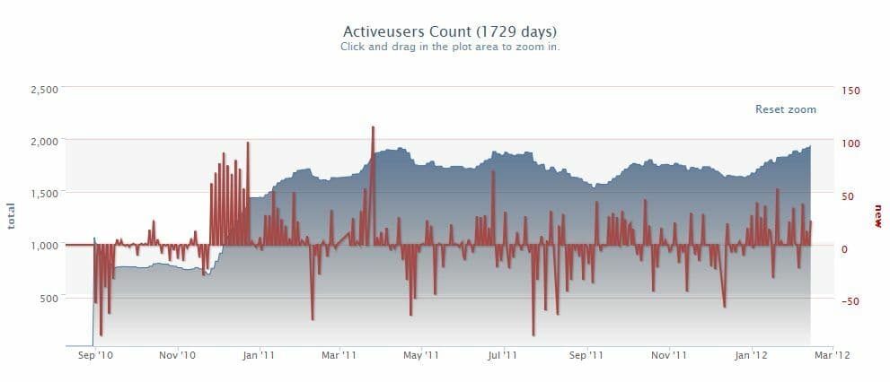
DAU/MAU Ratio: Measuring Product Stickiness
The DAU/MAU ratio measures product “stickiness” by showing what percentage of your monthly users return daily. A high ratio suggests a strong daily habit, common for social or communication apps. The footgun is judging all products by the same benchmark.

Push Notifications: Strategy Over Noise
A push notification strategy treats a user's lock screen like rented real estate, not a free megaphone. It's used by mobile apps to re-engage users with timely value, like sales or reminders.
Information Radiator: Your Team's Public Billboard
An information radiator is a large, public display that broadcasts key project info to anyone walking by. It's used for build statuses or task boards to keep the team aligned without meetings. The footgun is cluttering it until it becomes ignorable noise.
Timeboxing: Fix the Time, Flex the Scope
Timeboxing fixes the duration for a task, not the scope. You work for a set period and then stop, forcing focus and preventing endless work. It's the core of Agile sprints and daily stand-ups. The footgun is treating it as a hard deadline to cram.

Product Roadmap vs. Backlog: Strategy vs. Tactics
A roadmap is your strategic travel plan showing major destinations (product goals), while the backlog is the turn-by-turn navigation for the current leg of the journey (development tasks). The footgun is cluttering the roadmap with backlog details.
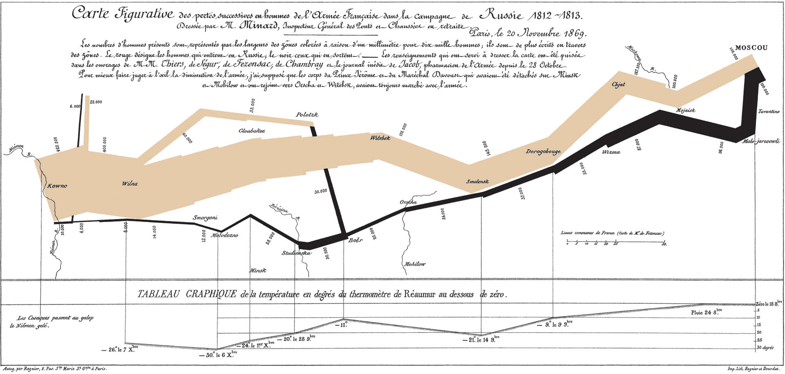
Exploratory Data Analysis (EDA): Look Before You Leap
Exploratory Data Analysis (EDA) is like being a detective with your data: you look for clues, patterns, and outliers before forming a theory. It's the first step in any data project, from building a model to creating a dashboard.
Correlation Is Not Causation
Just because two metrics move together doesn't mean one causes the other. This is vital when analyzing user data, as a feature launch might correlate with higher signups when the real cause was a marketing campaign.
Root Cause Analysis: Stop Fixing Symptoms, Find the Source
Root Cause Analysis digs past surface-level symptoms to find the true origin of a problem. It’s used to analyze IT outages, manufacturing defects, and even medical misdiagnoses.
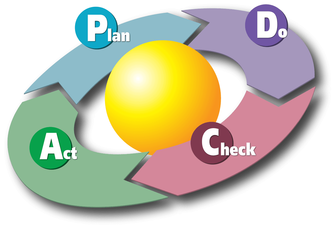
PDCA Cycle: The Scientific Method for Business Improvement
The PDCA cycle is the scientific method for business: Plan a change, Do the experiment, Check the results, and Act on the findings. It's used to refine manufacturing or improve software cycles.
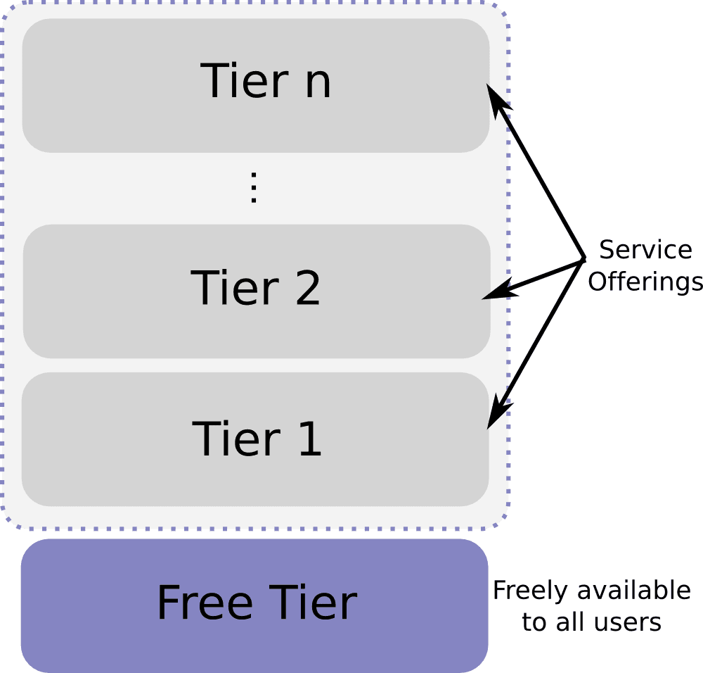
Freemium: Give Away the Basics, Sell the Upgrades
Freemium gives away a useful core product for free to attract a large audience, then sells premium features to a small subset of users. It's common in apps and games. The footgun is miscalibrating the free tier: make it too good and no one pays.
We are hiring for this. Every open role lists the topics its interview covers, so you can prepare for the real thing rather than guessing.
See open roles