More in Analytics & Metrics — page 17
Why not t-test p99 latency? Describe a valid alternative.
This tests your grasp of statistical test assumptions. A good answer explains why p99 violates t-test normality, then outlines a resampling method like bootstrapping to build a confidence interval on the *difference* of p99s.

Explain Simpson's Paradox with a user engagement example
This tests your understanding of statistical pitfalls in A/B testing. A good answer defines the paradox, gives an example where a feature fails in aggregate but wins in every segment, and attributes it to a confounding variable.
How to Statistically Test a 10% DAU Drop?
Tests your knowledge of hypothesis testing. A good answer outlines the steps: state a null hypothesis, choose a test (e.g., Z-test), calculate a p-value, and compare it to a significance level (alpha).
Explain the difference between correlation and causation
Tests if you can avoid statistical fallacies. First, define correlation (association) and causation (cause-effect). Then, explain the difference via a confounding variable. A red flag is giving an example where one metric actually could cause the other.
p-value is 0.08, significance is 0.05. Ship it?
This tests your ability to translate statistical risk for business partners. Explain that p=0.08 means an 8% chance of a false positive, quantify the cost of a bad decision, and suggest extending the test to increase power.
What does a p-value of 0.03 mean in an A/B test?
Tests your practical statistical literacy. A good answer defines the p-value (3% chance of this result if the null is true), compares it to alpha (0.03 < 0.05) to reject the null, and decides to ship.
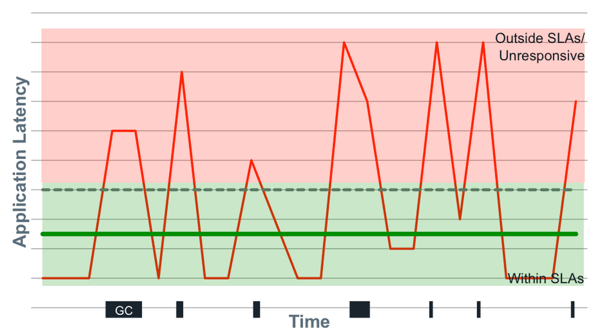
Mean vs. Median for API Response Times?
Tests if you know latency data has outliers. A good answer chooses median because it's robust to extremes. Explain that mean gets skewed by a few slow requests (e.g., GC pauses), hiding the typical user experience.

How would you architect a fast, multi-dimensional analytics dashboard?
This tests your grasp of analytics architectures and trade-offs between pre-computation and real-time querying. A great answer clarifies needs, then proposes a hybrid model using an OLAP cube for core metrics and a columnar store for ad-hoc queries.
How would you validate a PM's claim about feature success?
This tests your grasp of causal inference vs. correlation. A great answer acknowledges self-selection bias, proposes a quasi-experimental method like Propensity Score Matching to create a synthetic control group, and then compares outcomes for the matched…
An A/B test has imbalanced traffic. What do you do?
This tests your ability to spot confounding variables and Simpson's Paradox. A good answer first invalidates the aggregate result, then proposes segmenting by device to salvage insights, and finally investigates the root cause.

Generate a monthly cohort retention table from user events
This tests your ability to translate a business metric into a multi-step SQL query. A great answer defines cohorts by first activity, maps subsequent activity to period indices, counts distinct users, and pivots the result.

Average latency is up, but p99 is flat. Why?
This tests your grasp of latency distributions. Hypothesize that a large group of typical requests slowed, pulling up the average but not crossing the p99 threshold. Segment by endpoint or customer to find the cohort.
Is 20% higher retention from Feature X causal or correlational?
This tests your ability to distinguish correlation from causation. A great answer questions the data, identifies confounding variables (e.g., power users), and proposes a randomized A/B test as the gold standard to prove causality.
DAU dropped 10%. What user segments do you investigate first?
Tests your systematic problem-solving. First, clarify the metric and timeline. Then, segment by platform, geography, and user tenure (new vs. returning). A red flag is jumping to external causes before ruling out internal issues like a bad deployment.
How do you visually represent statistical uncertainty in a chart?
This tests your ability to communicate statistical nuance beyond simple averages. A great answer discusses error bars (specifying CI vs. SD), then moves to richer visualizations like graded error bars or violin plots.
Visualize Millions of Time-Series Data Points
Tests your ability to handle large datasets by combining backend downsampling (like LTTB) with frontend multi-resolution fetching and canvas rendering. A red flag is suggesting naive sampling (every Nth point) or focusing only on frontend libraries.

Explain pre-attentive attributes in data visualization
Tests your grasp of visual psychology in data viz. Define pre-attentive attributes (instantly processed visuals), give examples (color, size, shape), and explain using one to highlight outliers in a dense plot.
Feature A correlates with retention. Should we invest more?
Tests your ability to move beyond clichés to propose concrete analysis. A great answer questions the correlation, suggests cohort analysis or A/B testing, and probes for confounding variables. Red flag: just saying 'correlation isn't causation' with no plan.

How would you design a product management dashboard?
Tests your ability to structure data into a decision-making narrative. A good answer moves from a high-level summary (DAU) to trends (retention) and then actionable details (feature adoption). A red flag is simply listing charts without a narrative connection.
Bar Chart vs. Line Chart for Market Share Comparison?
Tests basic chart selection: comparing static categories vs. showing trends. A bar chart is correct for comparing discrete companies at one point in time. A line chart wrongly implies a time-series relationship. Red flag: choosing a line or pie chart.